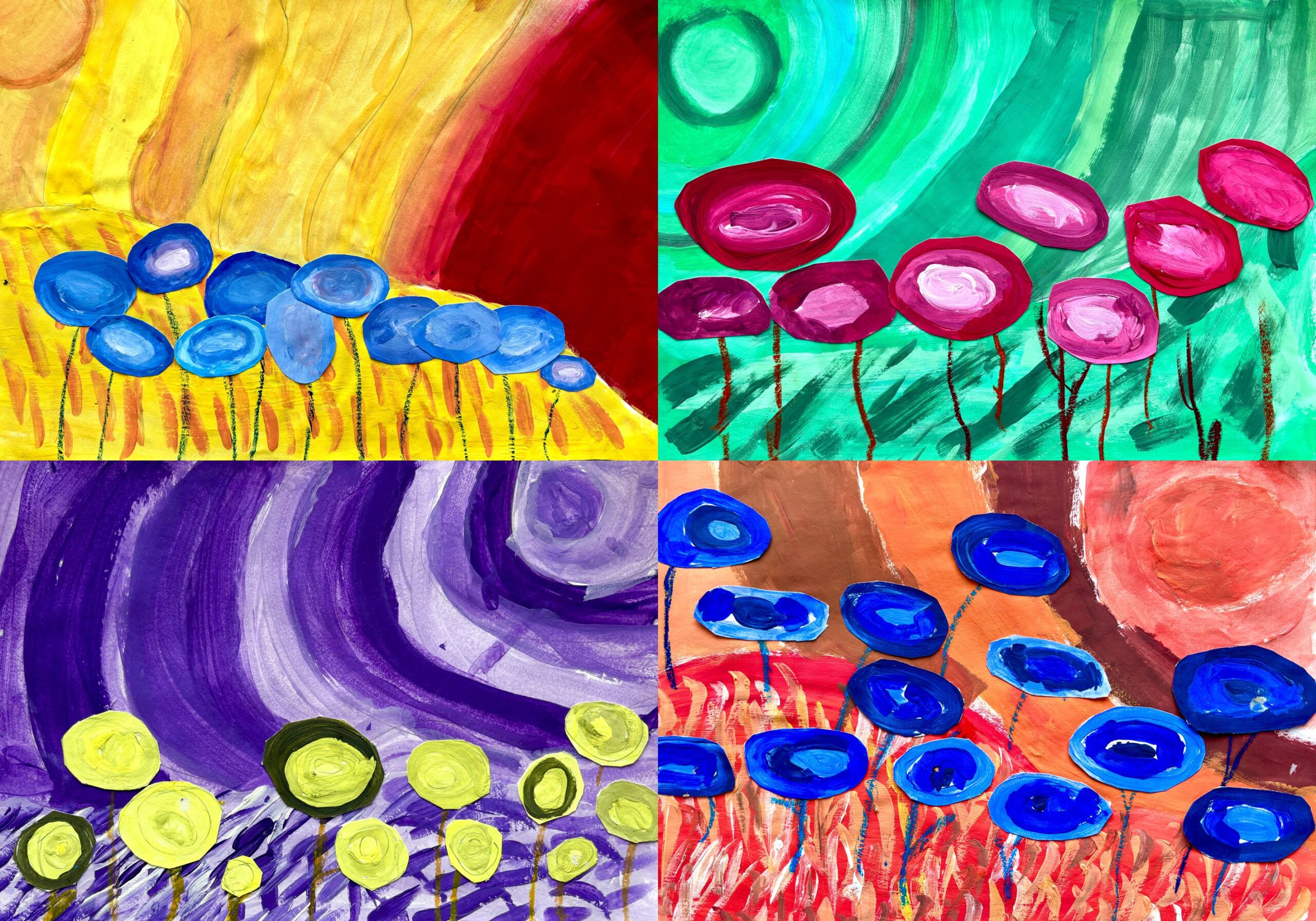
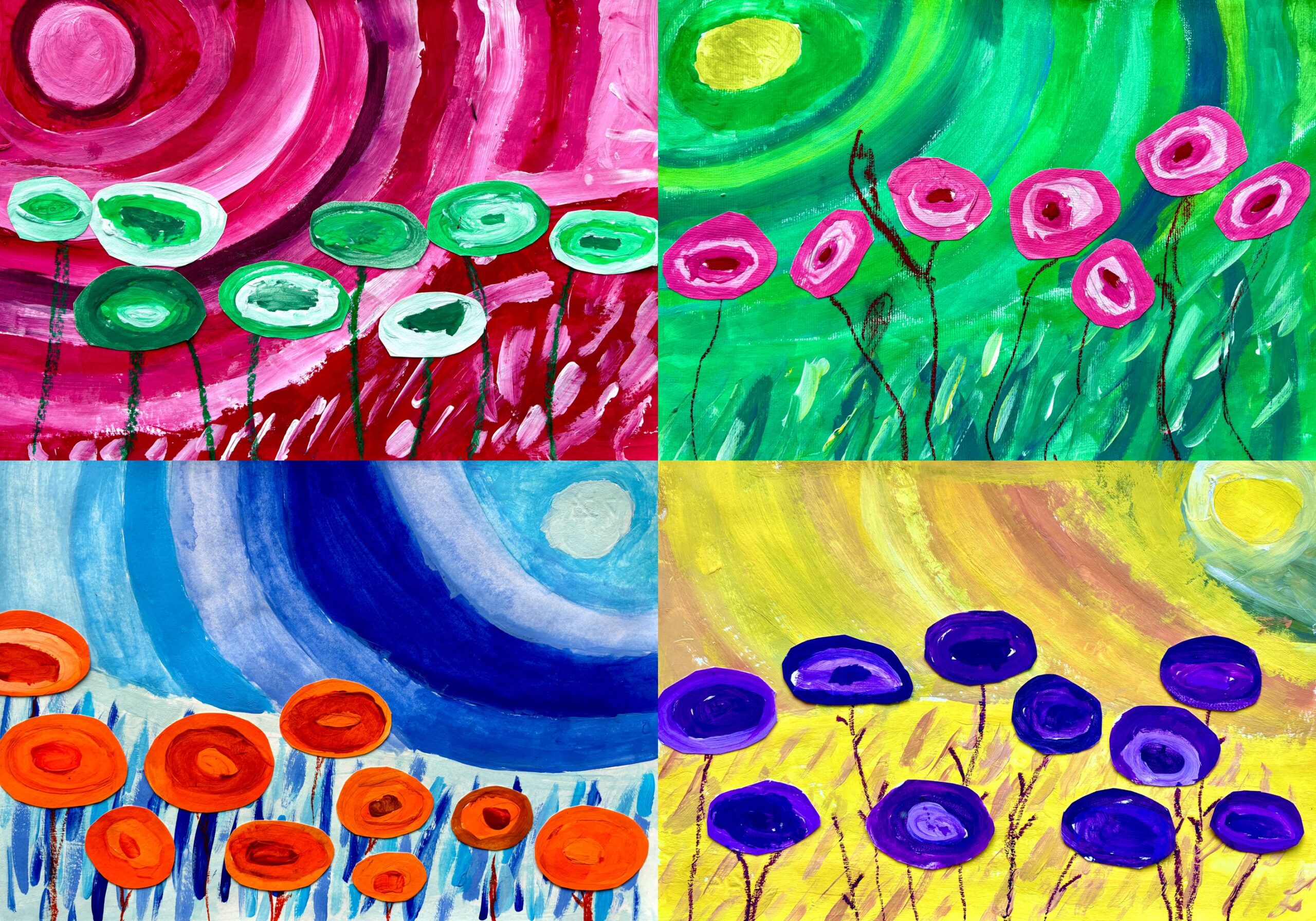
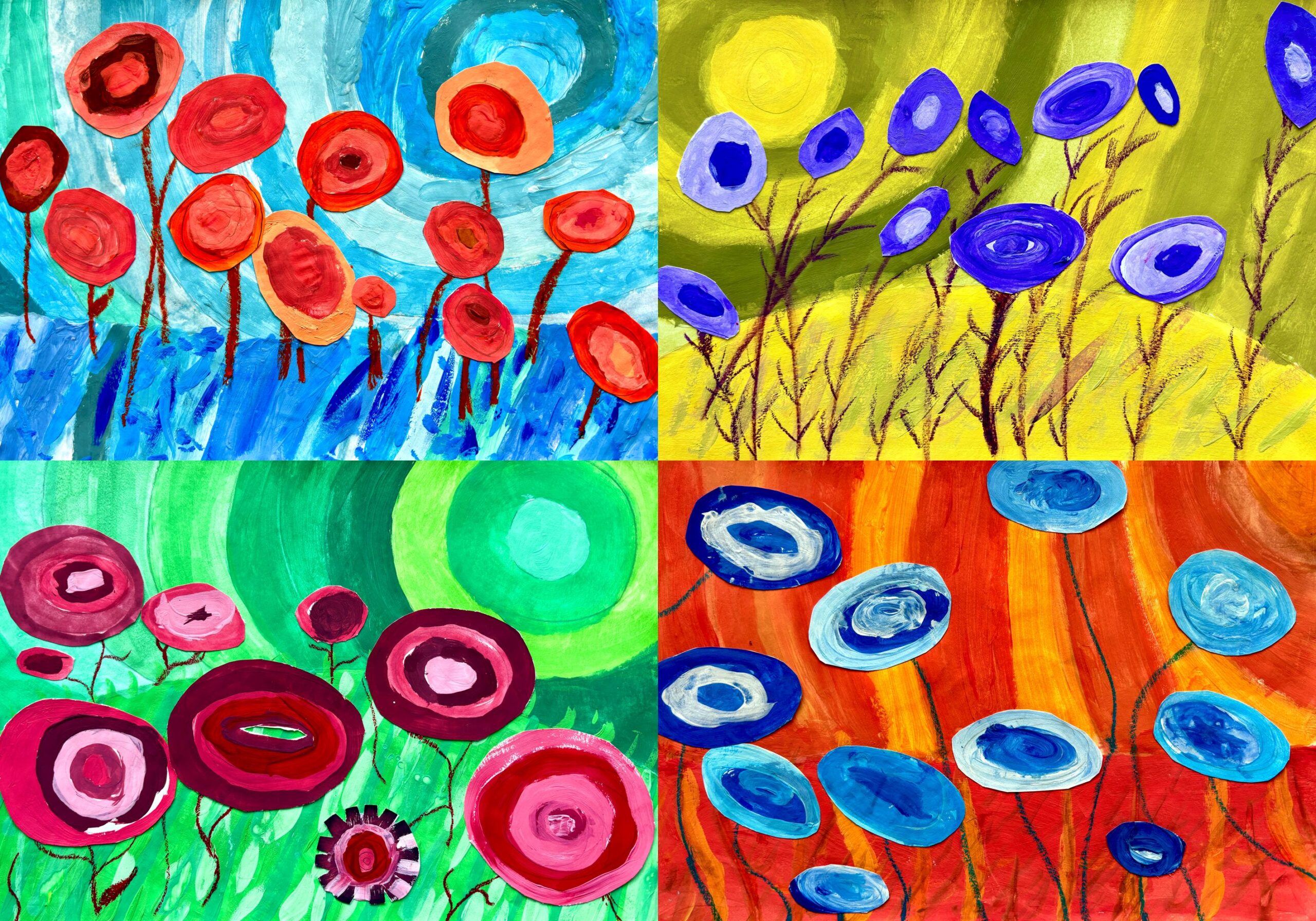
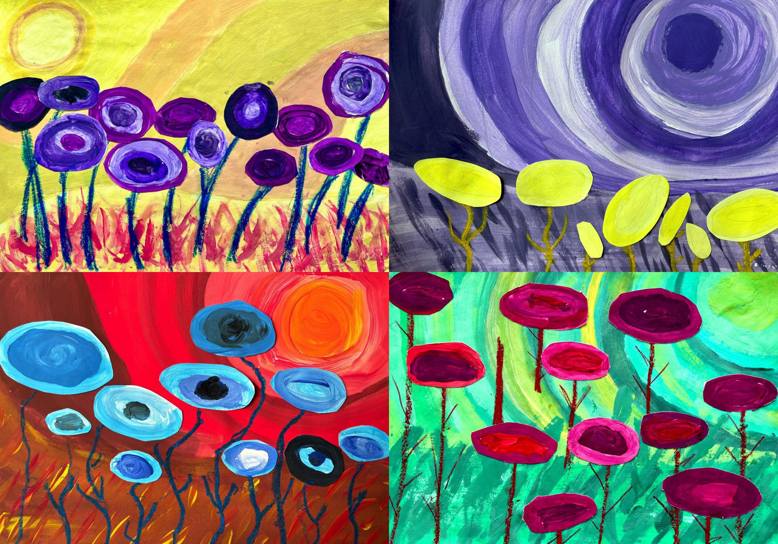
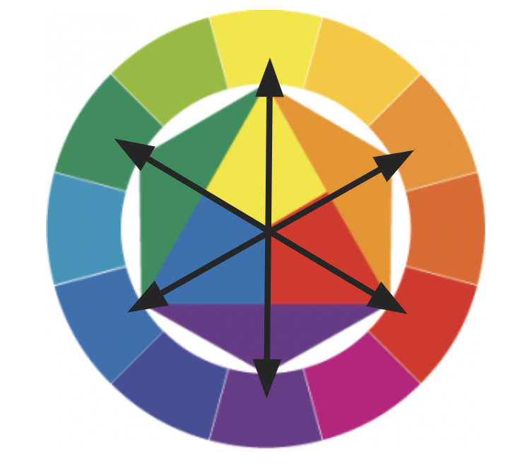
A very interesting topic of color theory is the complementary colours, colors that are opposite to each other in the Itten circle, which when put together are in strong contrast and create chromatic vibrations in our retina. With 6th grade students we observed these pairs of colors and how they are used in various fields of visual arts such as advertising, cinema, photography, fashion, theatre, graphic and painting. We have also found various visual games and optical illusions online, based on the mutual influence of these colors.
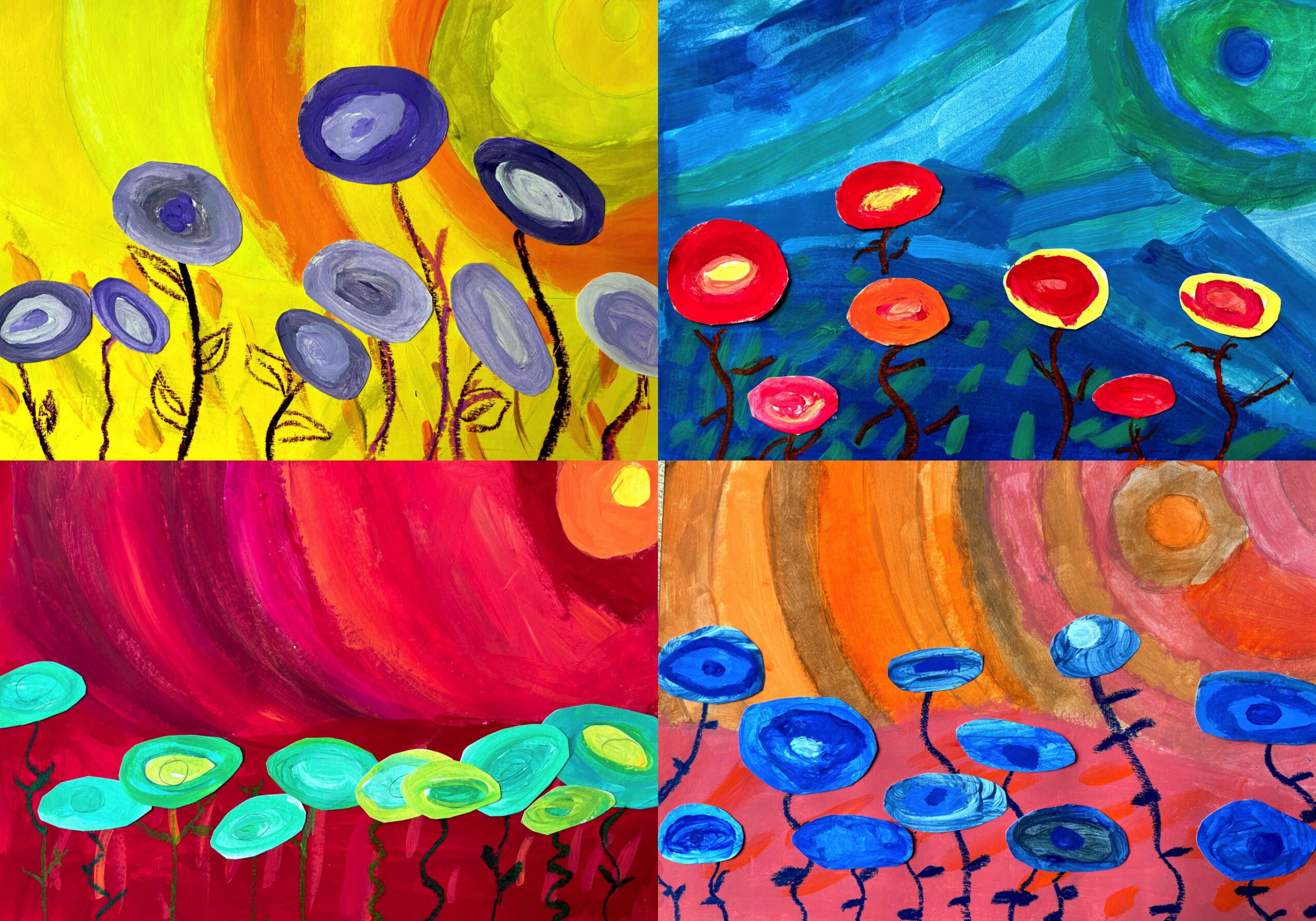
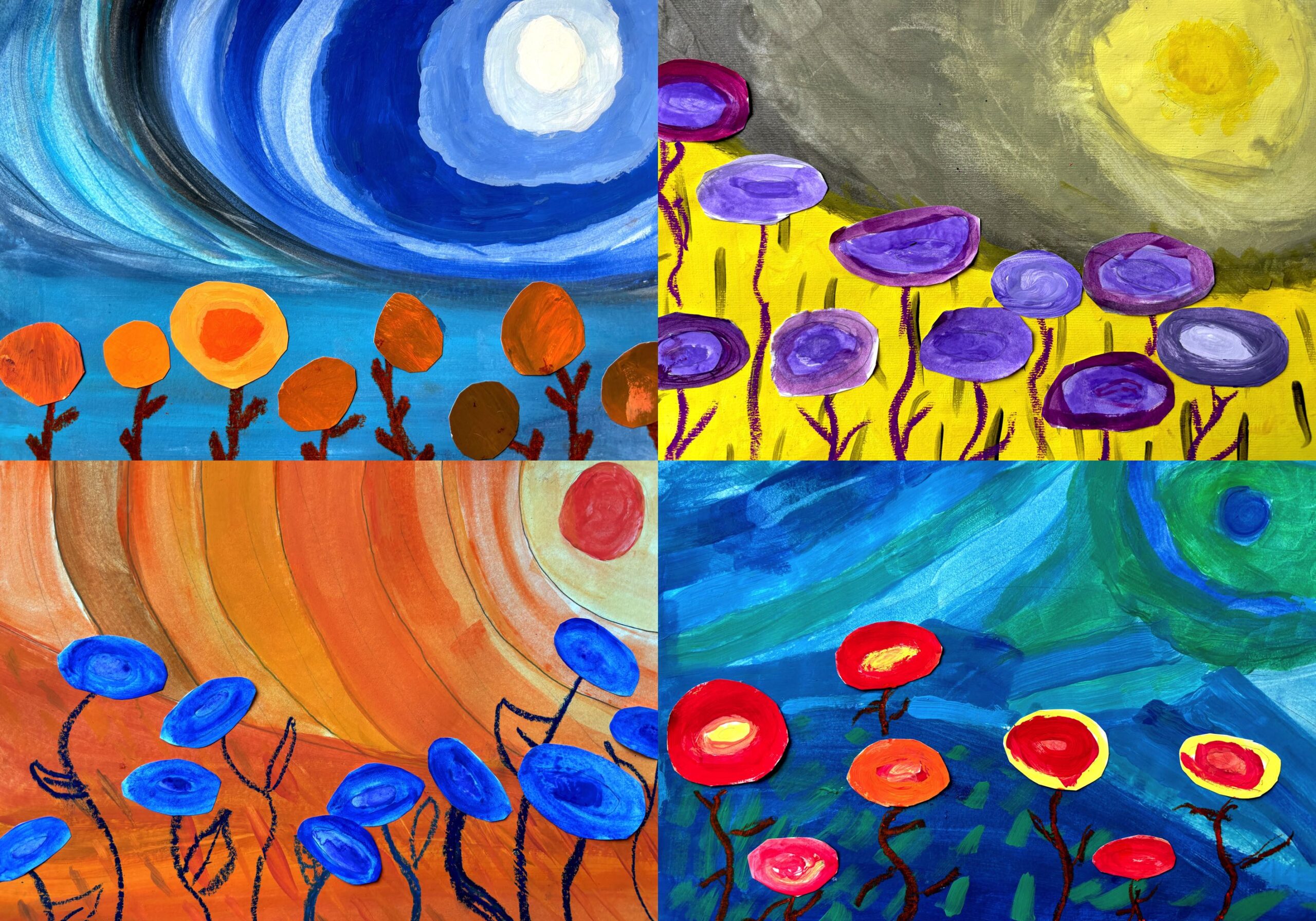
We created a painting work based on complementary colours: first of all each student chose the pair of complementary colors they preferred, and then we painted on two different sheets. On the first sheet we painted just the flowers, on the second sheet we painted the background. For this imaginary landscape we worked with flat and round paintbrushes of various sizes, the final effect must be very pictorial and material, so it is not a matter of precision but the search for the right range of colors.
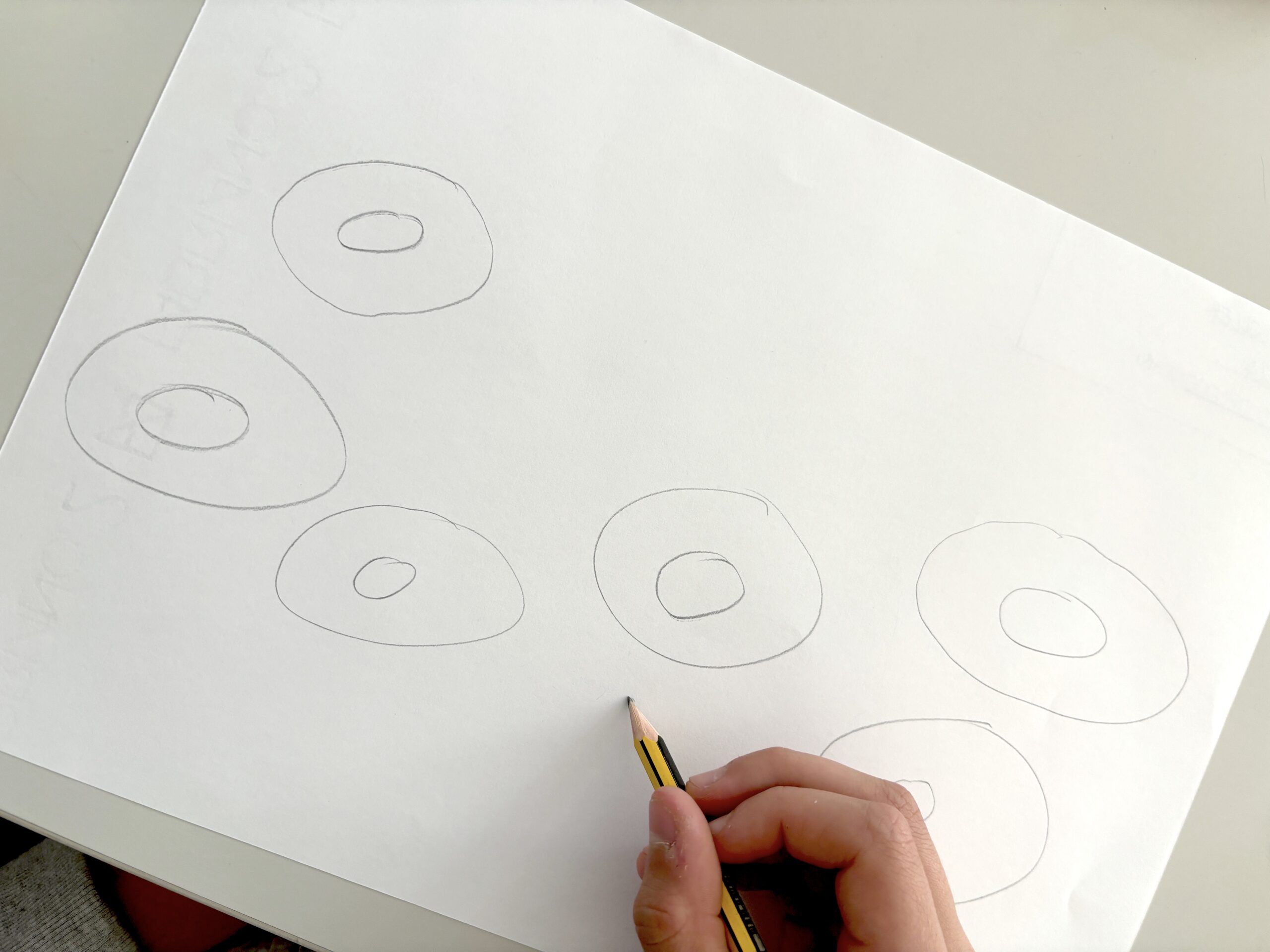
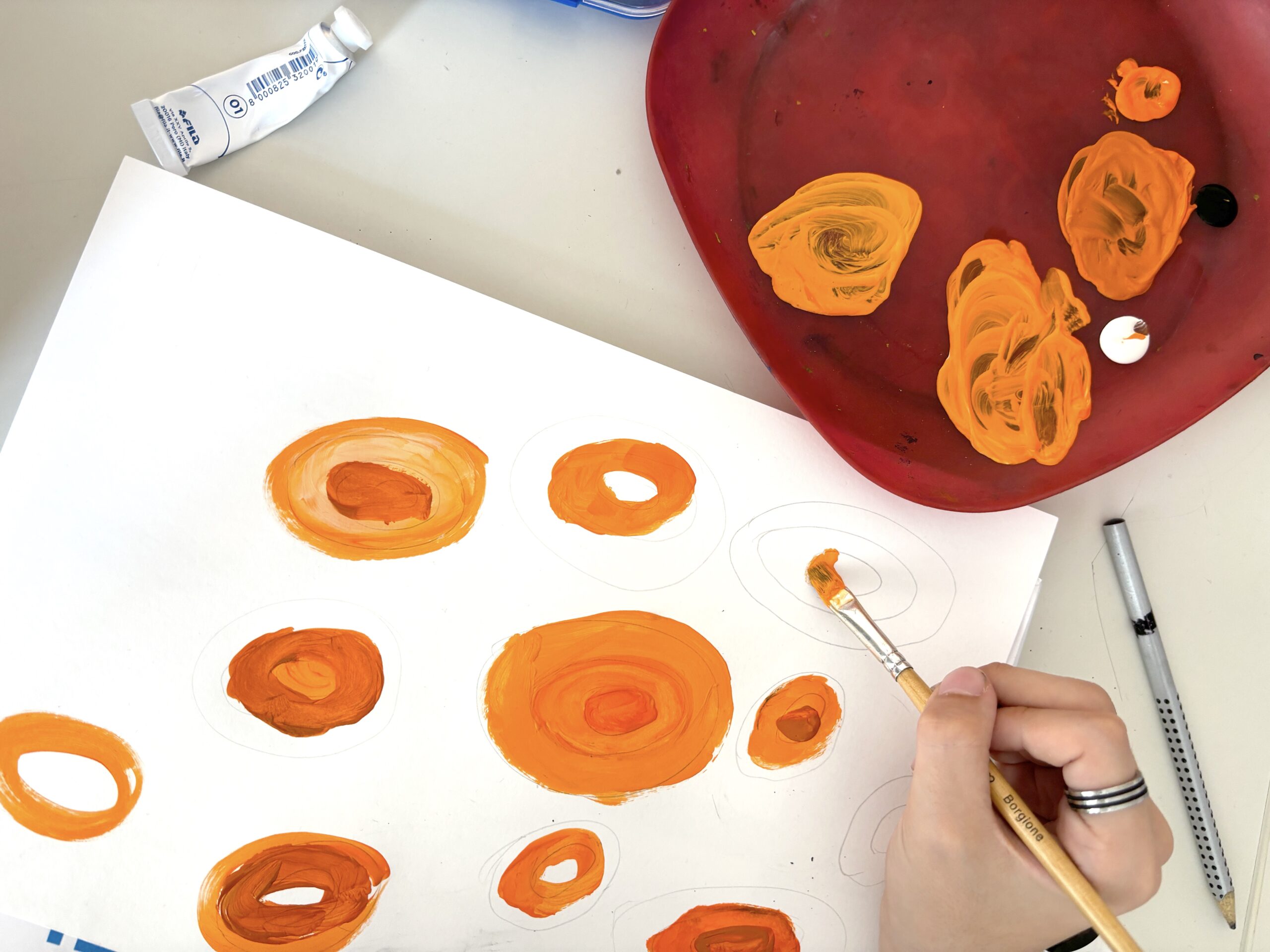
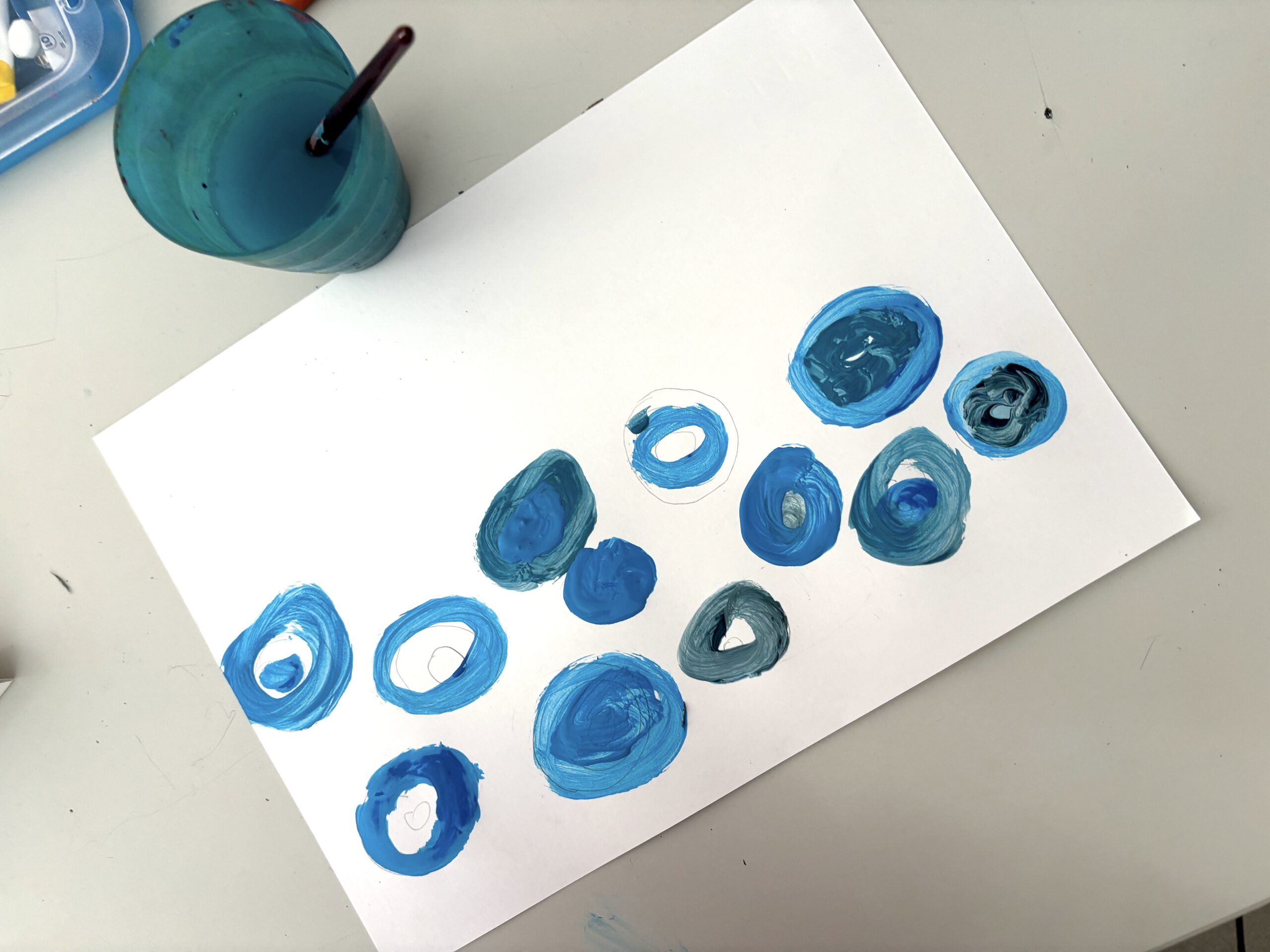
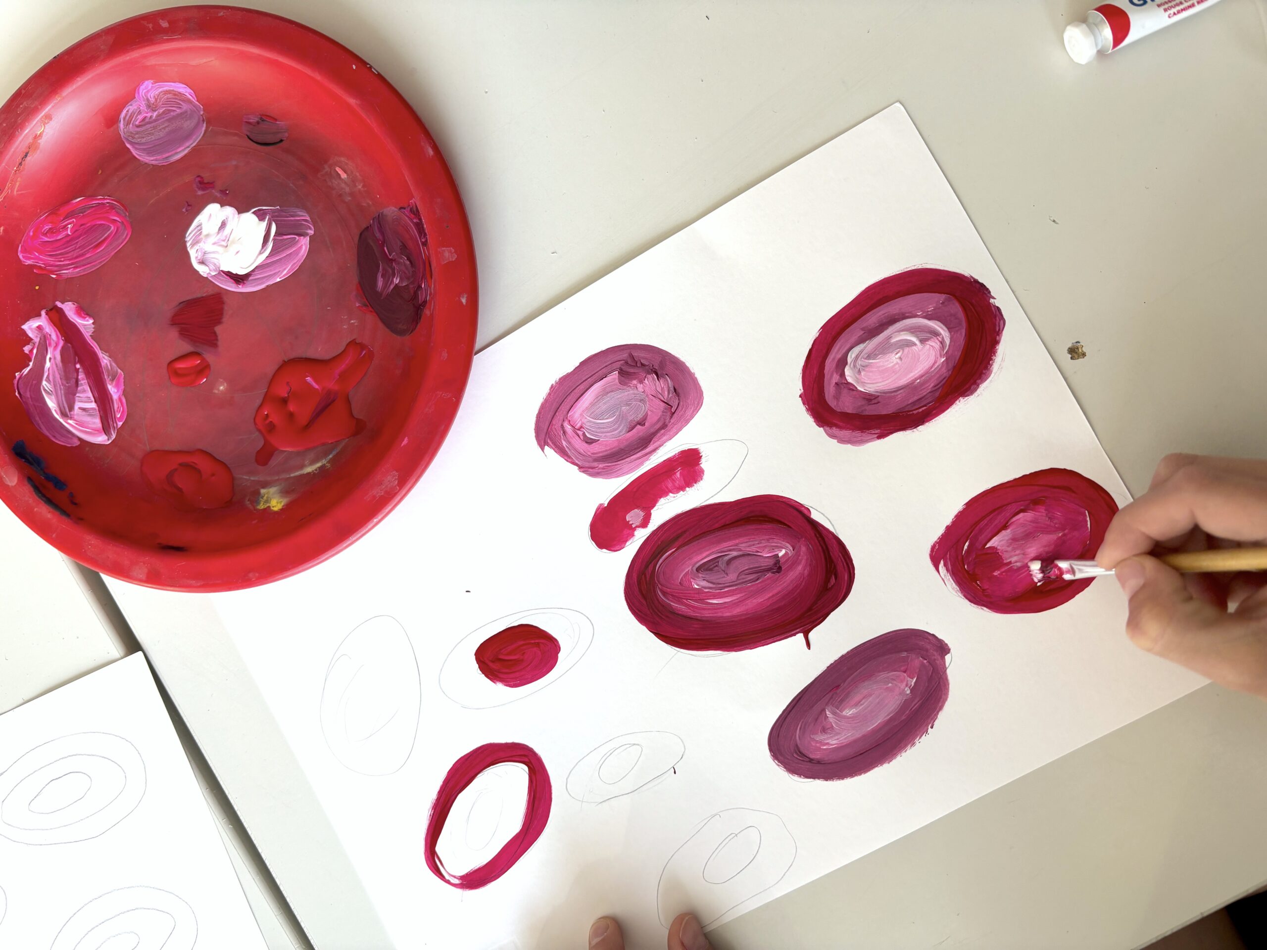
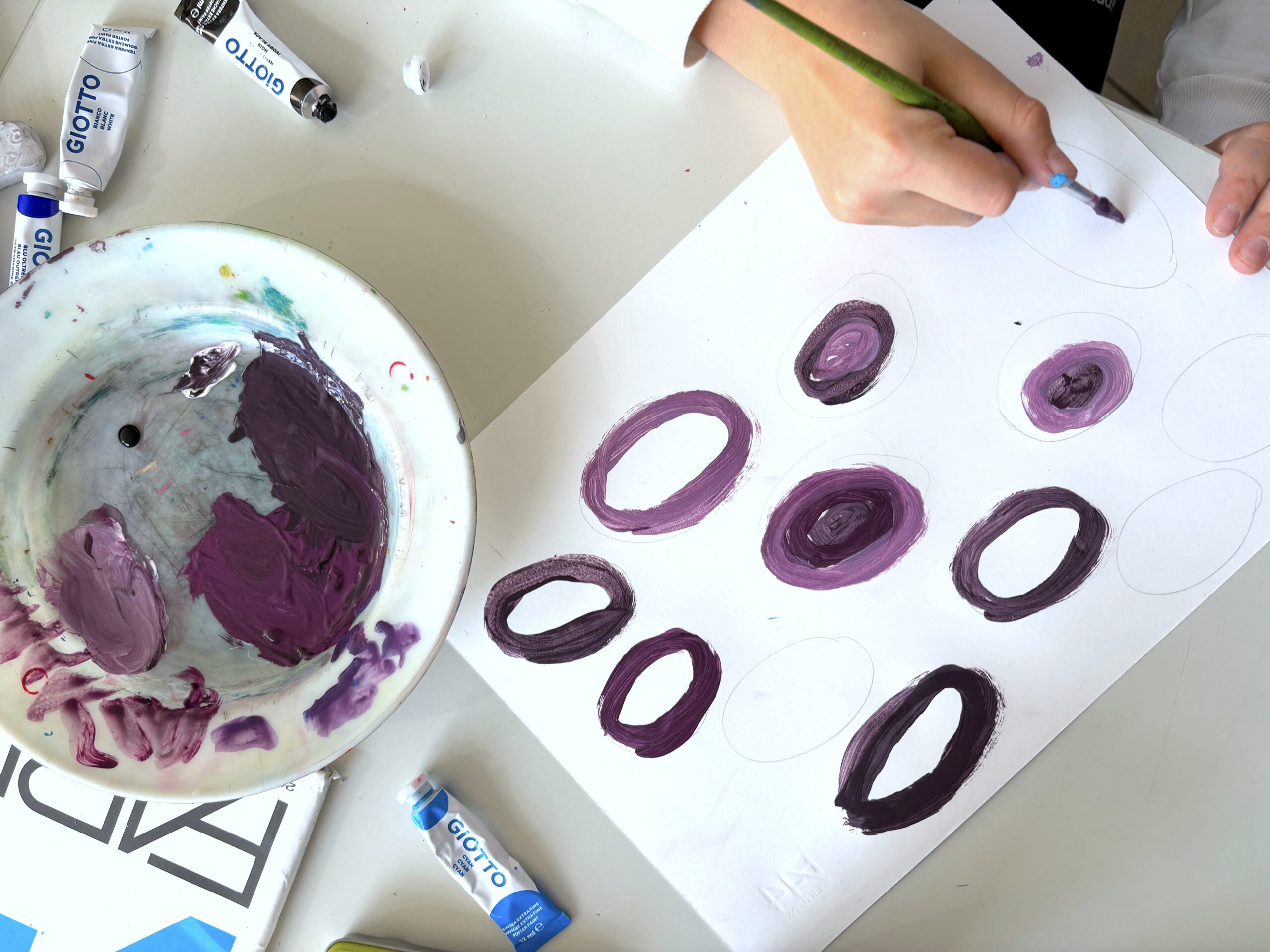
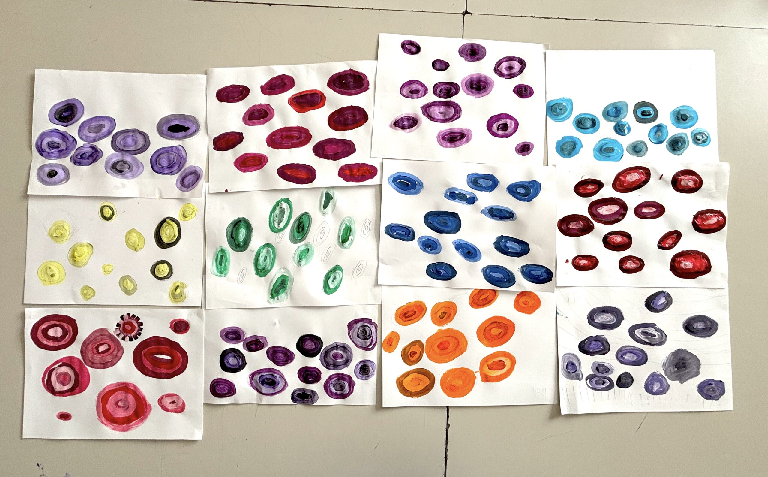
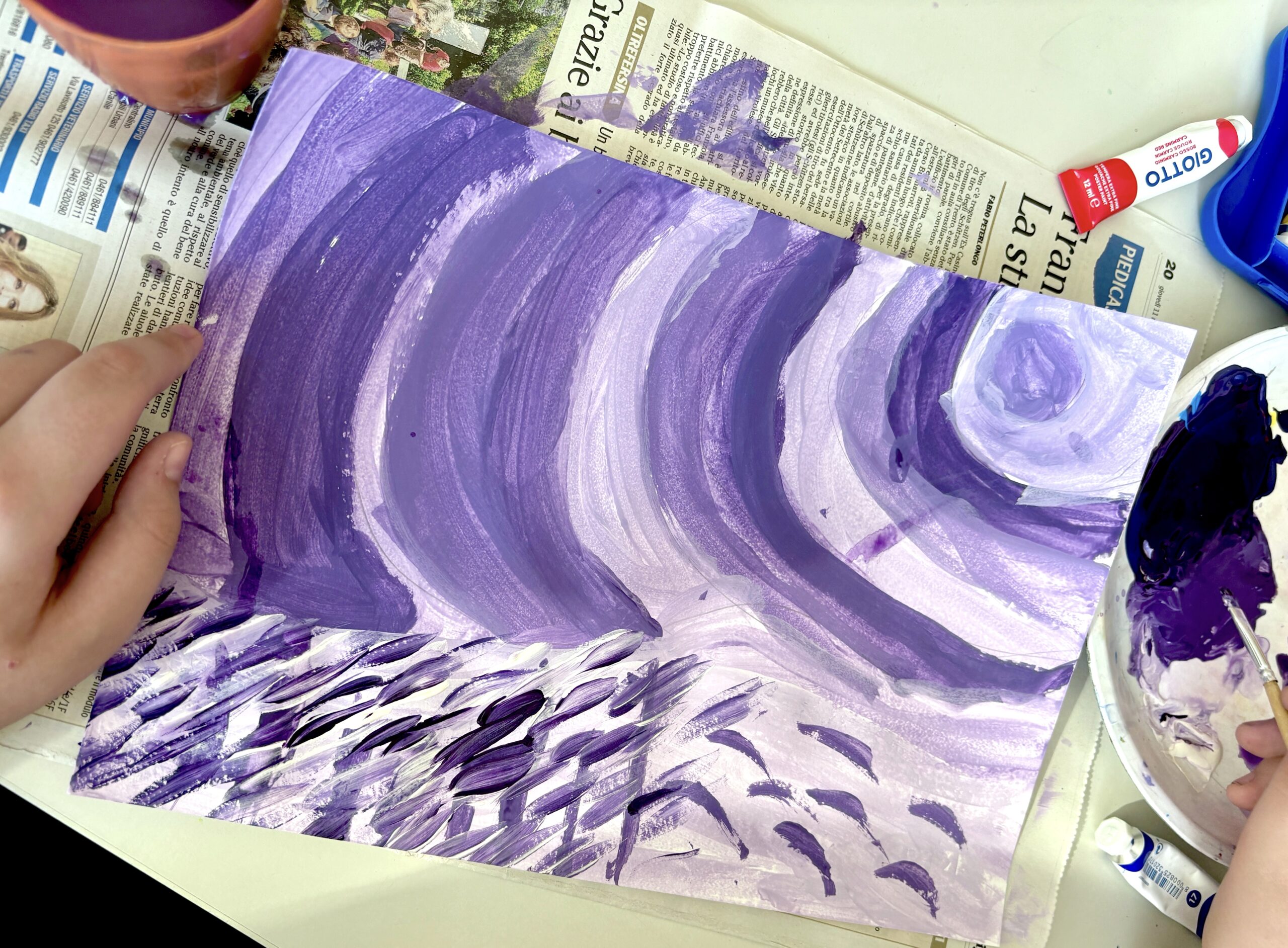
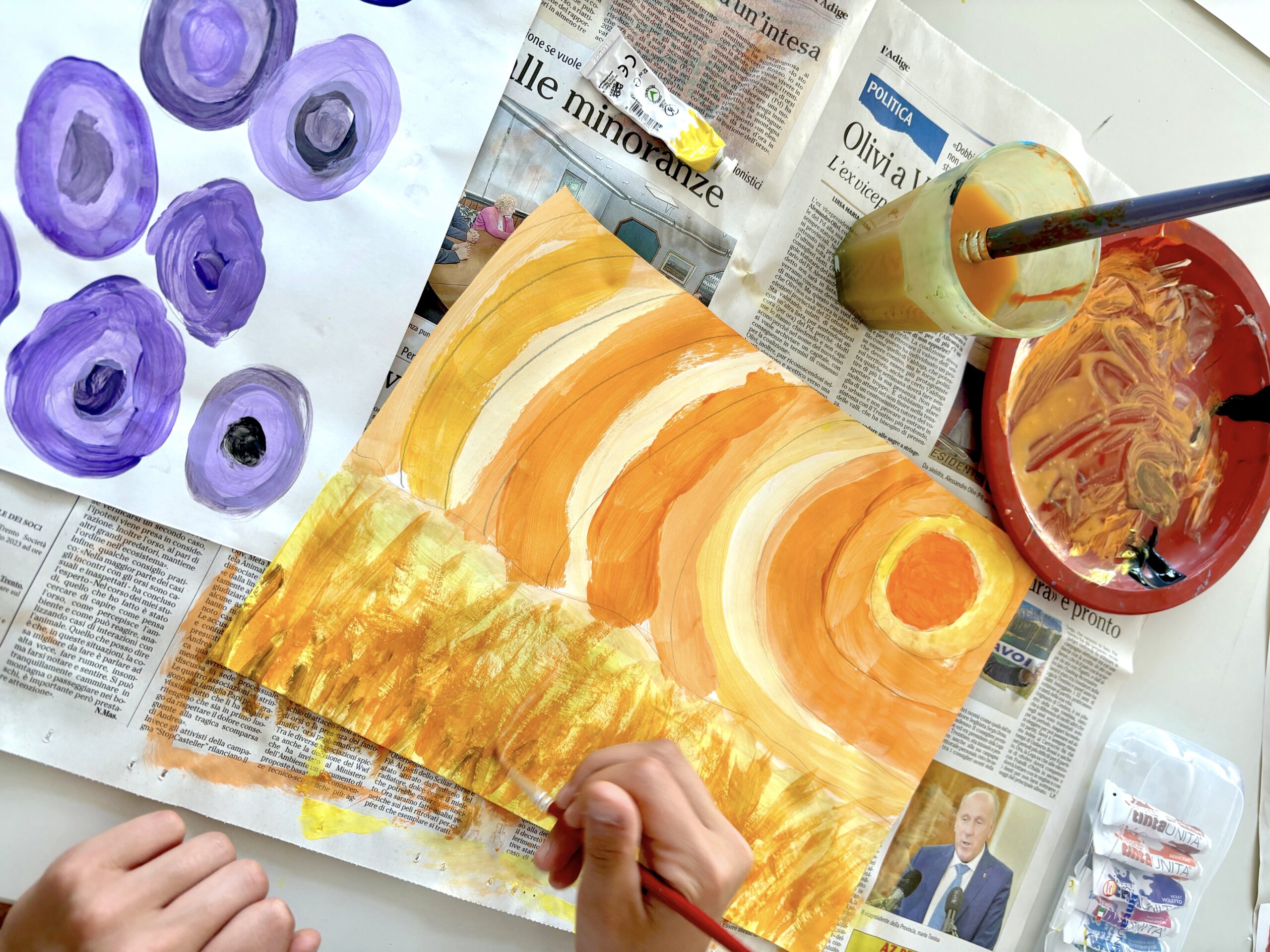
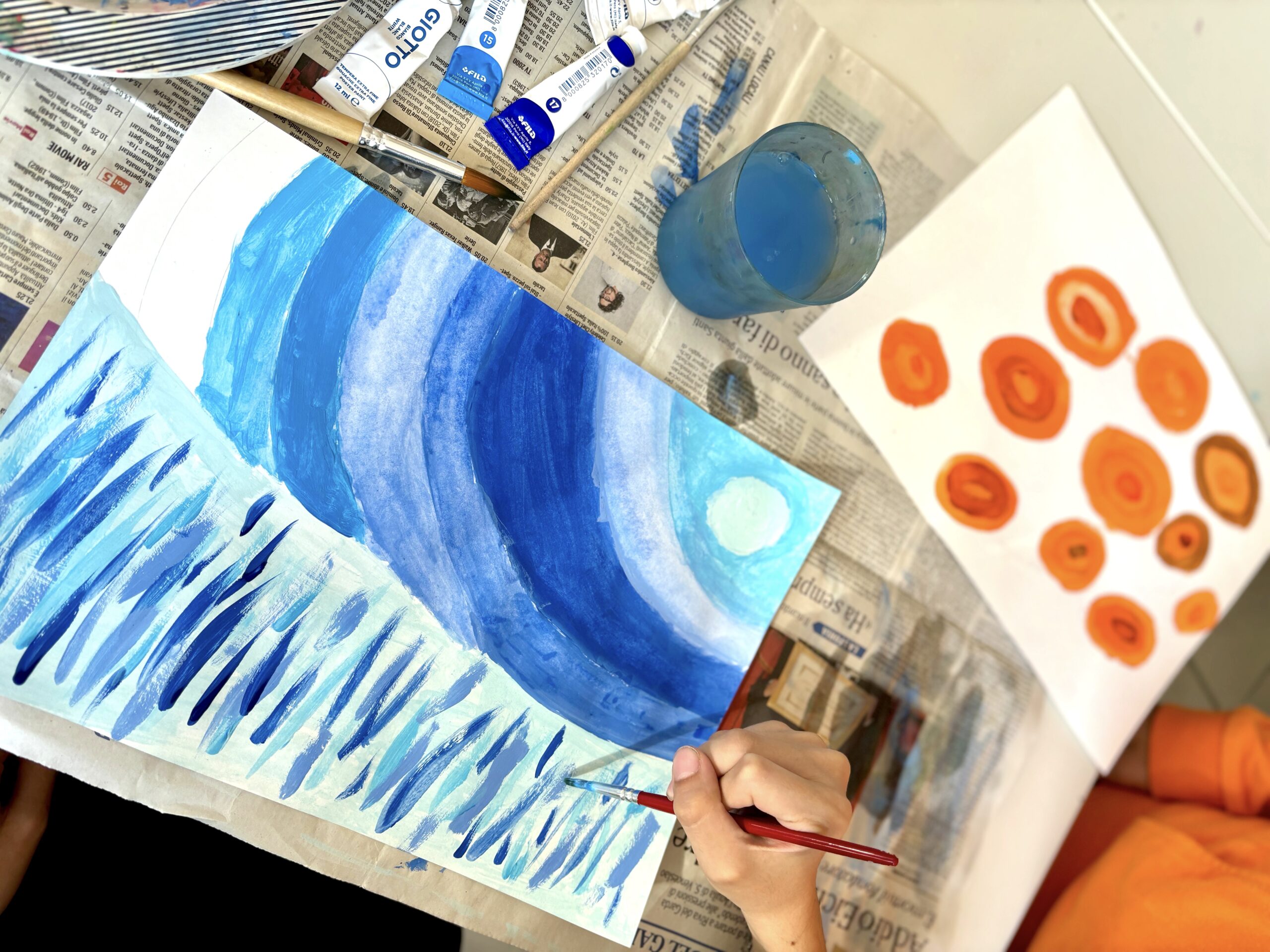
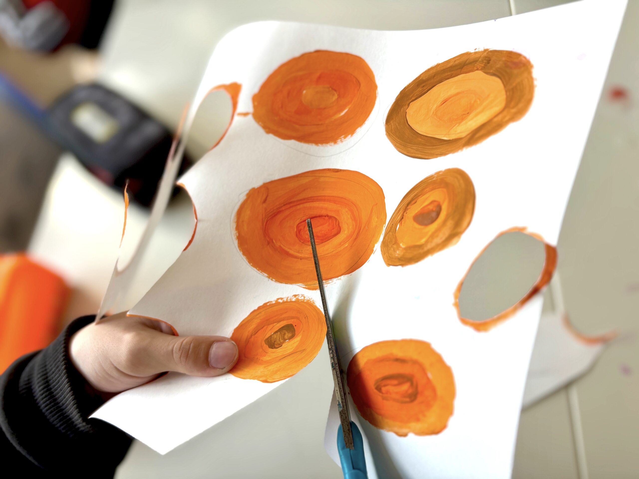
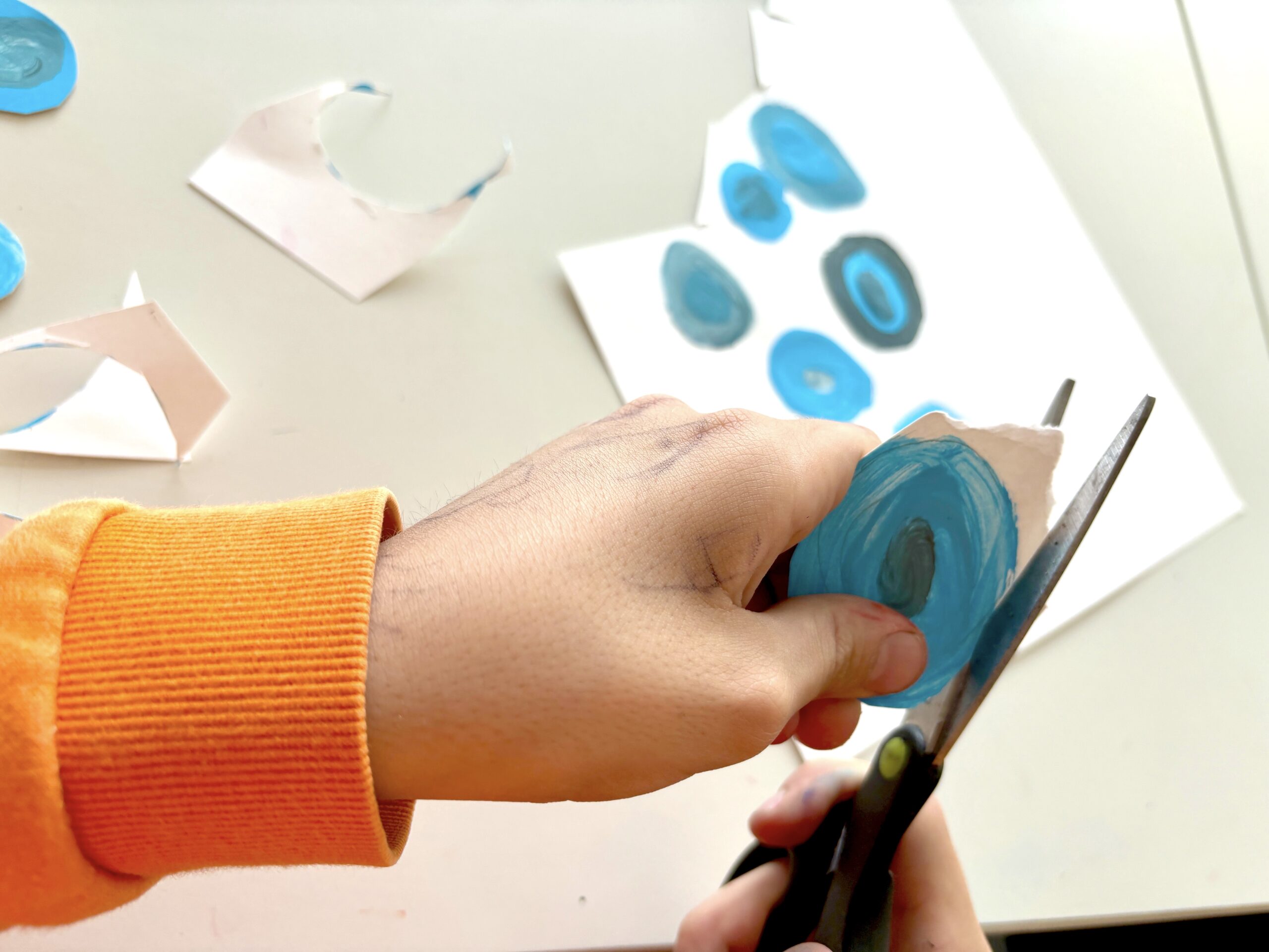
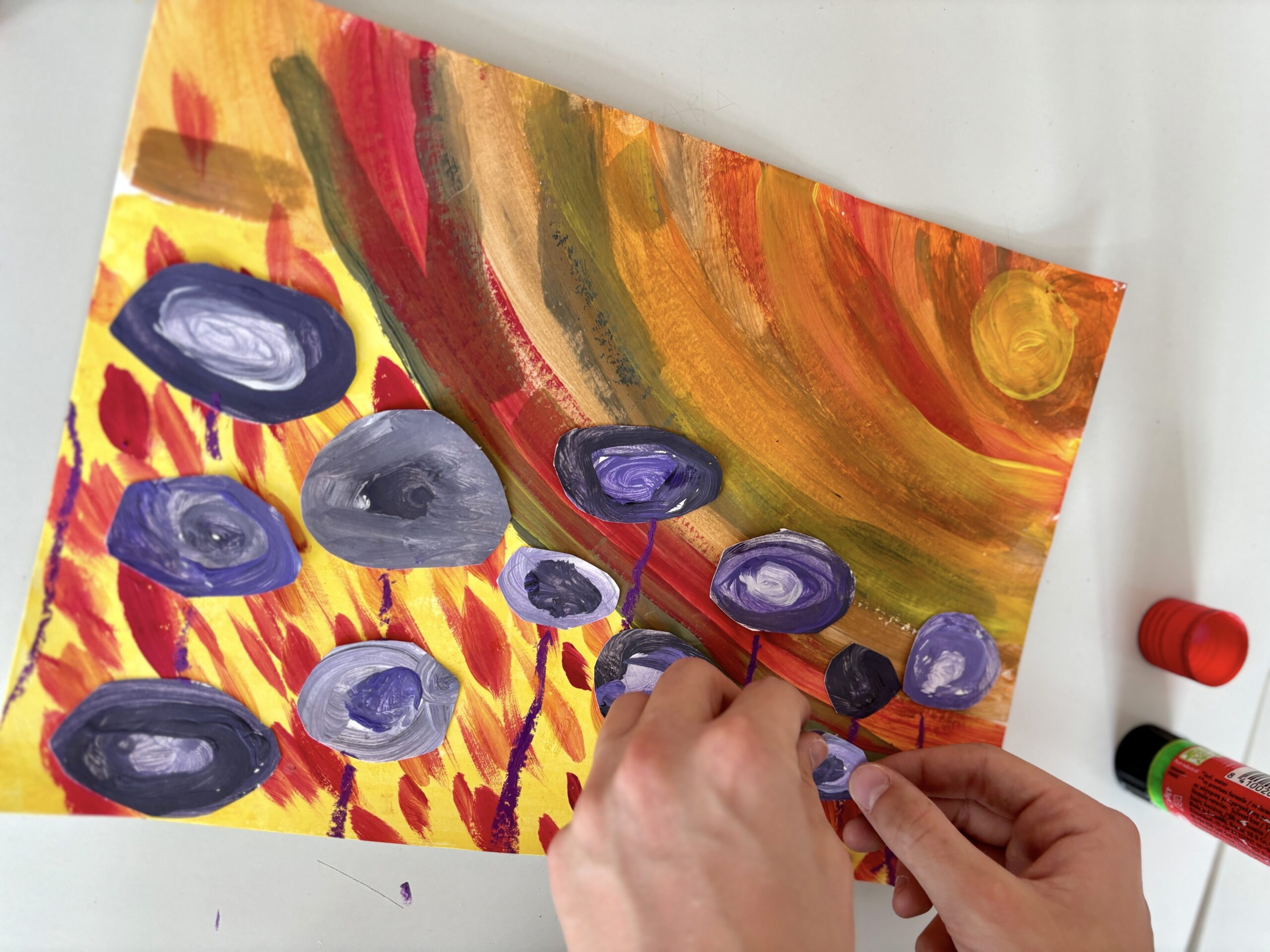
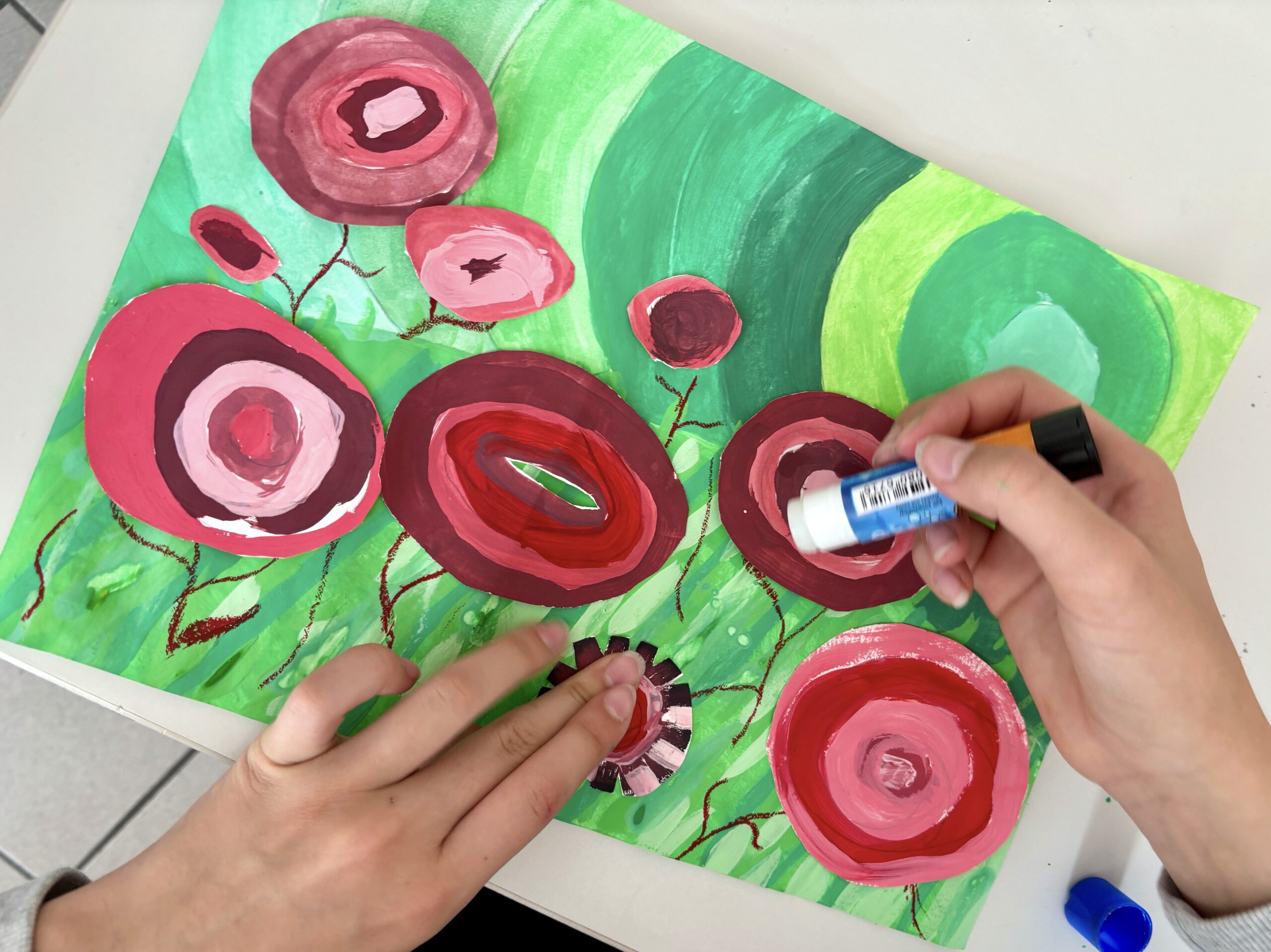
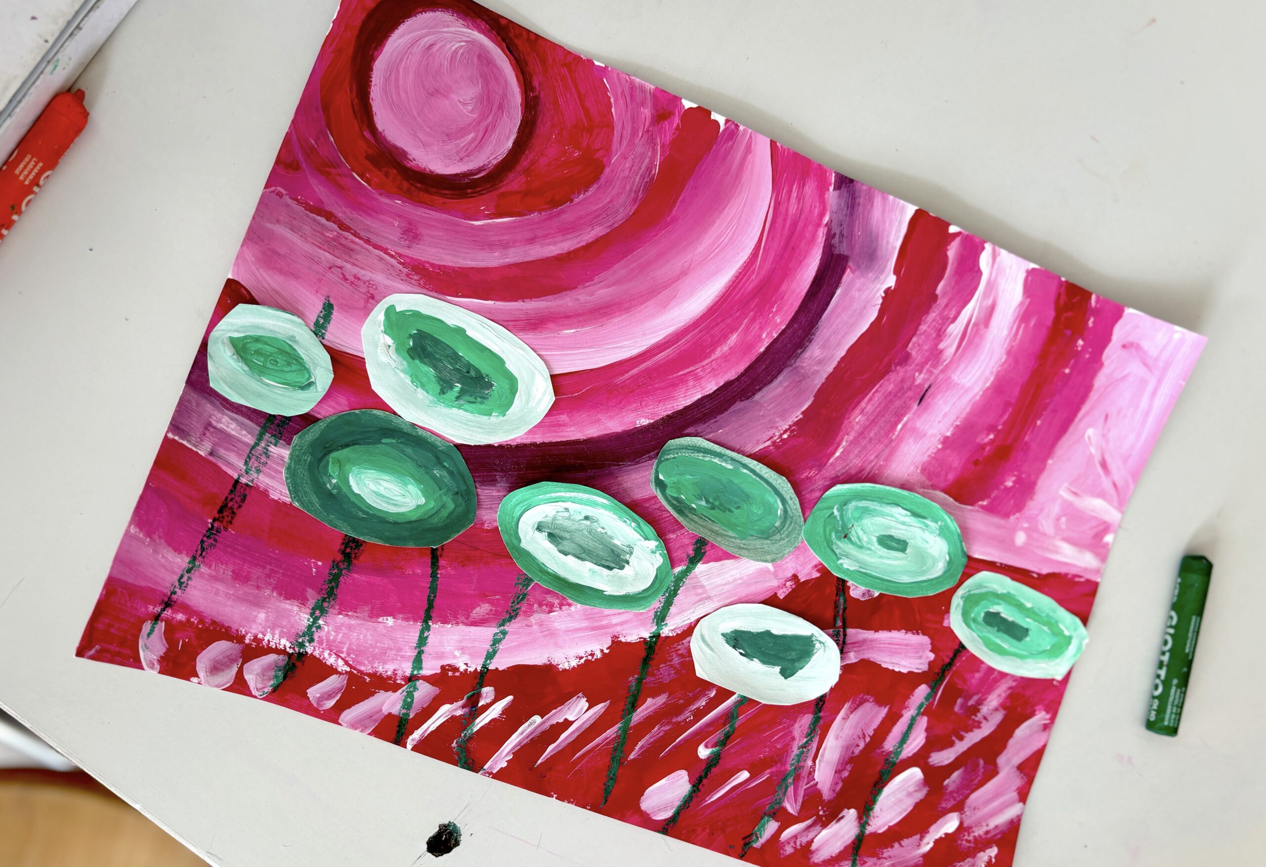
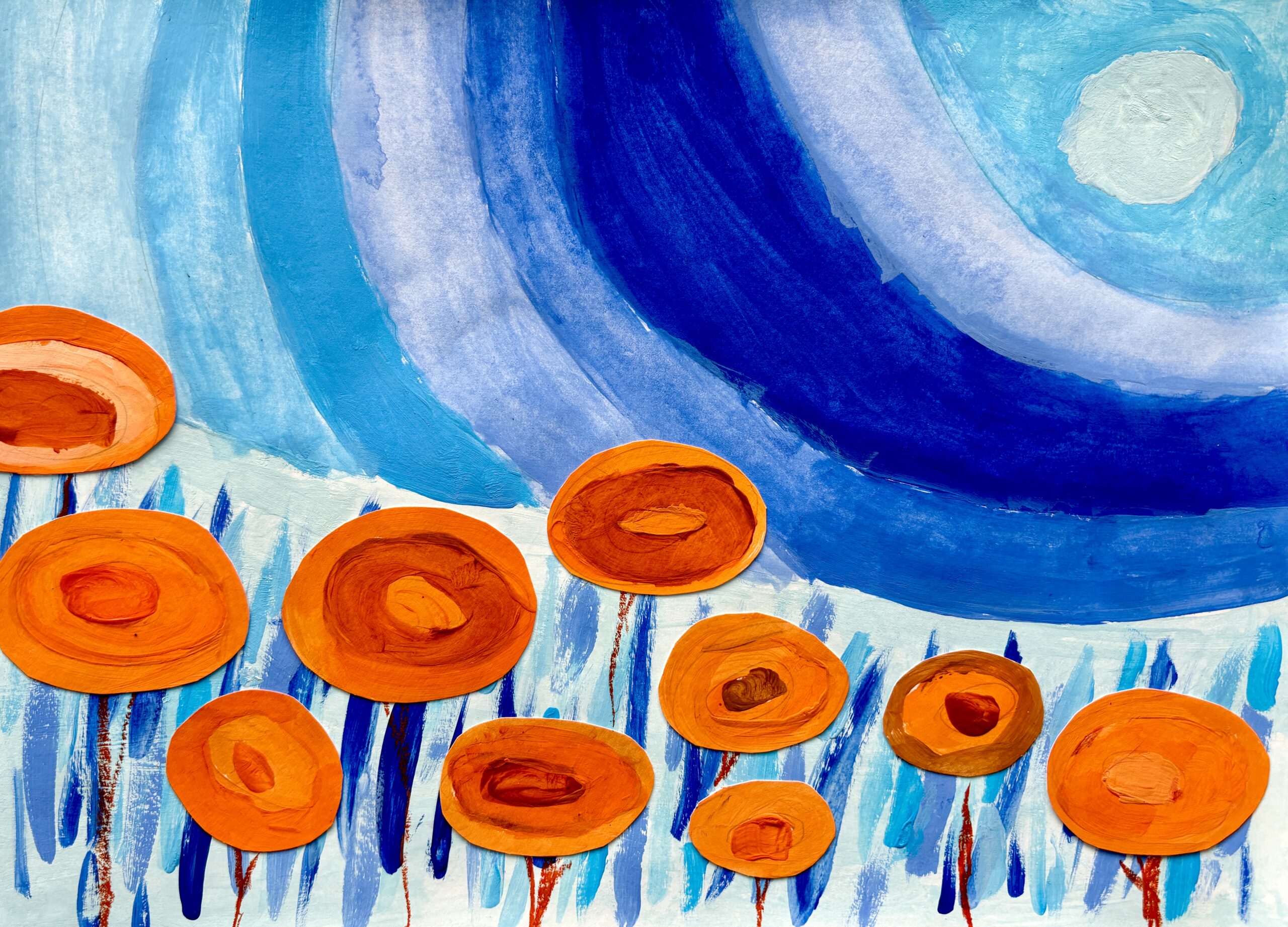
For each chosen color we created a palette of various shades of that color: darker, lighter, warmer or colder, in order to have a series of similar colors. First we painted 10-12 ovals with various shades of the chosen color in concentric bands. These ovals will be our flowers.
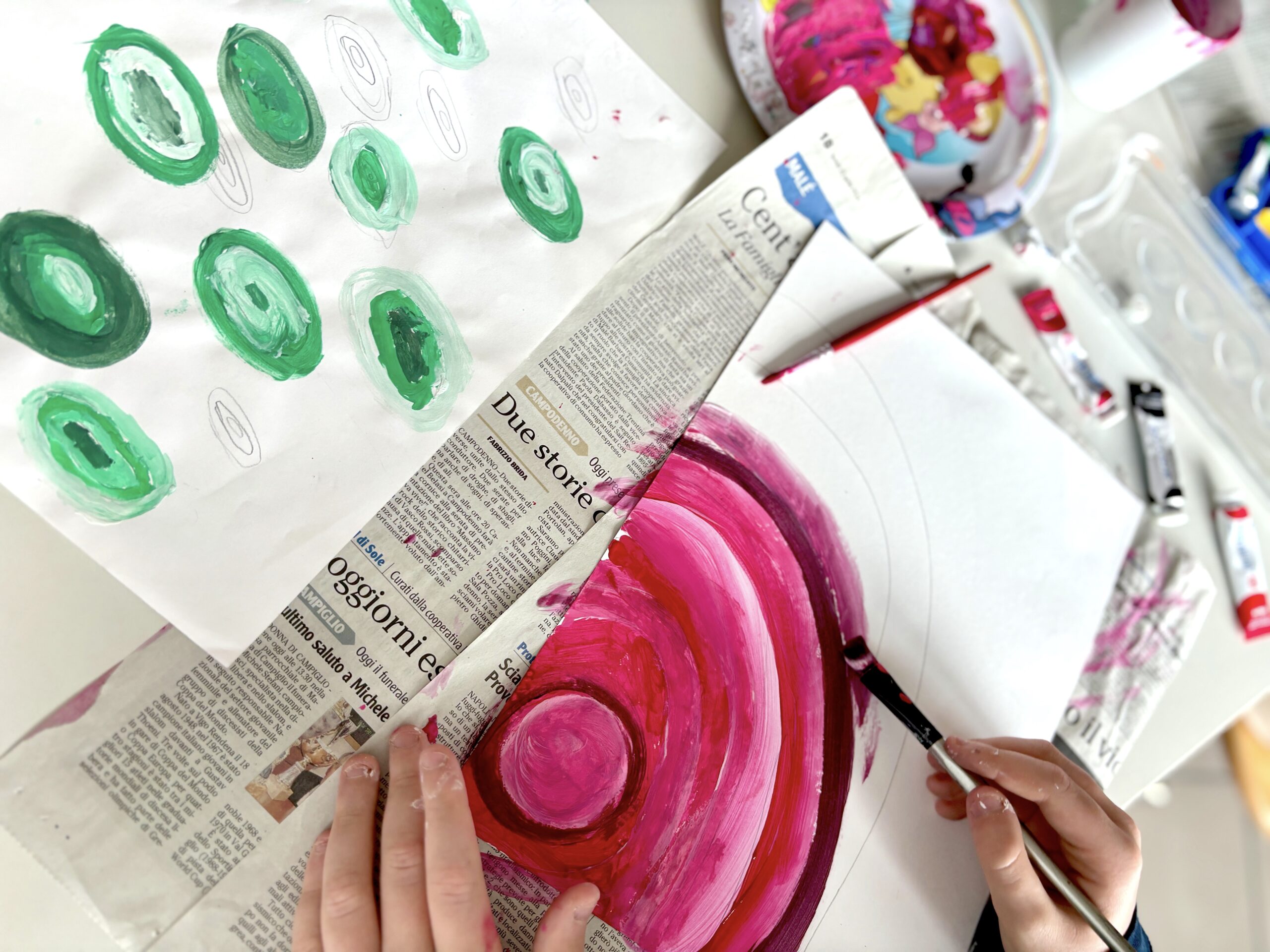
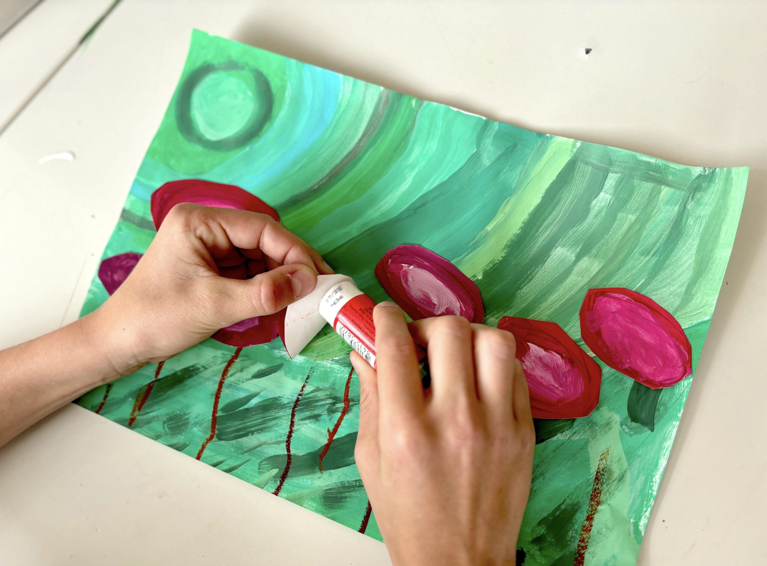
To create the background we roughly drew a sun surrounded by concentric circles, and a field underneath. We painted freely, in alternating colored bands.

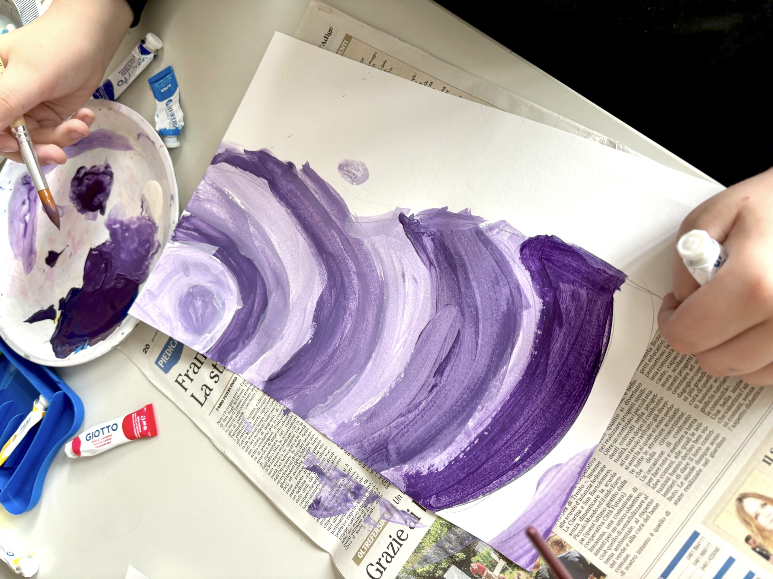
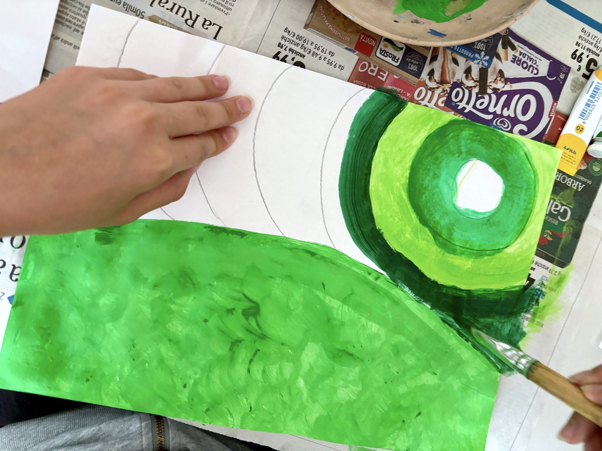
The field was colored in a solid color and then we painted some stems, like blades of grass, using always the various shades of the chosen color:
Subsequently, on the background of the flower field we drew the STEMS of the flowers with an OIL PASTEL of the same color as the flowers and we cut out and glued the ovals of the flowers:
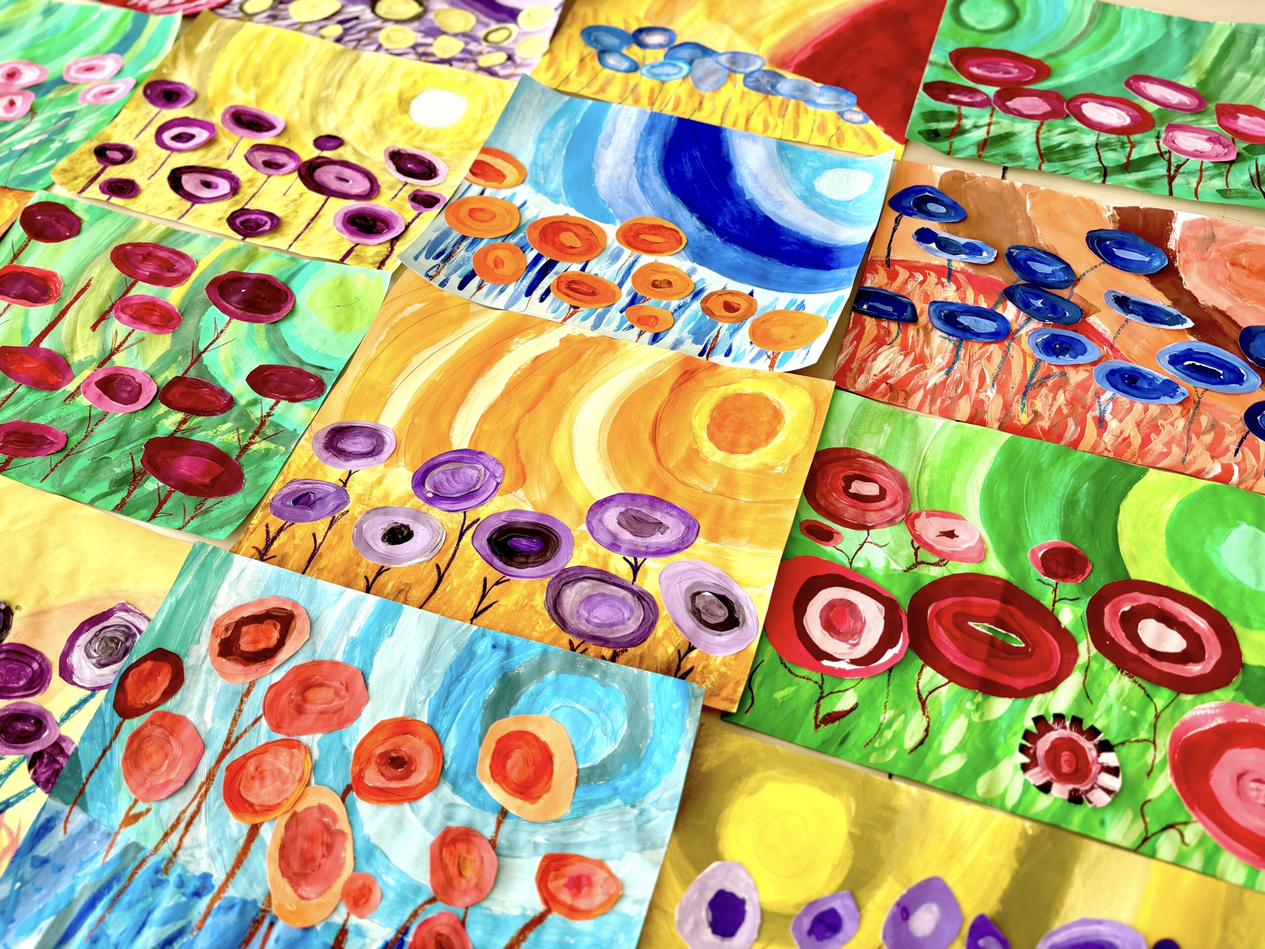
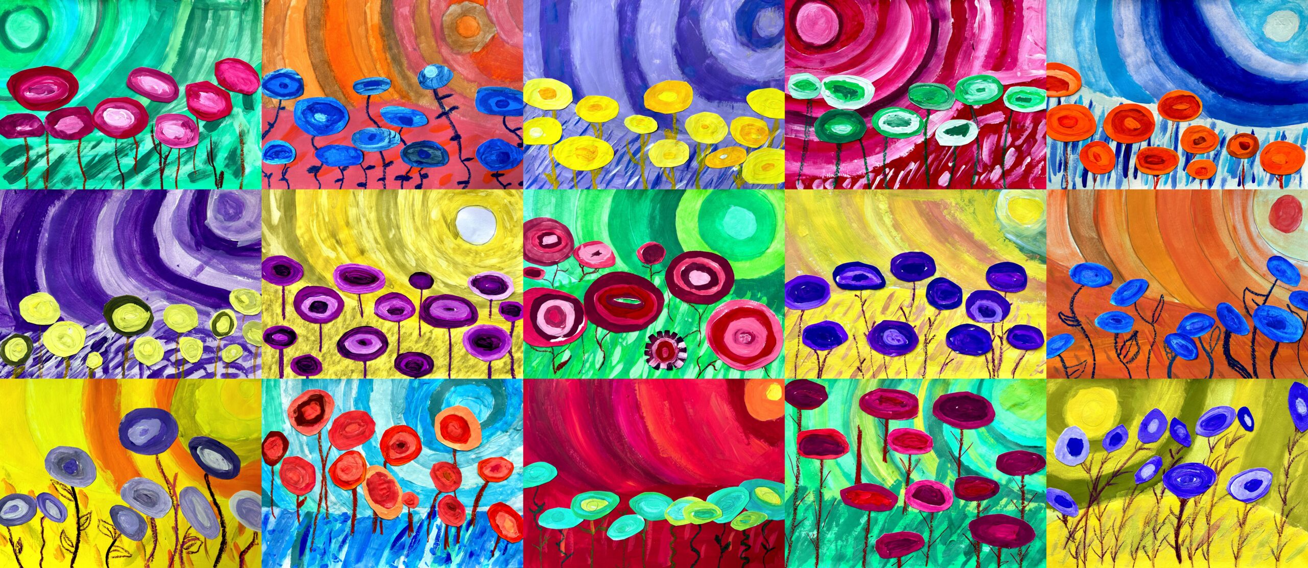
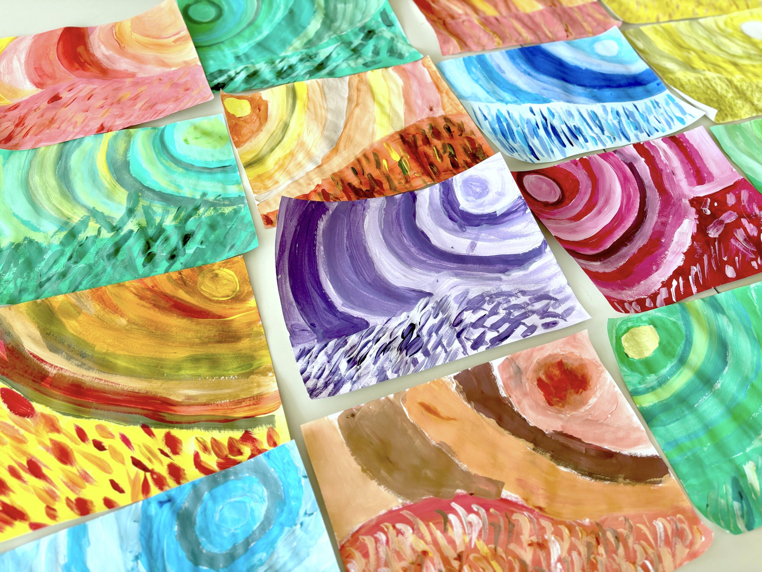
Here are our complementary colors flower fields, the paintings all together are an explosion of colors!