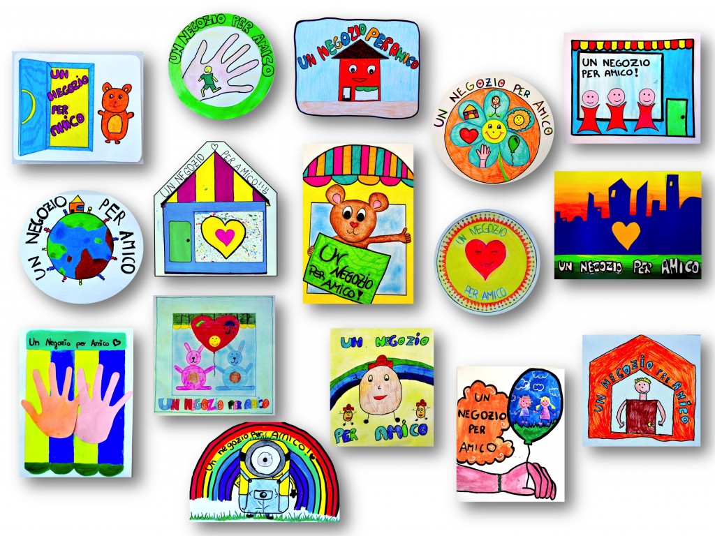
With all classes of seventh grade, we participated this year in a competition to design a logo entitled “A shop as Friend”. The project, proposed by our Valley Community Rotaliana-Konigsberg, aims to increase the safety of children in the path from school. The shops displaying this logo are willing to accept any child who needs information, shelter or aid.
First with the students, we tried to understand what is a LOGO and what features it should have. To achieve it we must follow some rules. The logo should:
• Being READABLE (few colors, simple shapes, clear written)
• Being RECOGNIZABLE and easily MEMORISABLE (simple and stylized, recognizable even if shrunken)
• Give a MESSAGE EFFECTIVE (make graphically an idea, for example: peace, help, sports, unity, music …)
• Meeting the requirements of CUSTOMER ( pictures and symbols show the aim that is targeted)
We then thought about what, our logo, would have to communicate and to whom it was addressed.
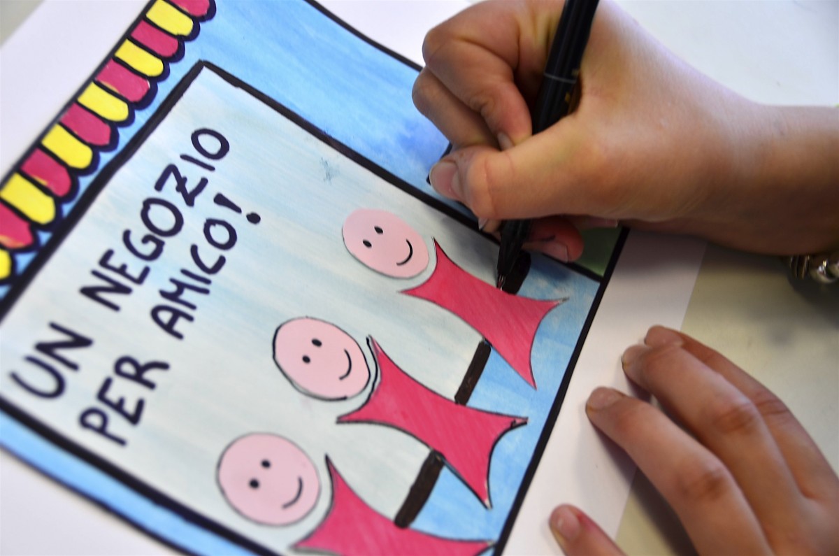
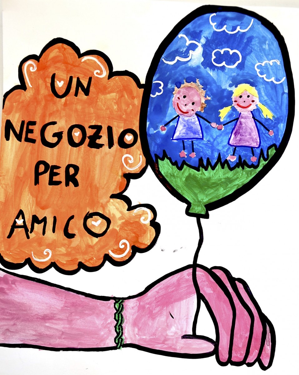
We worked in groups of two or three students, sharing ideas and making quick sketches. Then we moved to the realization with the artistic techniques most suitable. Once we have finished the drawings, these were presented to a commission that evaluated the work and chose the logo-round winner of the competition.
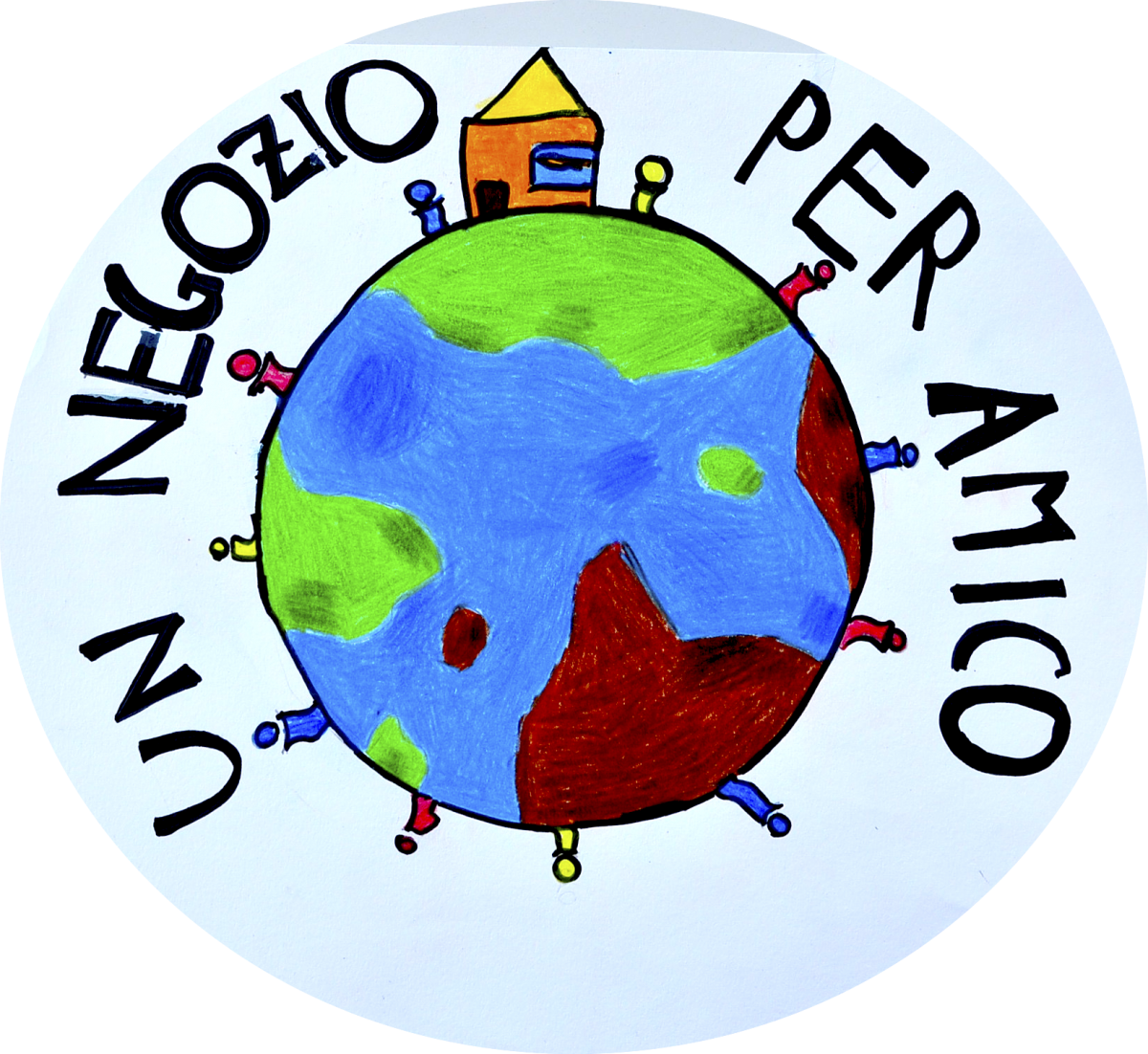
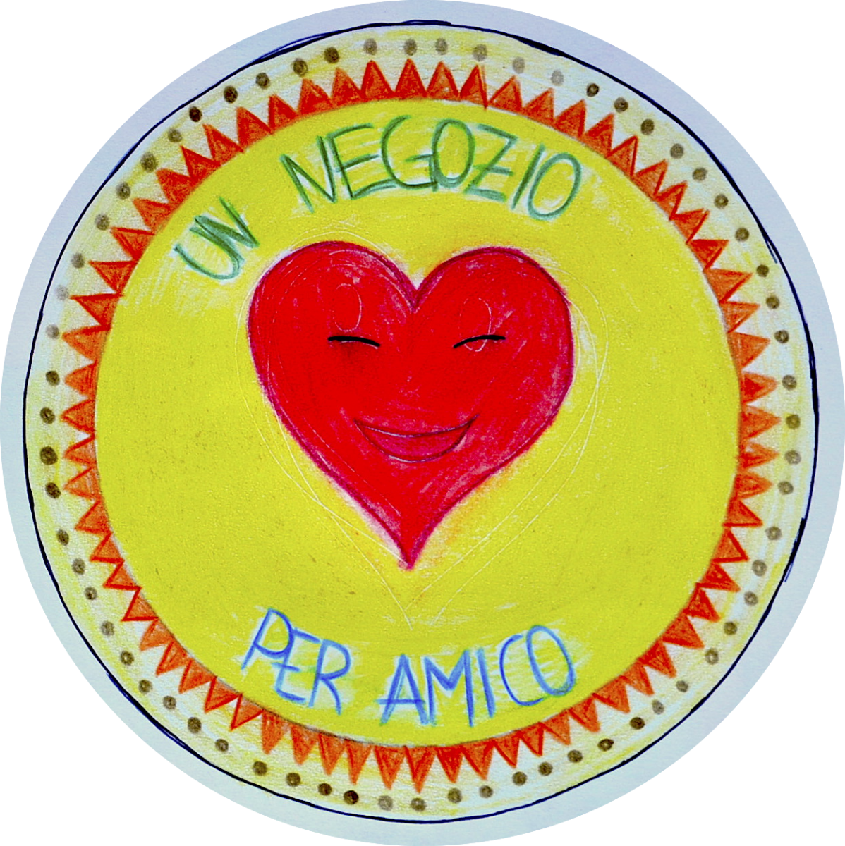
Here are some phases of the work, from the first sketches to finished drawings. Which logo do you think has won the competition?