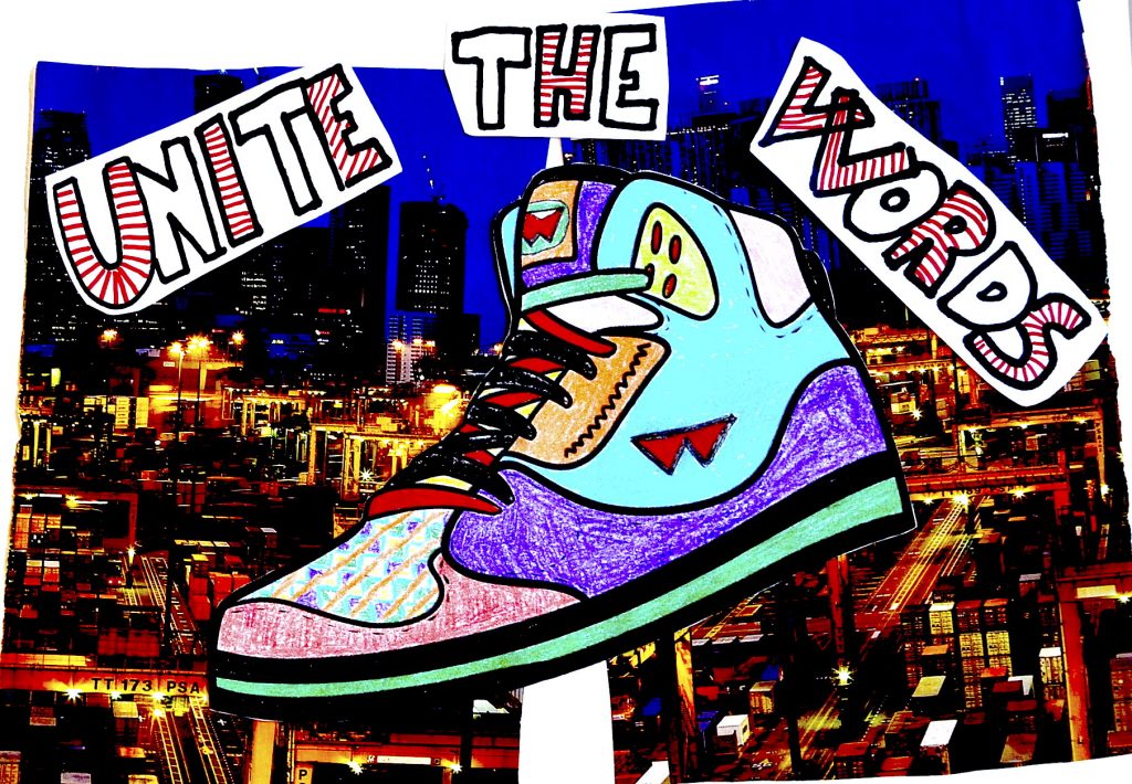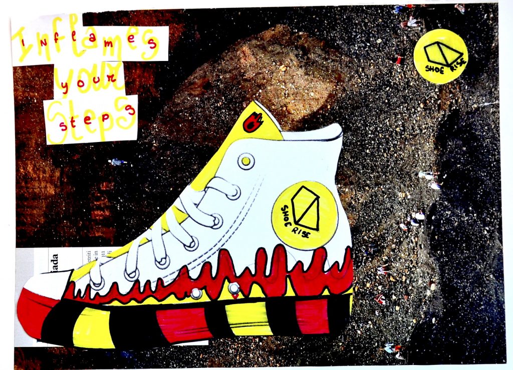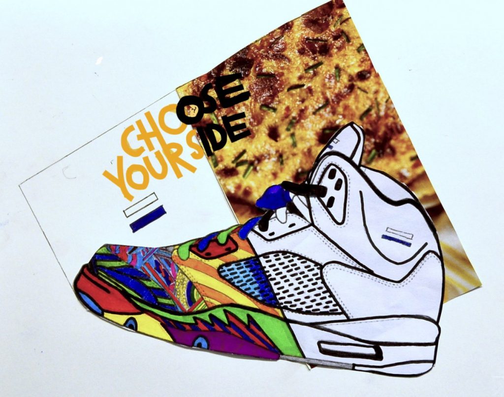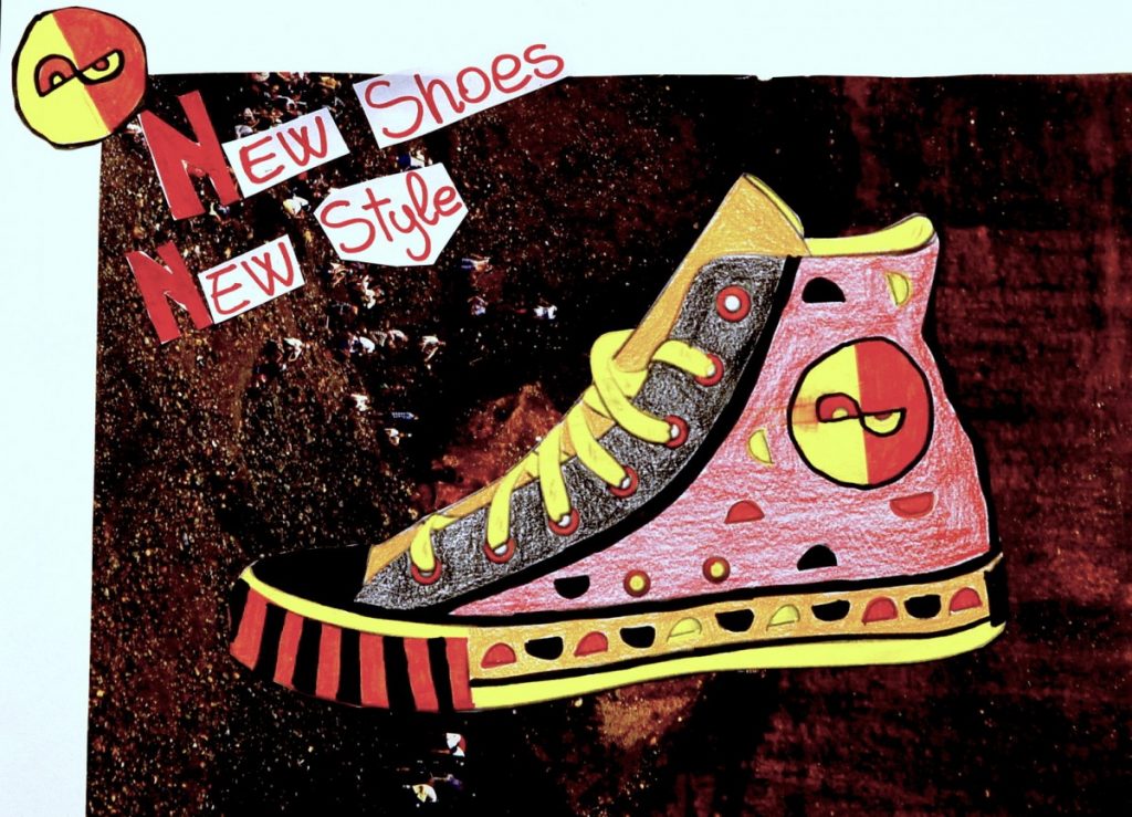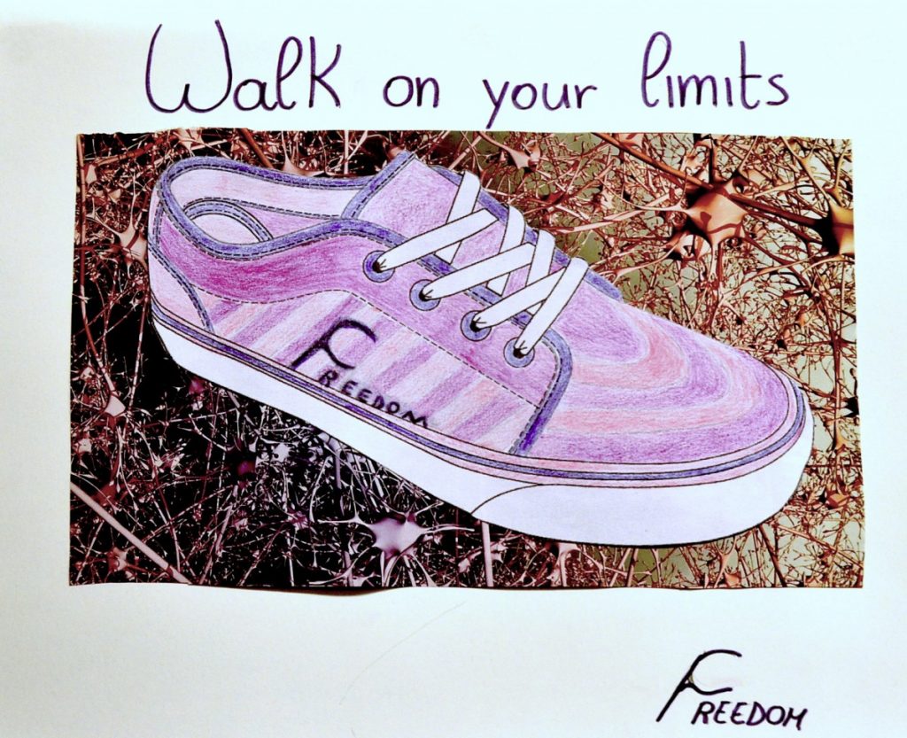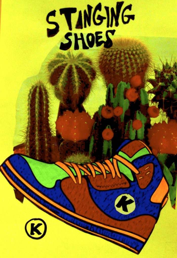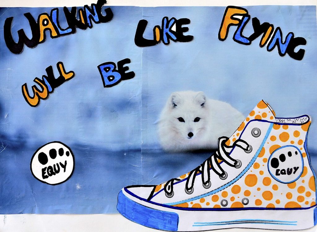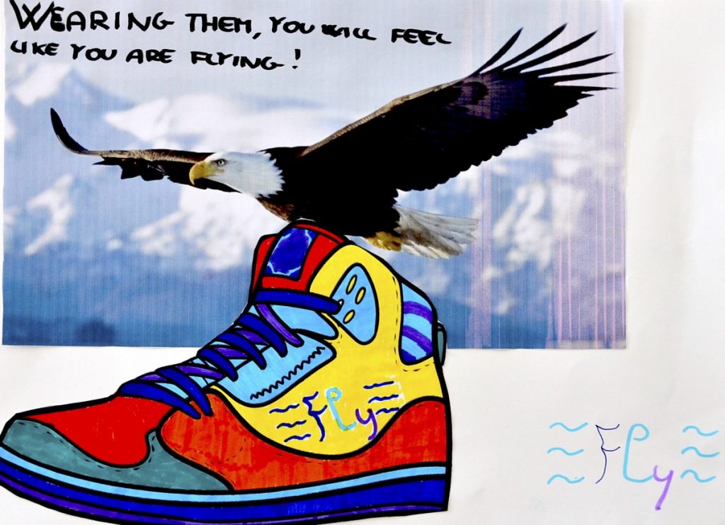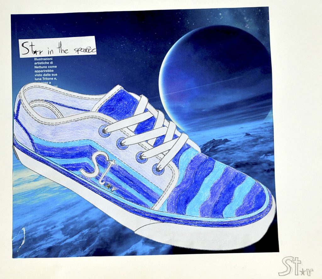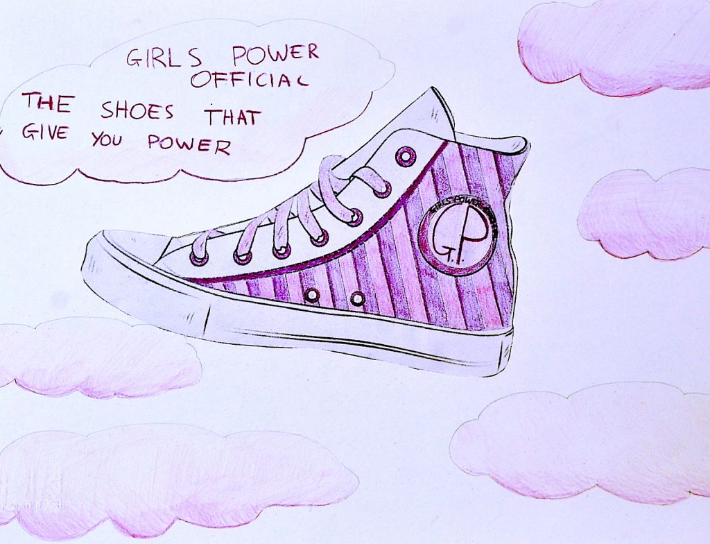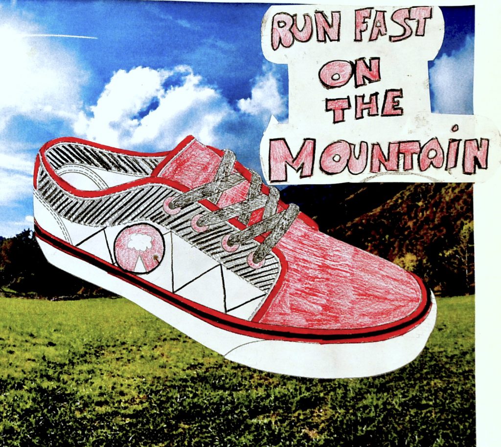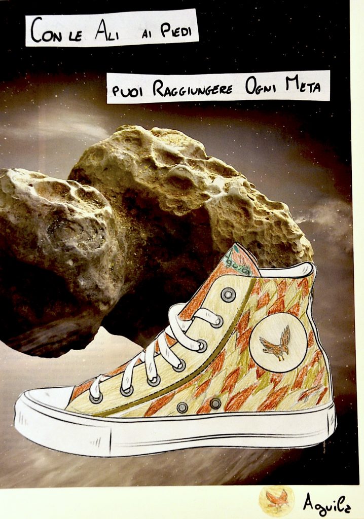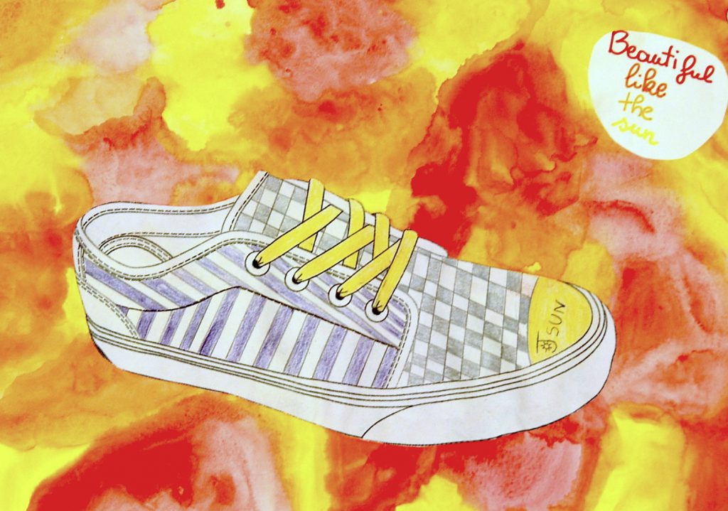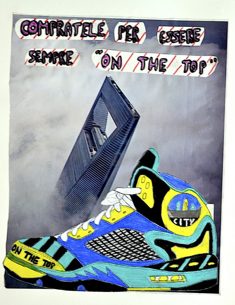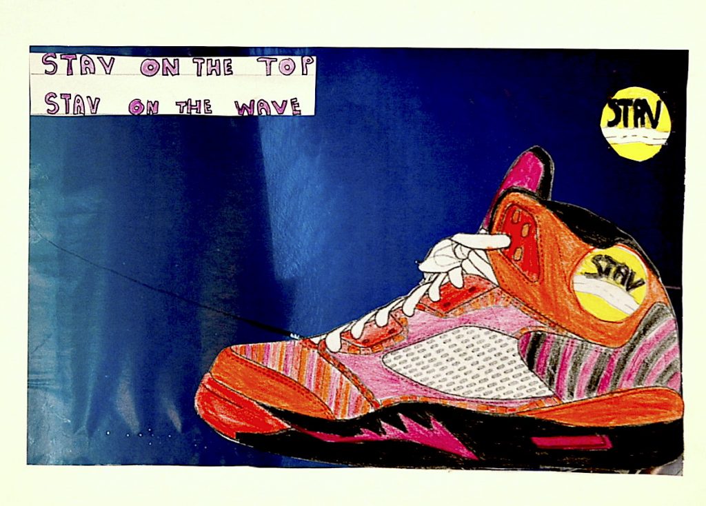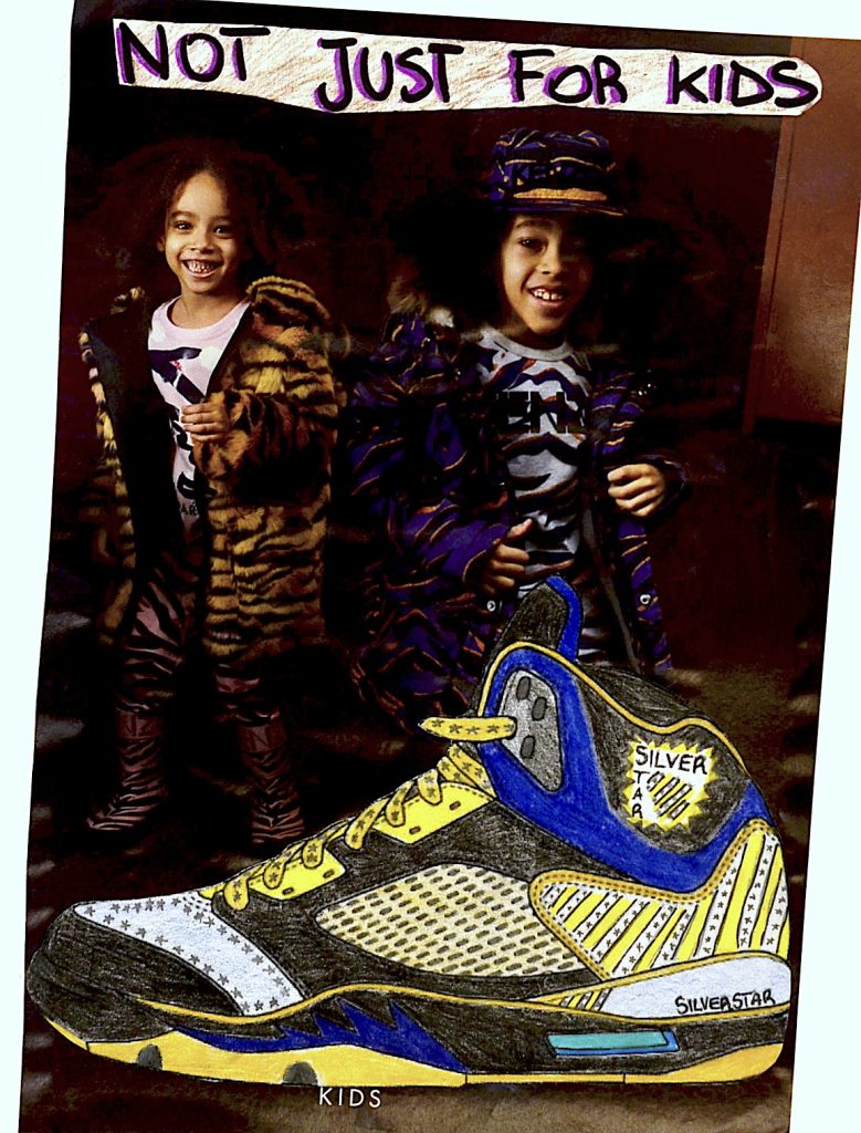
With 8th grade students, I did an interesting lesson about the print advertisement and its rules. The idea comes from my colleague Luigi Santibacci, an extraordinary art teacher and designer with whom I am fortunate to work.
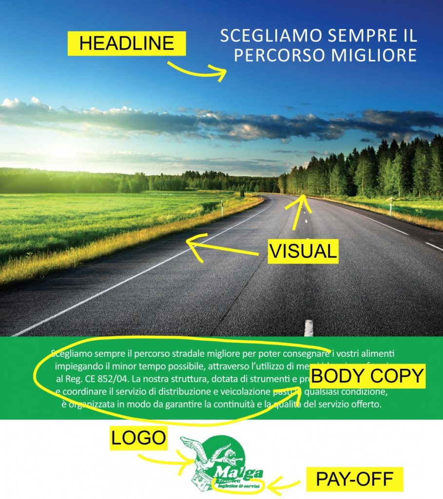
With students, we observed the layout of many advertisements in different magazines and studied the fundamental elements of an advertising page. We analyzed the 5 main elements of print ads: headline, visual, body-copy, logo and pay-off.
HEADLINE: The ad title offers a short, snappy preview of what the reader will find in the copy. Your headline explains to the reader the key benefit or offer you are providing. In general, headlines are the largest part of the advertisement. A good headline keeps a potential customer reading; a weak headline and the customer turns the page.
VISUAL: a print ad includes one or two striking pictures that illustrate your offer. If you are offering a free product, your ad should include an attractive photo of the product. If you are highlighting a hot new product or sale, your image should be of that hot new product. If possible, run your images in color to draw in readers.
BODY-COPY: The body of your ad includes details about your offer, details about your store or product and any other information you want to highlight. Keep your body text short and easy-to read. Use bullet points or subheadings to break up the text. Readers want to get the information they need as quickly as possible.
LOGO: the signature, or logotype (logo) is the distinctive identification symbol for a business.
PAY-OFF: it’s a catch phrase or small group of words that are combined in a special way to identify a product or company. It may support a firm’s signature/logo.
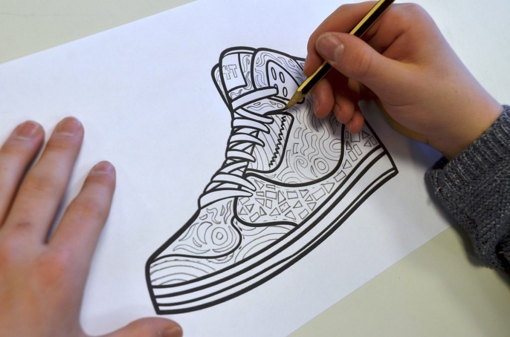
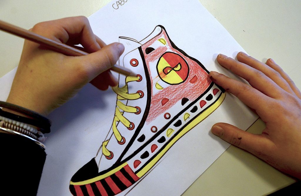
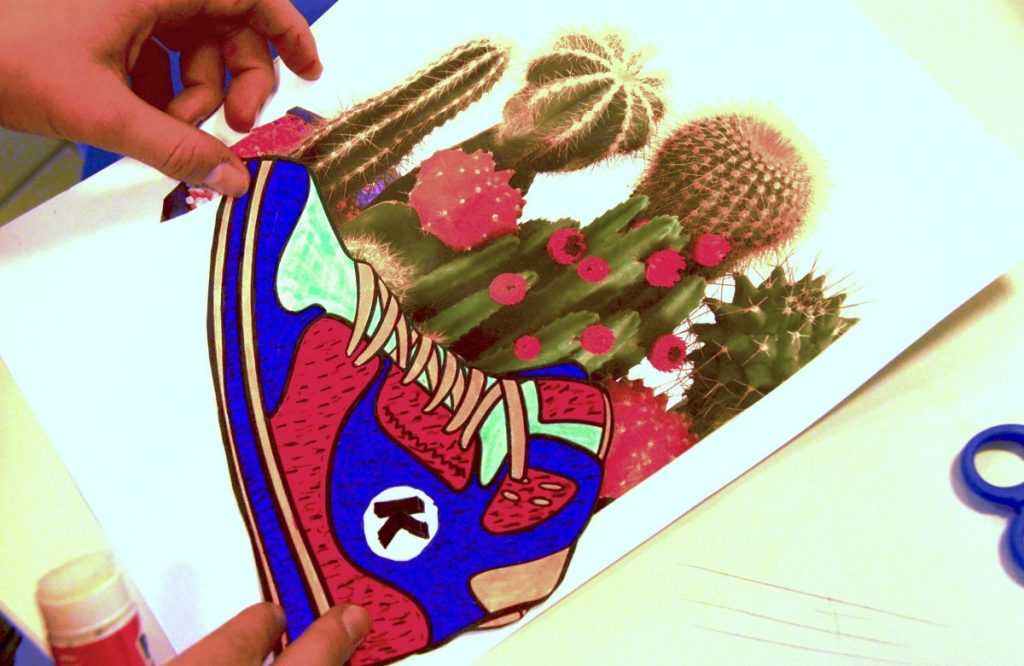
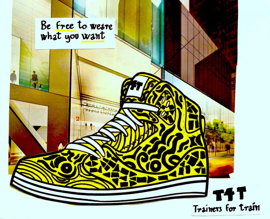
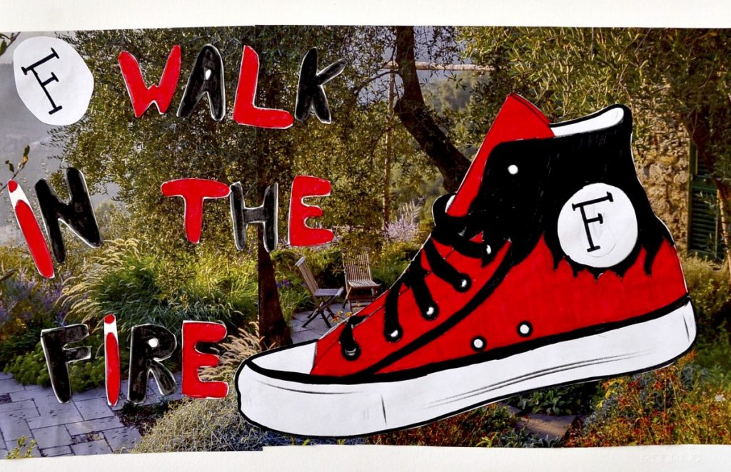
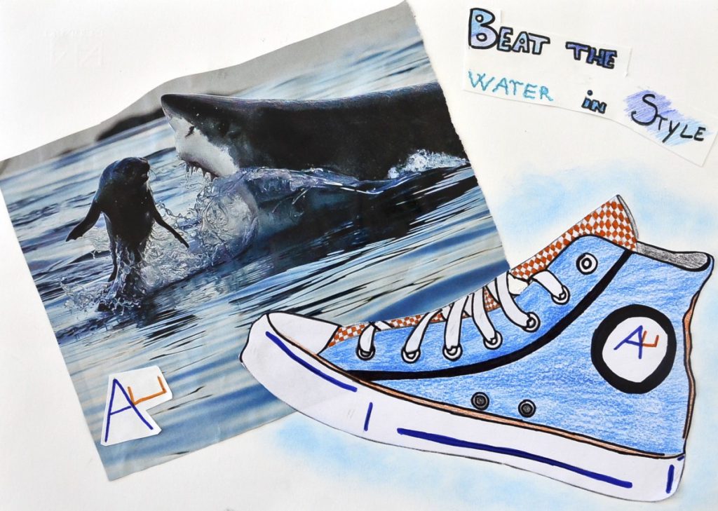
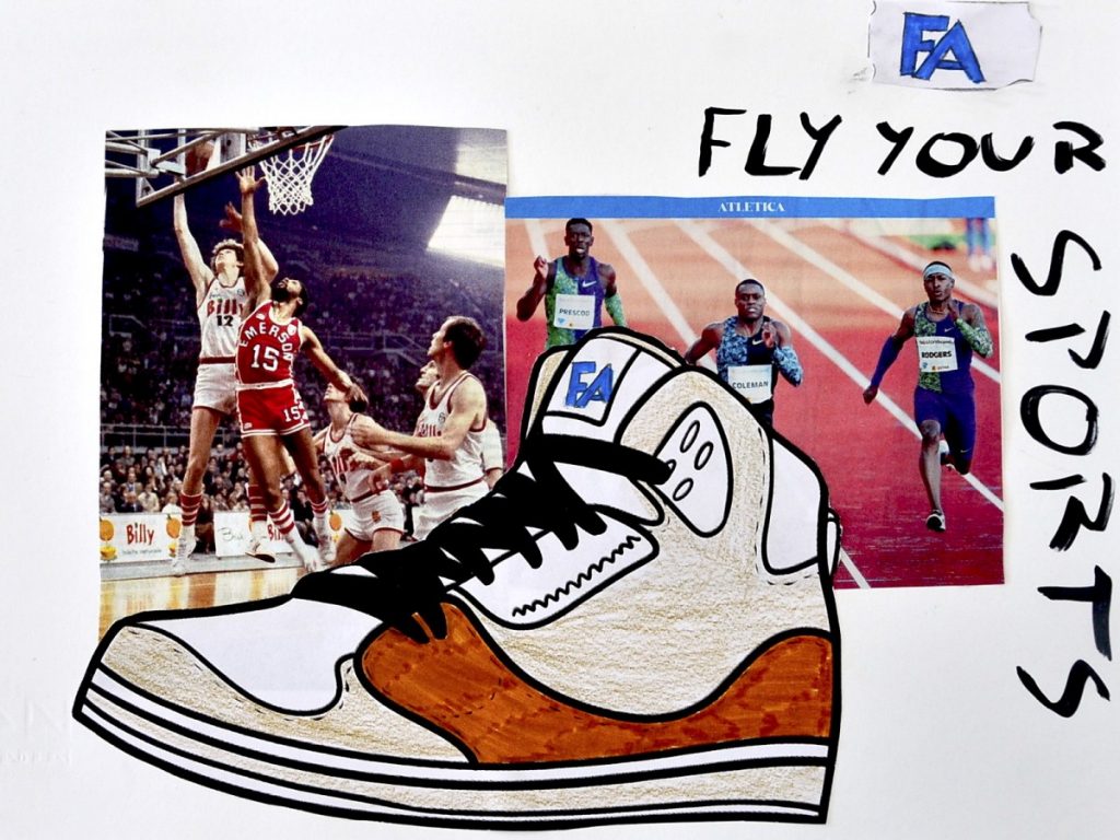
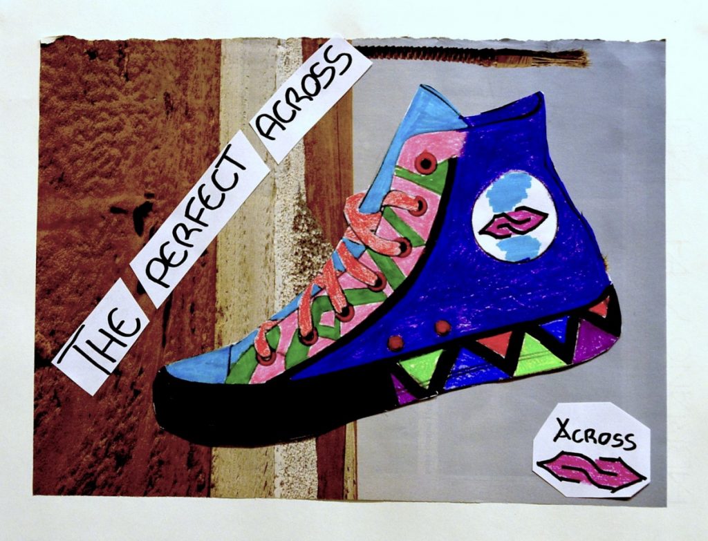
We didn’t have much time to realize this print ad, so we chose to focus just on three elements: headline, visual and logo. We worked on different templates of shoes using pictures from magazines as background and composing the whole ad as a collage.
