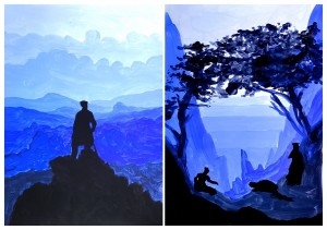
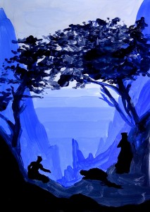
The Romantic works of Friedrich lend themselves to an interpretation of the landscape that can be divided into a value scale.
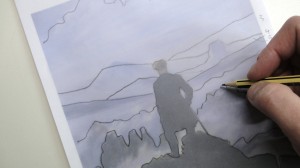
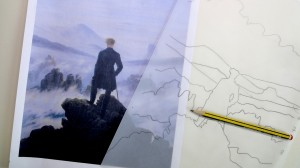
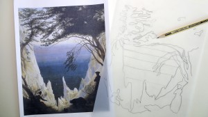
In these two exercises Friedrich’s paintings were traced on tracing paper with a pencil and the drawing thus obtained was then traced on a white sheet.
We started with acrylic paint starting from the lightest color and then we added more and more blue, to get the blue tonal gradation. from then on we added small amounts of black up to the saturated black.


Miriam, this is awesome!! This is a great project to combine a little art history with a color value exercise. I’m totally going to do this with my 8th grade students.
Hi Natalie! I’m thinking about lessons of Art History combined with Color Theory… I’m ready for other suggestions, if you have some new ideas share them with me;) Thanks for your comment!
Molto interessante, anche io sto pensando e facendo le prime sperimentazioni su questo.
ciao Romina, effettivamente questo lavoro è abbastanza avanzato, si fa con gli studenti di terza media che hanno un po’ più di esperienza con la pittura e la sintesi delle forme…
Does anyone have a rubric for this?
Hi dandmreimer, sorry but I didn’t understand what do you need. Whith “rubric” do you mean the steps of the work or something else? It’s my fault because my bad English… 🙂
Hi, a rubric is showing how to grade or mark an assignment.
No, I don’t have any rubric, I have to think about it!
Impressive, yet easy concept for students to grasp. I think students would gain a lot of self confidence from doing this project. Lovely!
thanks for your comment Patricia 🙂
Love this! Thank you!
Hi Kelly! Thanks for your comment 🙂