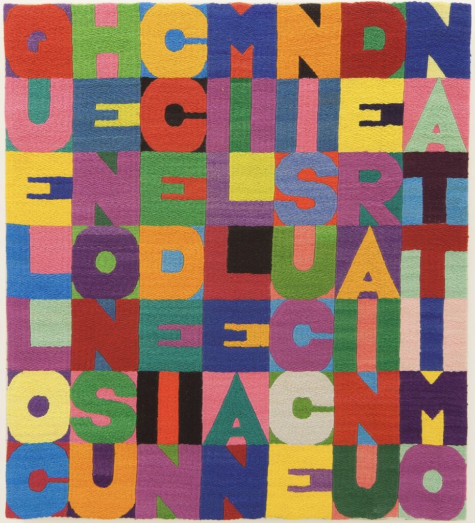
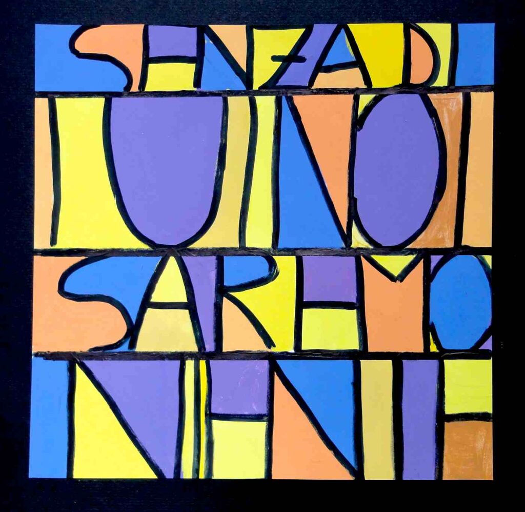
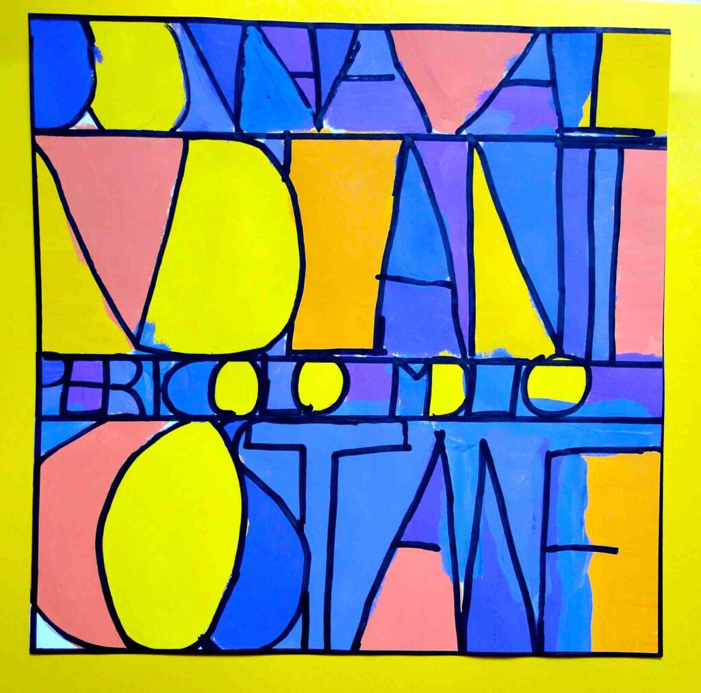
We have created a painting inspired by the works of Paul Klee and Alighiero Boetti using letters of the alphabet as a pretext to create forms and spaces to be colored. I explained that the sentence choice does not have to be recognizable: it is not a “slogan” advertising that needs to be readable, but a mere pretext to create a grid of straight lines, oblique, curved, horizontal, or vertical, to be filled with complementary colors.


These are absolutely beautiful- love the complementary colours- bravo!
This will be my lesson this afternoon! Thank you!
Hi Vanessa! I look forward to see your lesson, did your students paint with watercolors or acrylics? I’m curious to see which sentences they wrote… Mine are in italian language!
Thanks for your comment Vanessa, see you soon on the web 🙂