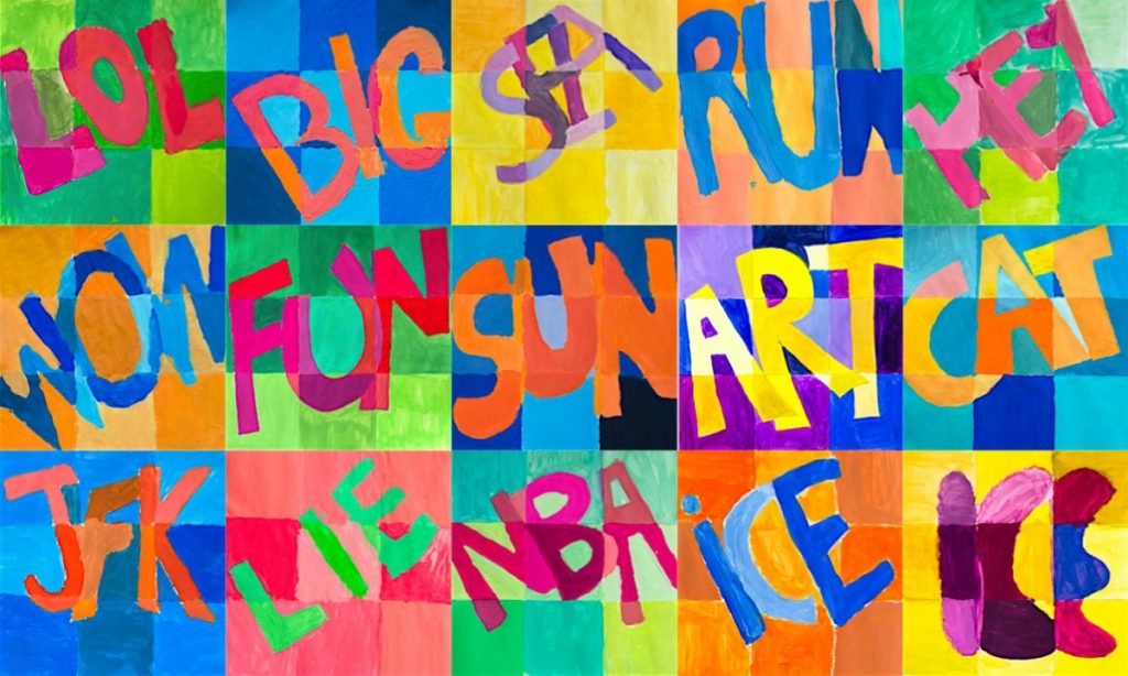
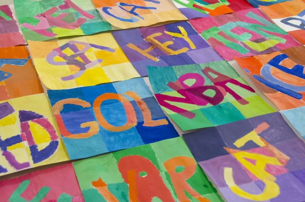
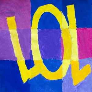
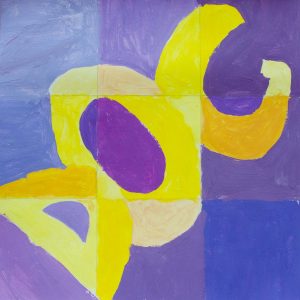
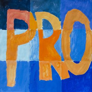
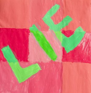
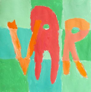
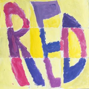
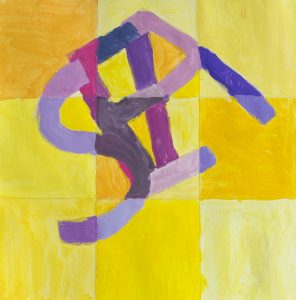
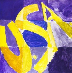
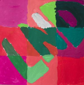
In order to better understand the complementary colors we created a drawing to paint with different shades of complementary colors. We chose a three-letters word to draw in bold type on a squared grid, on a square drawing sheet. The aim is to create at least 8 variation of every chosen color.
For example we consider the couple of complementary colors blue and orange: we can create many variation of blue using the ready shades of blue (cyan, ultramarine, prussian blue, turquoise etc…), adding white or black to these blues, by mixing them or adding red or yellow to create purplish blue or greenish blue. In the same way the orange can be lighter or darker, more yellowish or reddish, paler or more saturated.
With this activity we learned how to mix colors in order to find many variations of a same tint. In that way we can understand the slight differences of saturation, tone or temperature of a color.
Here below you can watch the video-tutorial created by Chad Brown. In his video this great art teacher and friend shows how to do the painting step by step.

