
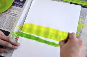
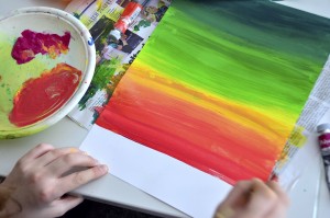
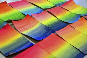
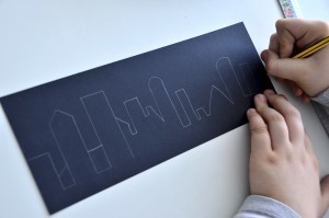
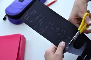
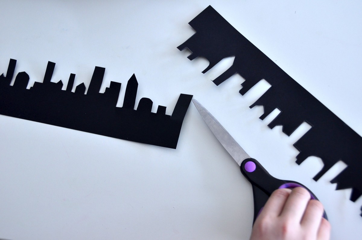
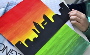
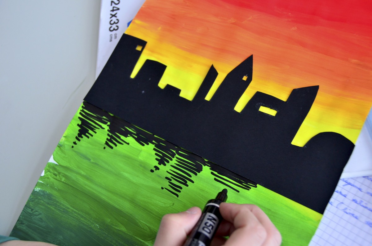
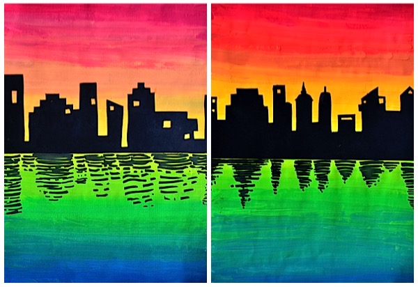
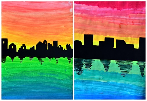
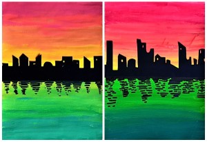
On a double chromatic gradation painted with acrylic paint, was pasted the skyline of a city cut out from a black cardboard. The color gradation was painted starting from a central yellow stripe, with a shade towards red on one half of the sheet, and with a shade towards blue on the other half of the sheet. These colors were chosen to simulate a sunset sky at the top and a surface of water below. The skyline of the city was drawn on a black cardboard and cut out with scissors and cutters to the smallest details, such as windows. After pasting the skyline on the middle of the painting, has been created the effect of “reflection in the water” with a black marker. Under the outlines of the buildings have been drawn irregular horizontal lines, which become less frequent and shrink, as they move away from the silhouette of the city.


I really love this, I’m going to try this with my students, been looking for some fresh ideas. I’m a new Art teacher. Thanks for the post.
Hi Yvonne, thanks for you comment, I like sharing my ideas, especially with new Art Teachers! Enjoy your work with students. 😉 Keep in touch
good idea , i like , i need to land
😉 Thanks kyawnaing! This painting it’s very effective! good work
Thank you, dear Miriam, for the idea! I used it and my little children from the school were excited. You can see their pictures here: http://cemaifacemlascoala.blogspot.ro/2016/11/orasul-seara-culori-calde-culori-reci.html.
Hi Ella! Your works are beautiful and your blog is amazing!
Thanks for sharing your ideas
Keep in touch!
🙂
Is this done on regular print paper?
Hi Angela. It’s not print paper, it’s too light (70-80gr/m2) to be used for painting. We used Drawing paper, the heaviness is 200gr/m2 and is suitable to be painted without becoming wavy. 🙂
Oooh fabulous idea! I will try this with students tomorrow! I teach a weekly art class for kids and this is so simple and yet incredibly effective! thanks for sharing, will post the results for you to see and credit your idea. xxx
Hi Emma! Are you Italian? I had a look at your blog, it’s amazing! I’m glad to meet you and your enthusiastic life style. Thanks for your comment, I’m looking forward to see your post 🙂
Thanks Miriam for your kind words. I also want to add my work in arts education onto my blog when I have time!…watch this space. I’m English but my family descended from Italy. But sadly I don’t speak the language as my grandad refused to speak it as when he came to the UK as a child, the family received much racism, so wanted to fit in by denying their nationality! Sad as I would loved to have known my heritage! x
Hello, I would love to do this with my students. Beatiful!!. Thank you for sharing.
Hi Yinette! Thanks for your comment, I had a look at your activity on your website, it’s a great job! Keep in touch 🙂
Wonderful thank you. I did it and the children LOVED it thank you!! don’t know how to post pics on here but I put some images on instagram and credited your website. My instagram account is called the_muse_in_the_mirror . I will also do a blog post soon so will tag you in it. love and gratitude. Emma. x
Heres the link to my instagram so you can see the kids fab artwork….https://www.instagram.com/the_muse_in_the_mirror/ xx
Thanks Emma, I’ll follow you! It’s a pleasure to meet you
Miriam, love this idea. I am teaching my 1st graders warm, cool and neutral colors and this would be perfect to use. Do you have a lesson plan by chance? I love what you posted but can’t copy and paste it. Any ideas?
Hi Johnna, I’m glad to be helpful with my ideas, enjoy the activity! 🙂
Thanks for linking arteascuola.com 🙂
This looks really cool and hopefully not to difficult.
Just curious, what age were the kids that did this project?
Thanks
the kids are 11 years old 🙂