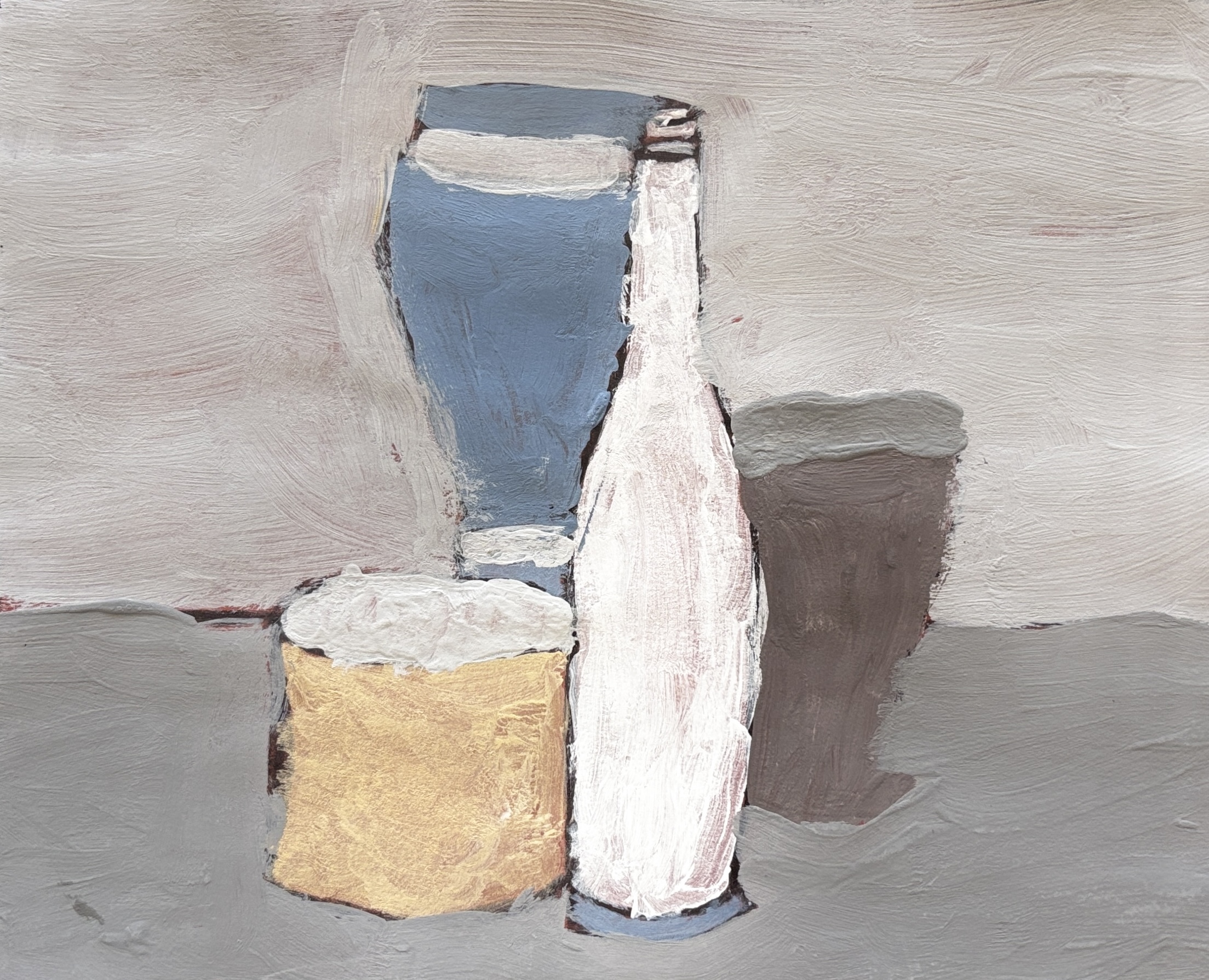
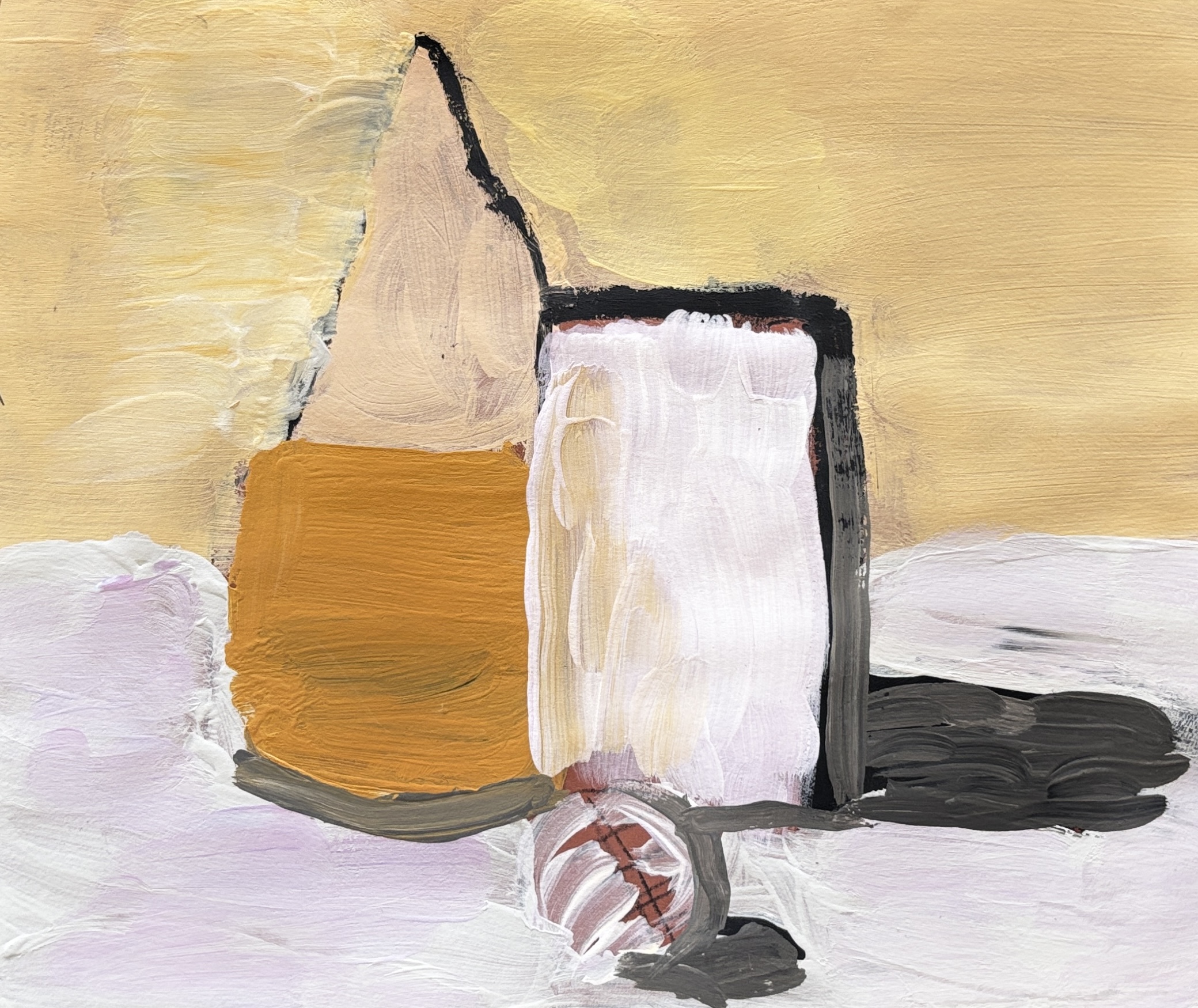
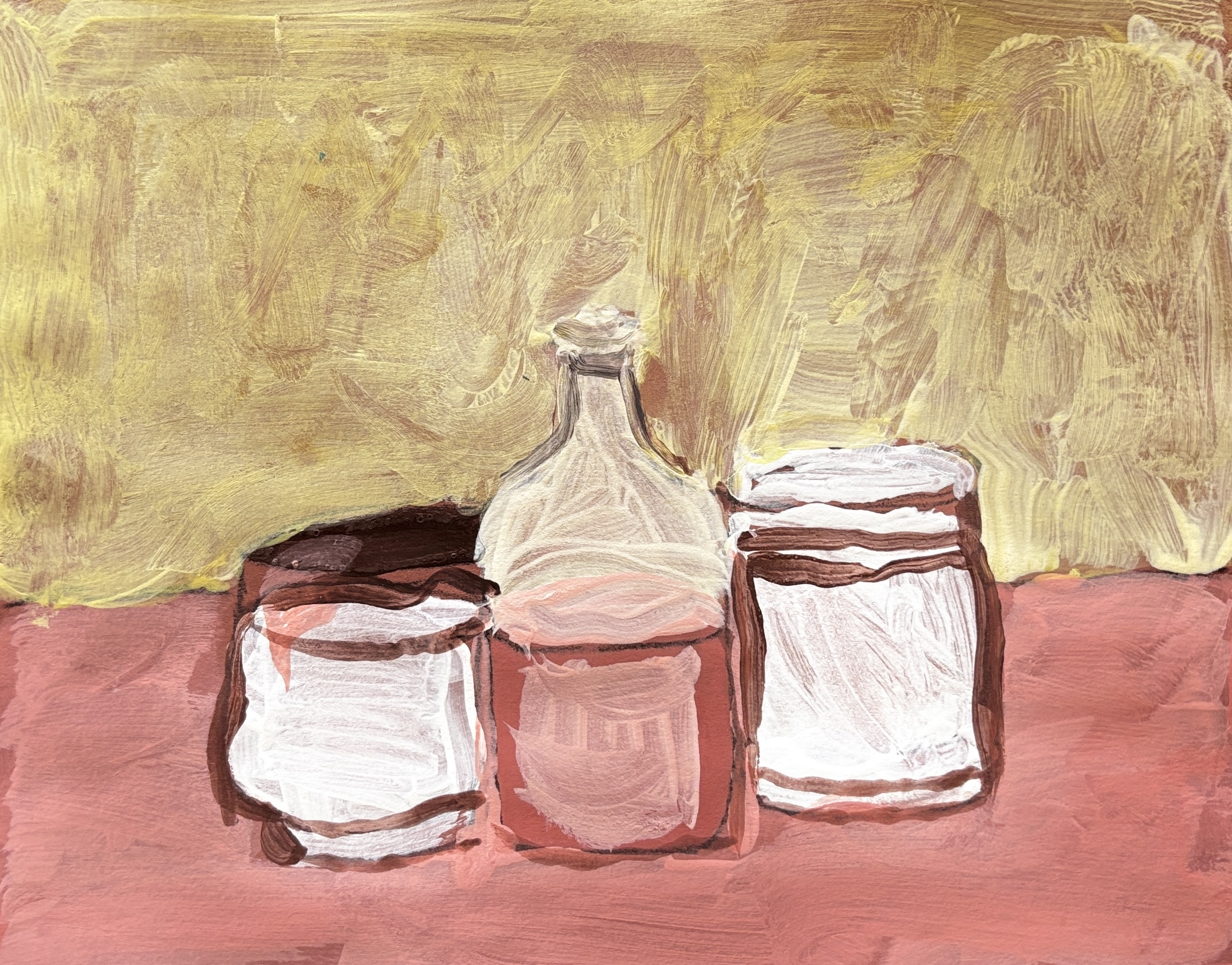
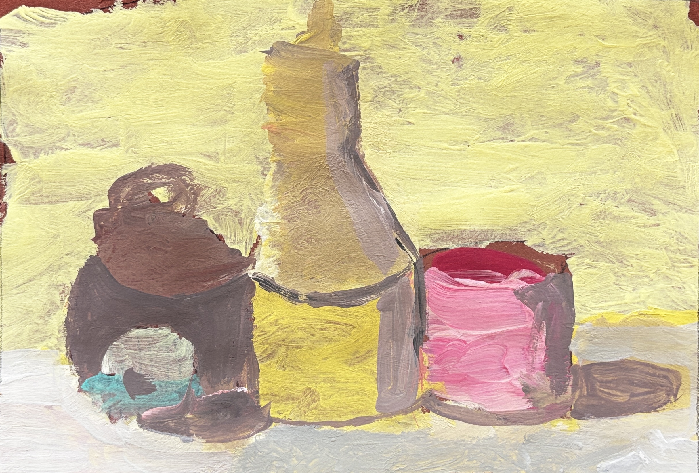
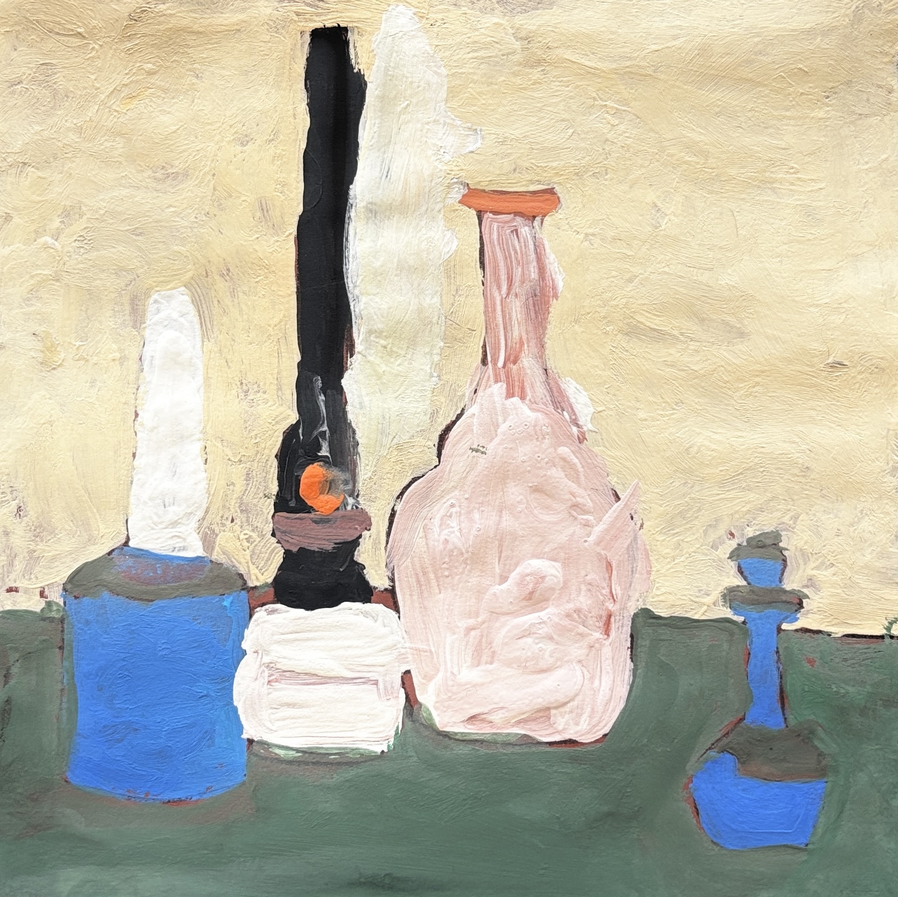
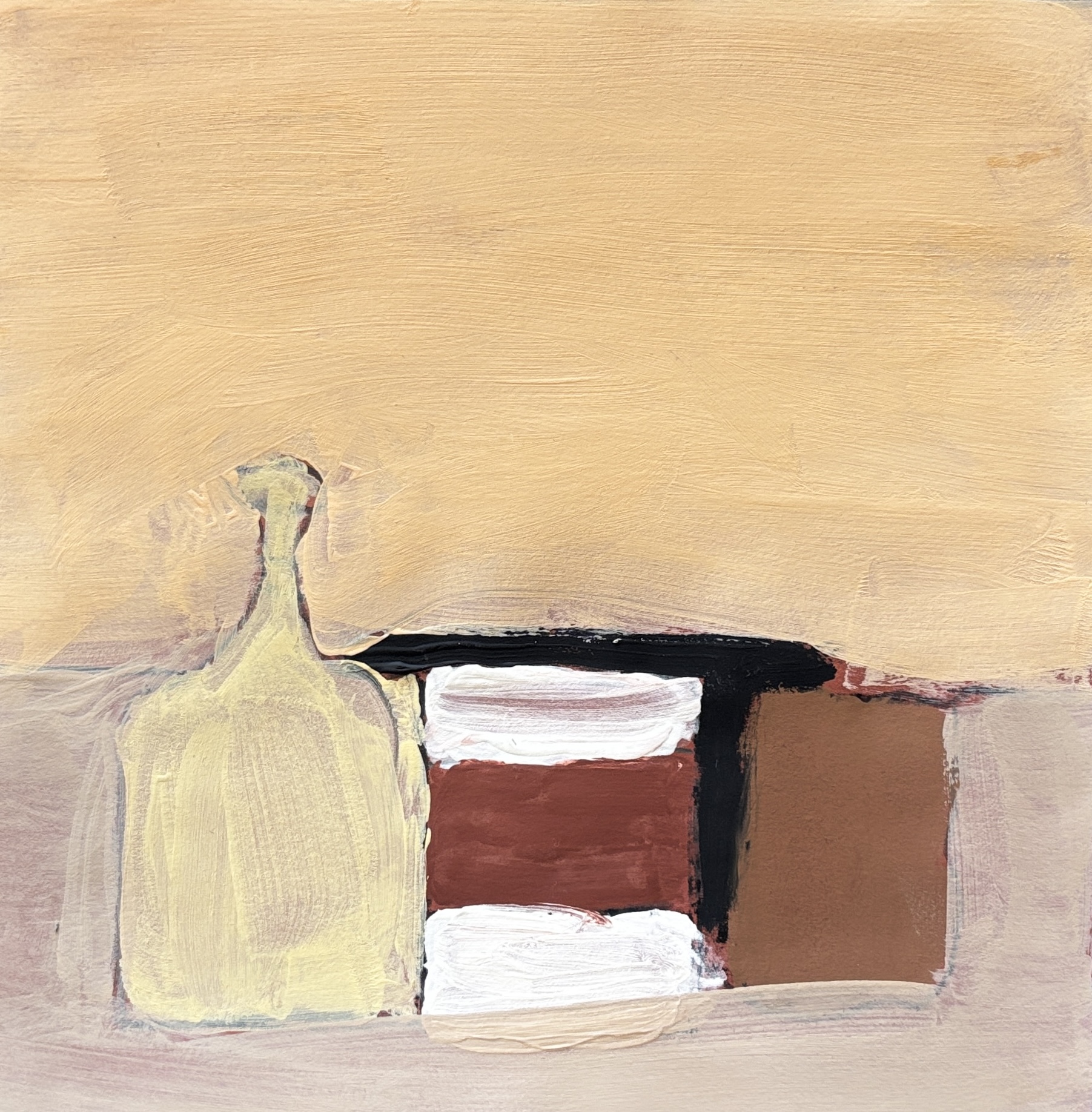
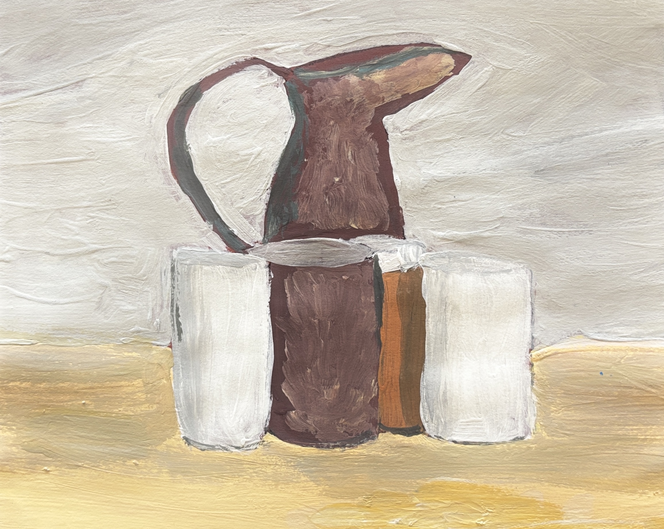
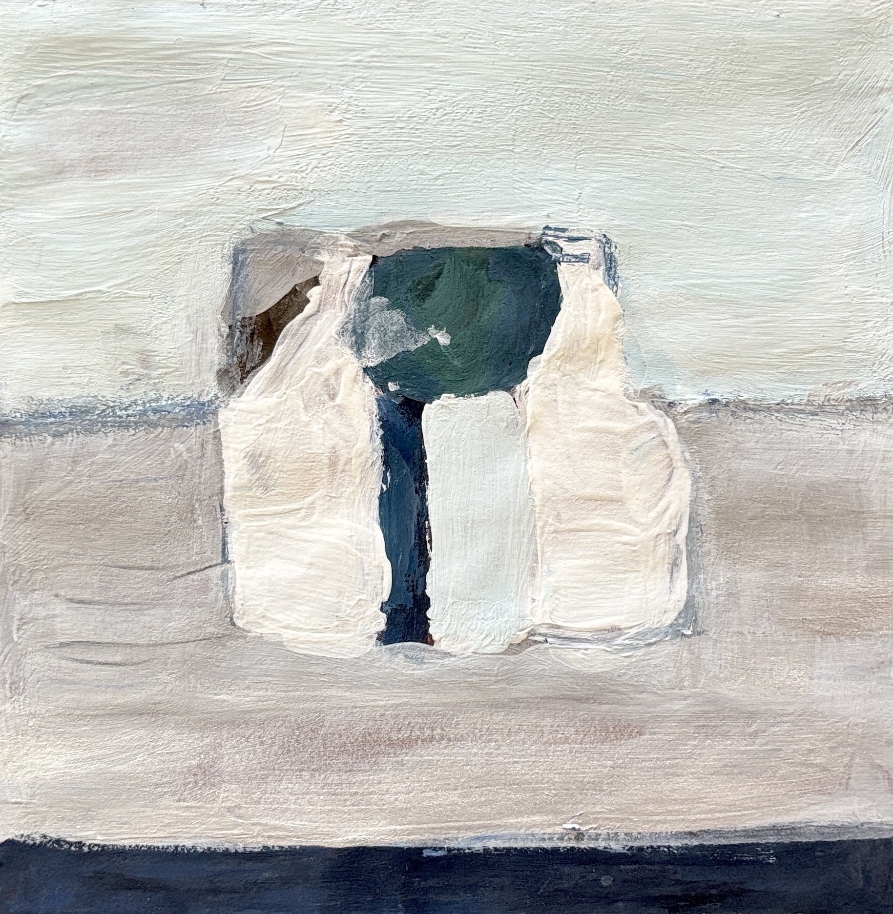
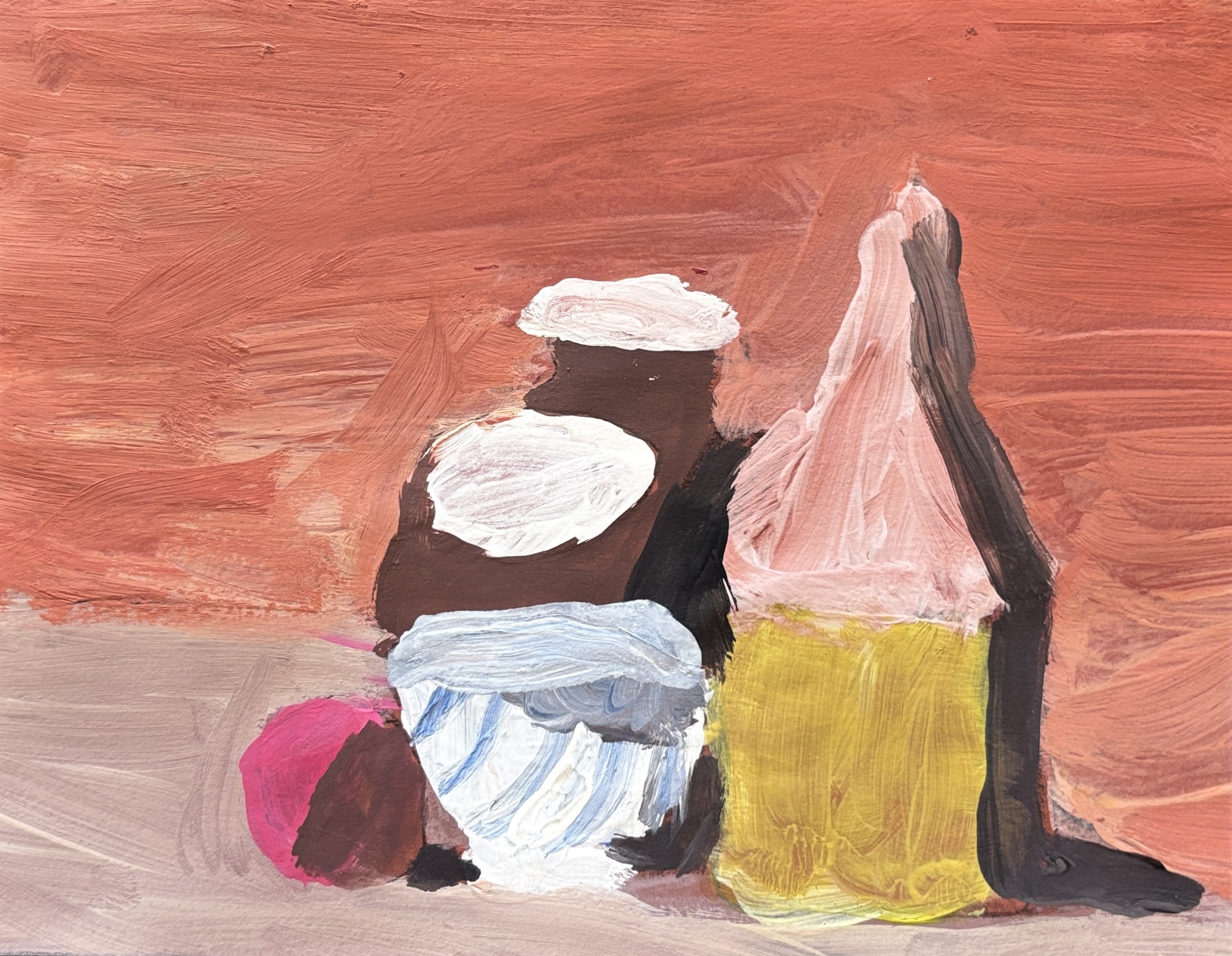
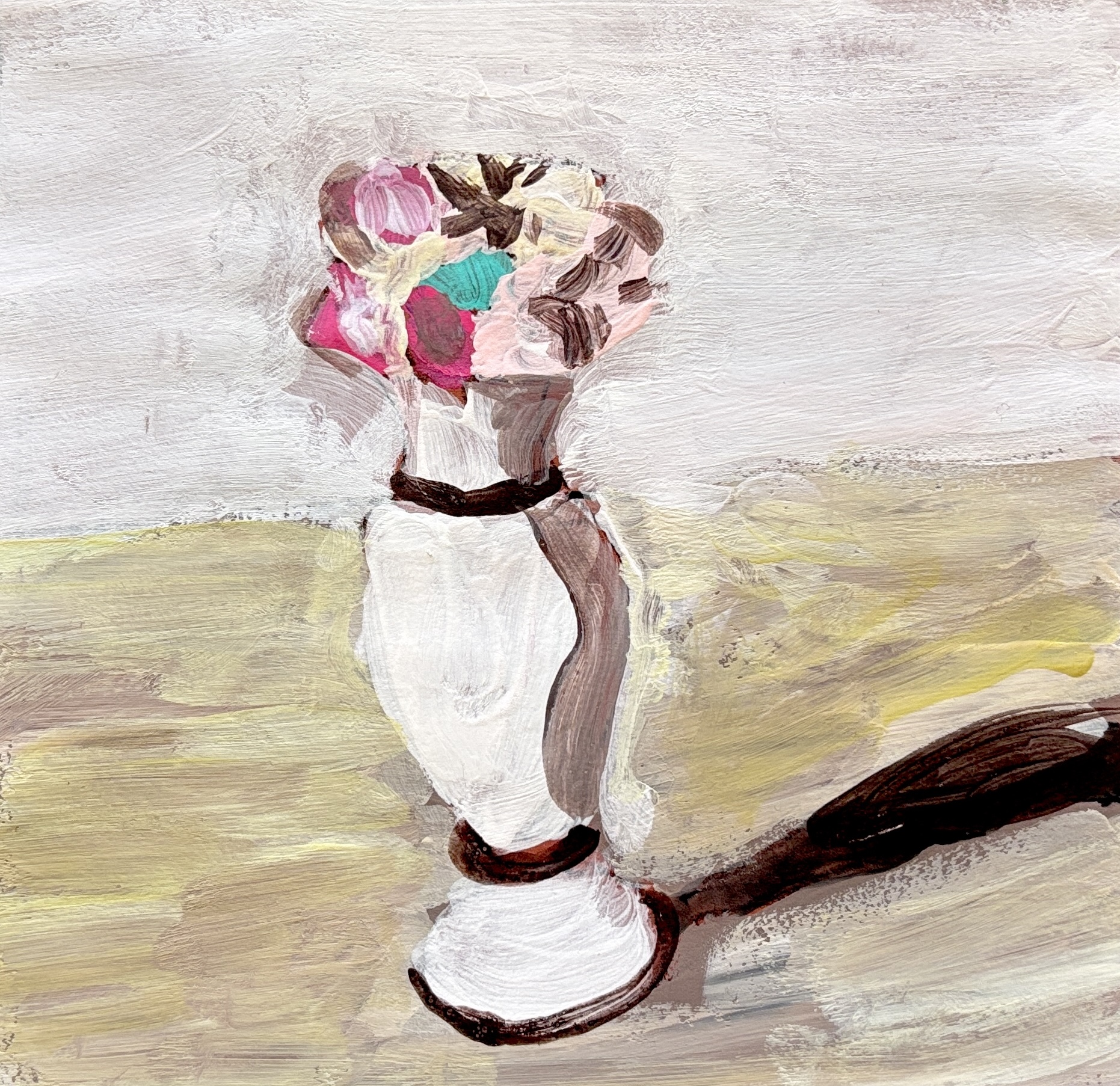
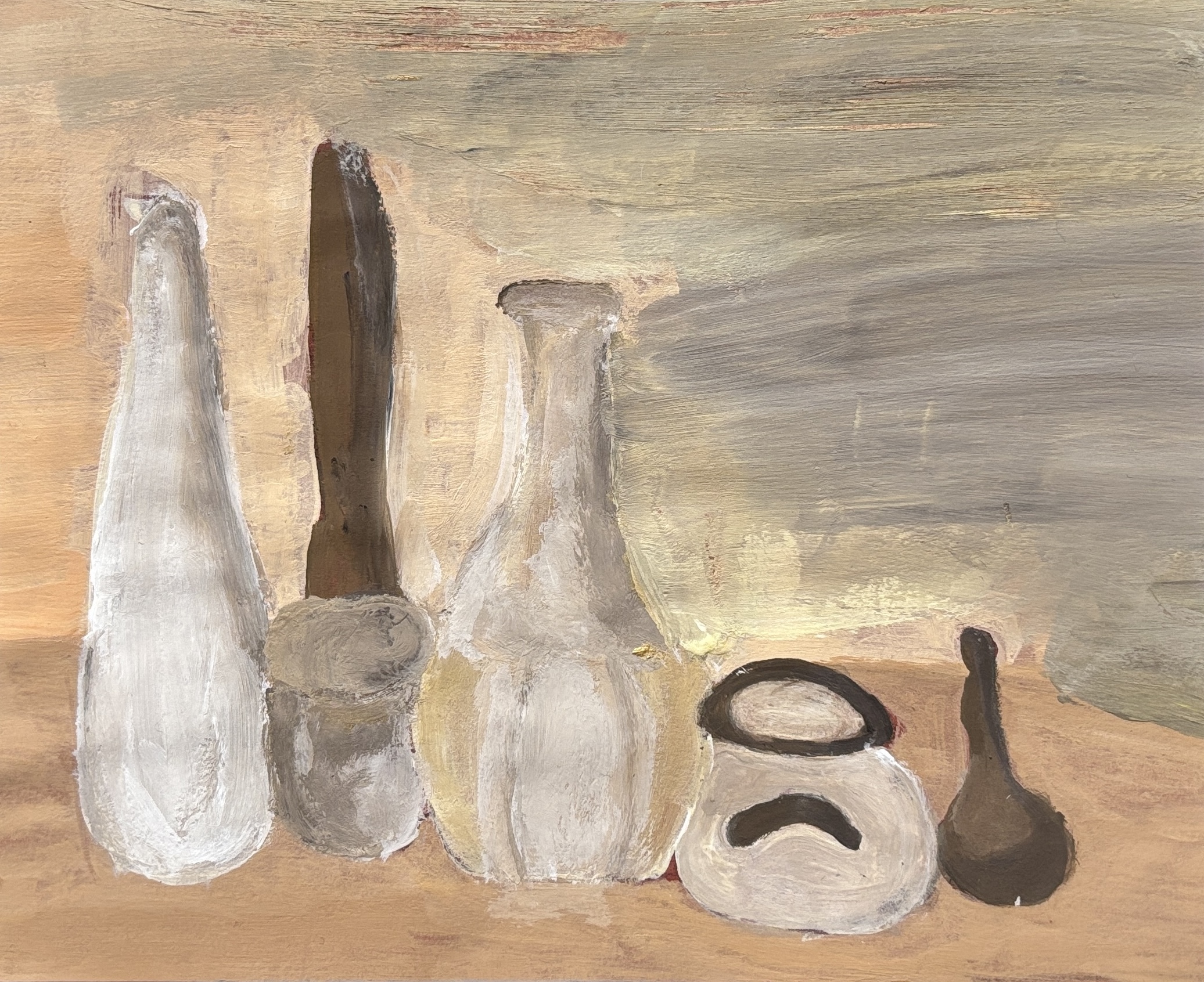
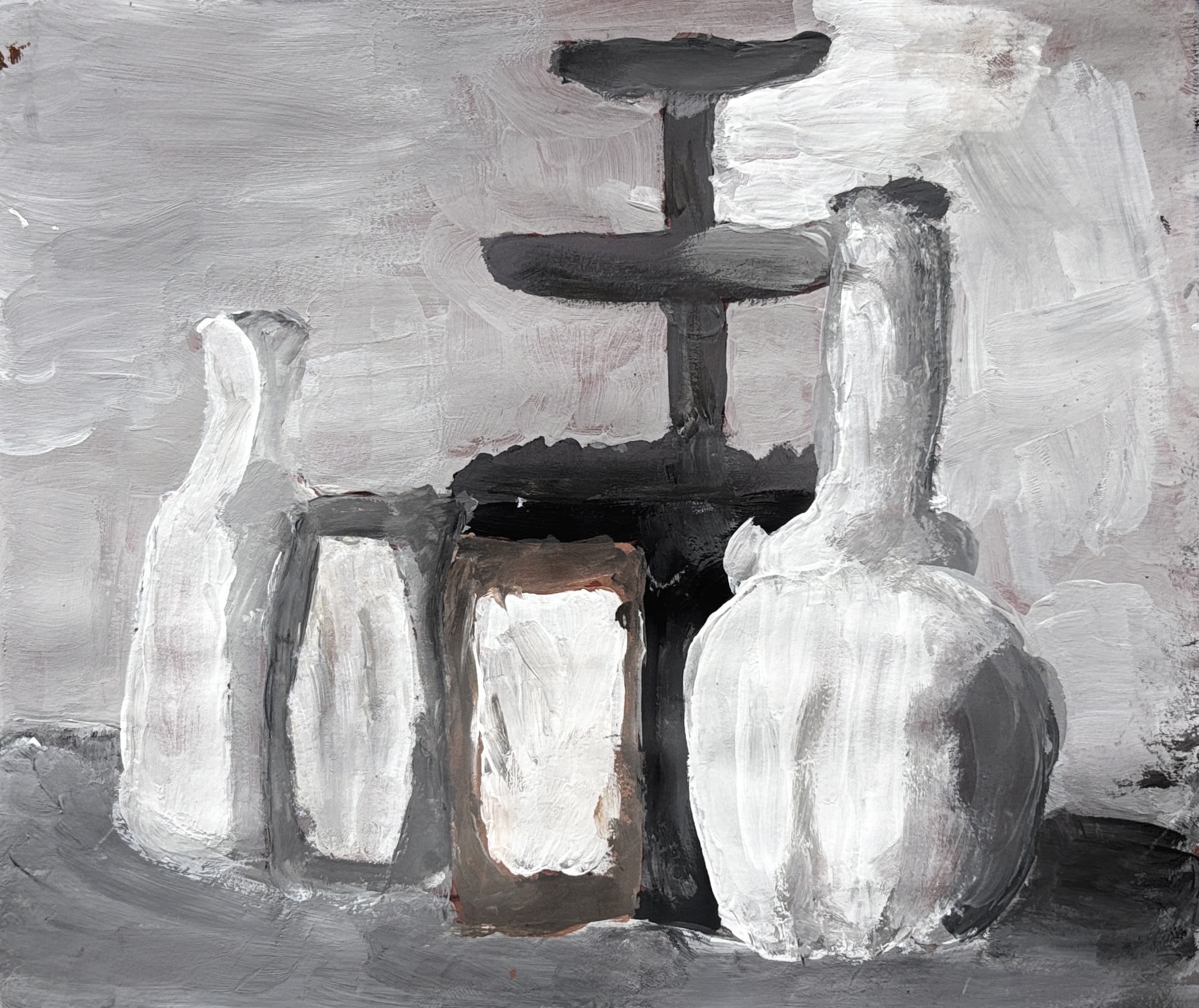
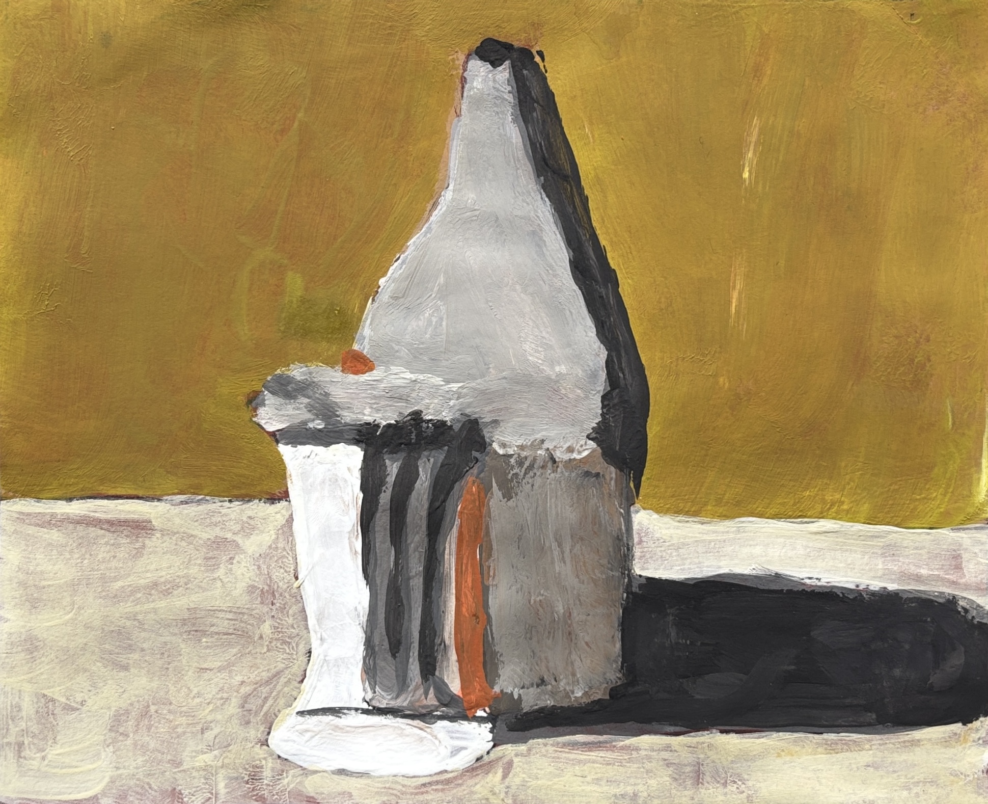
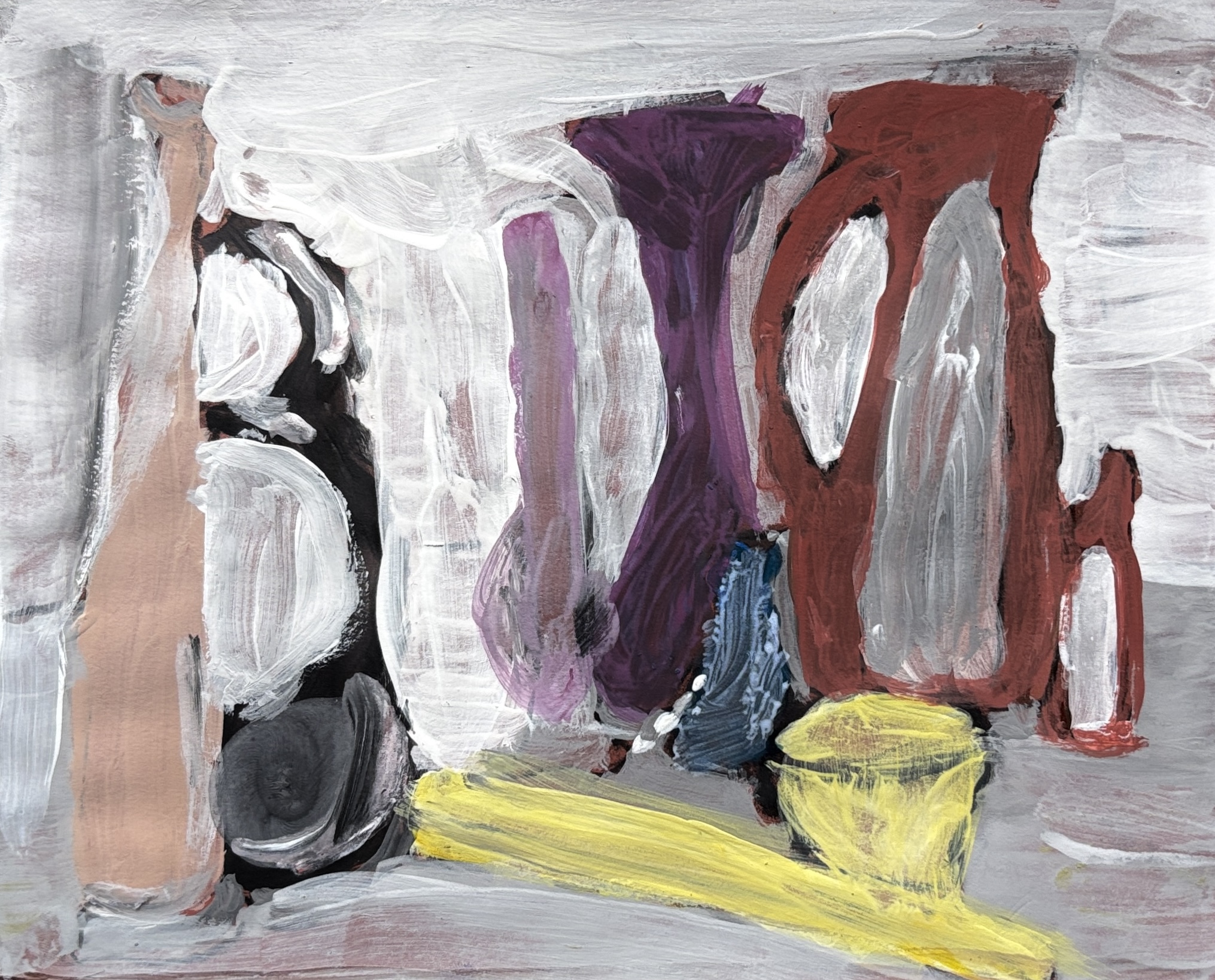
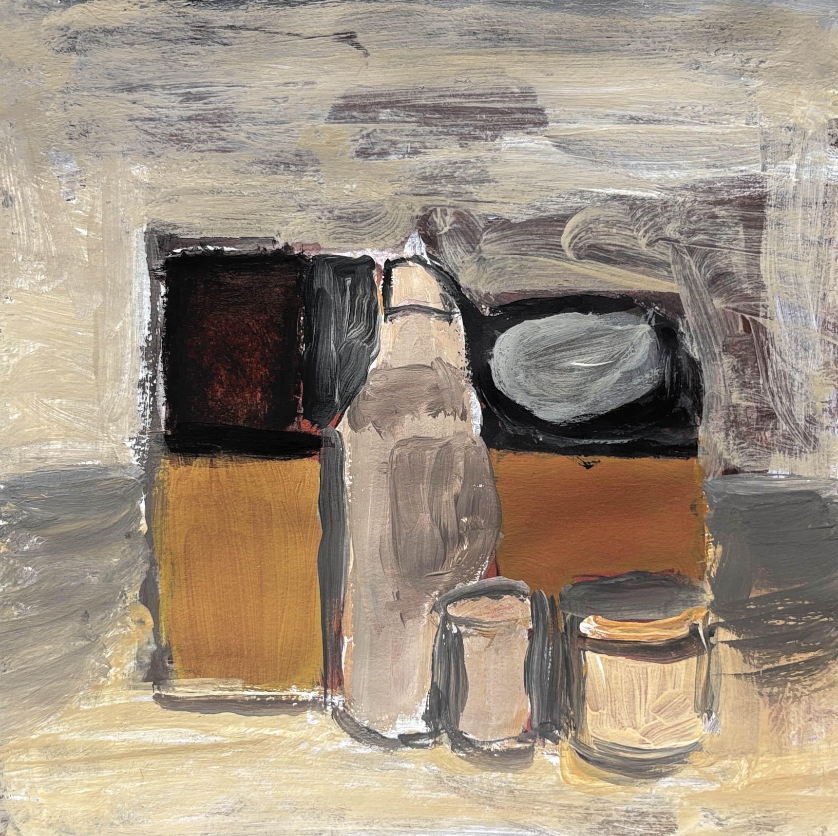
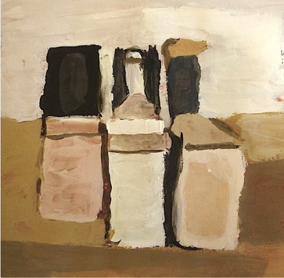
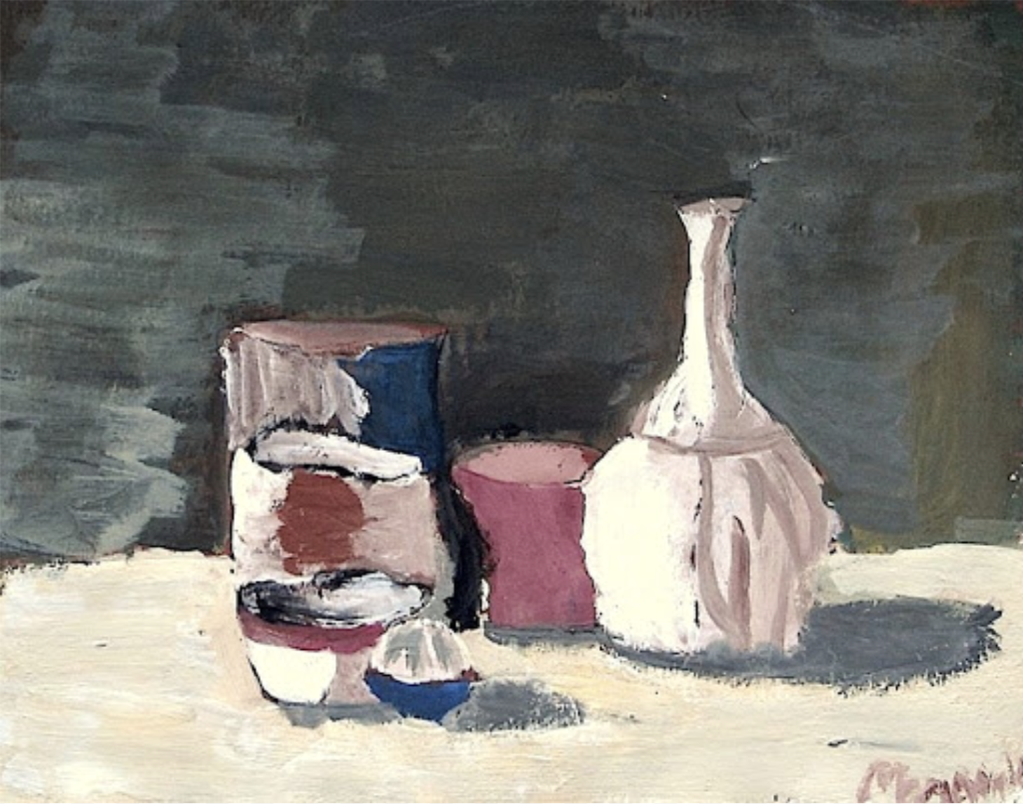
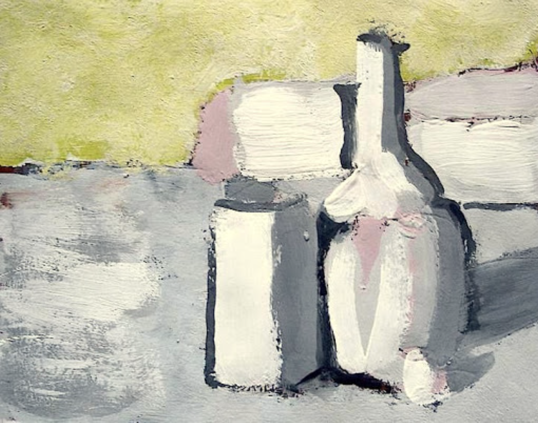
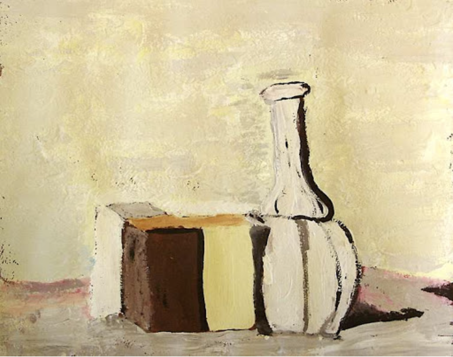
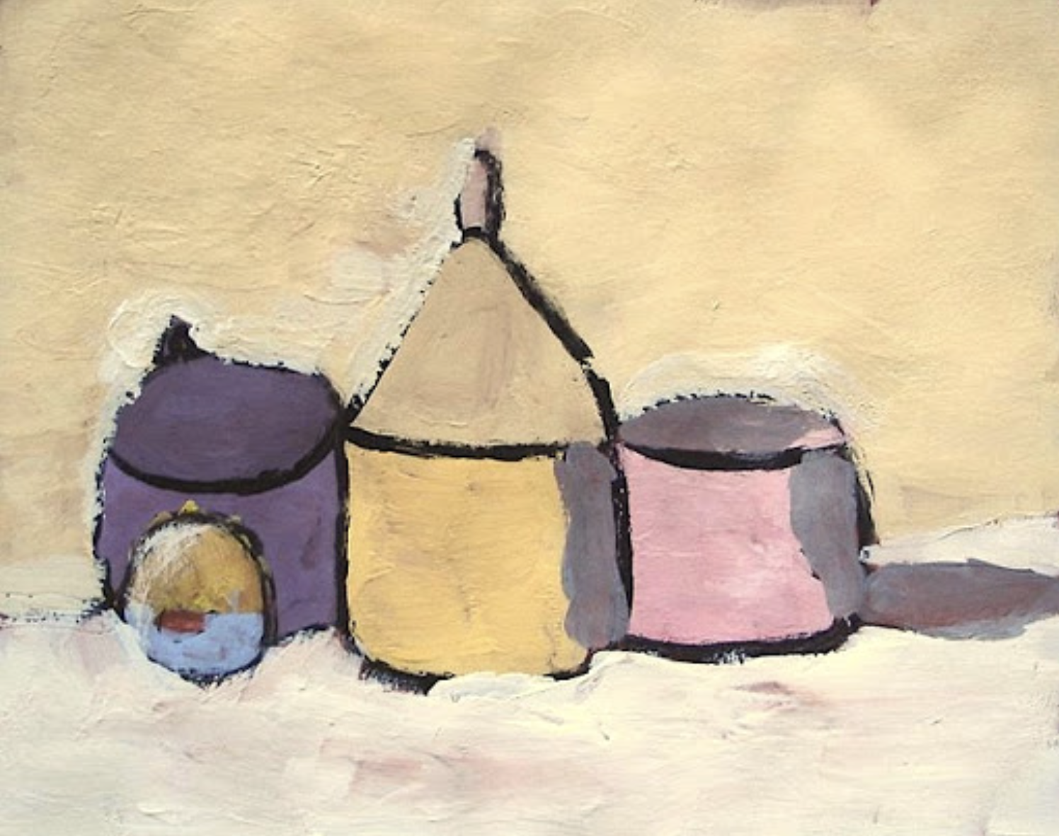
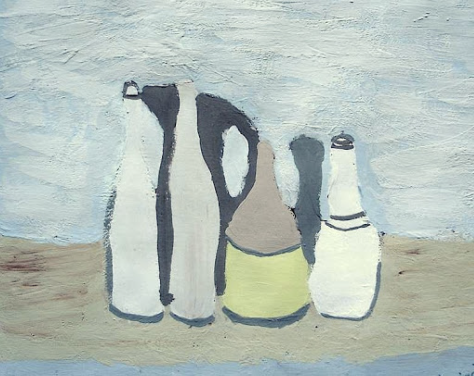
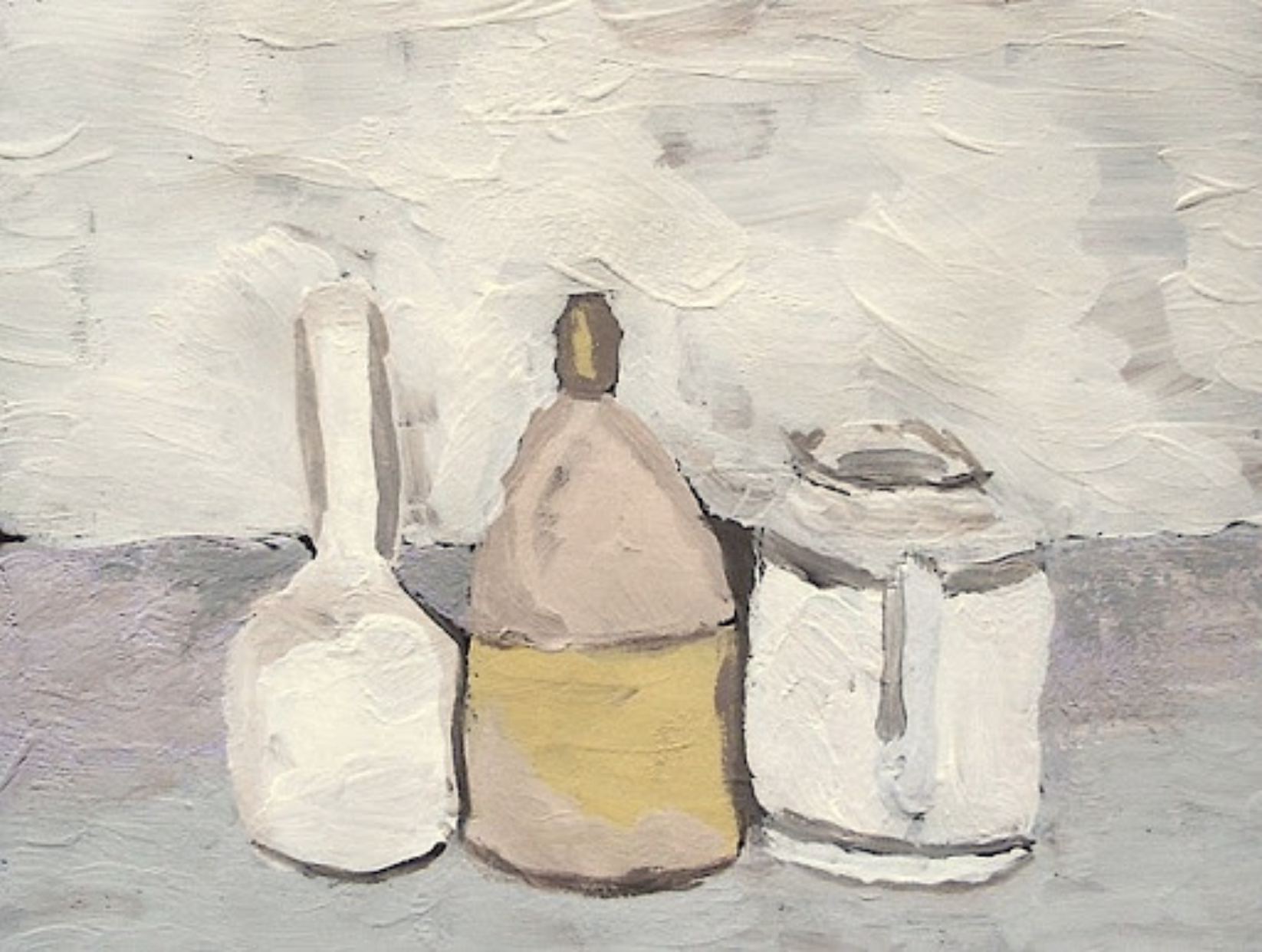
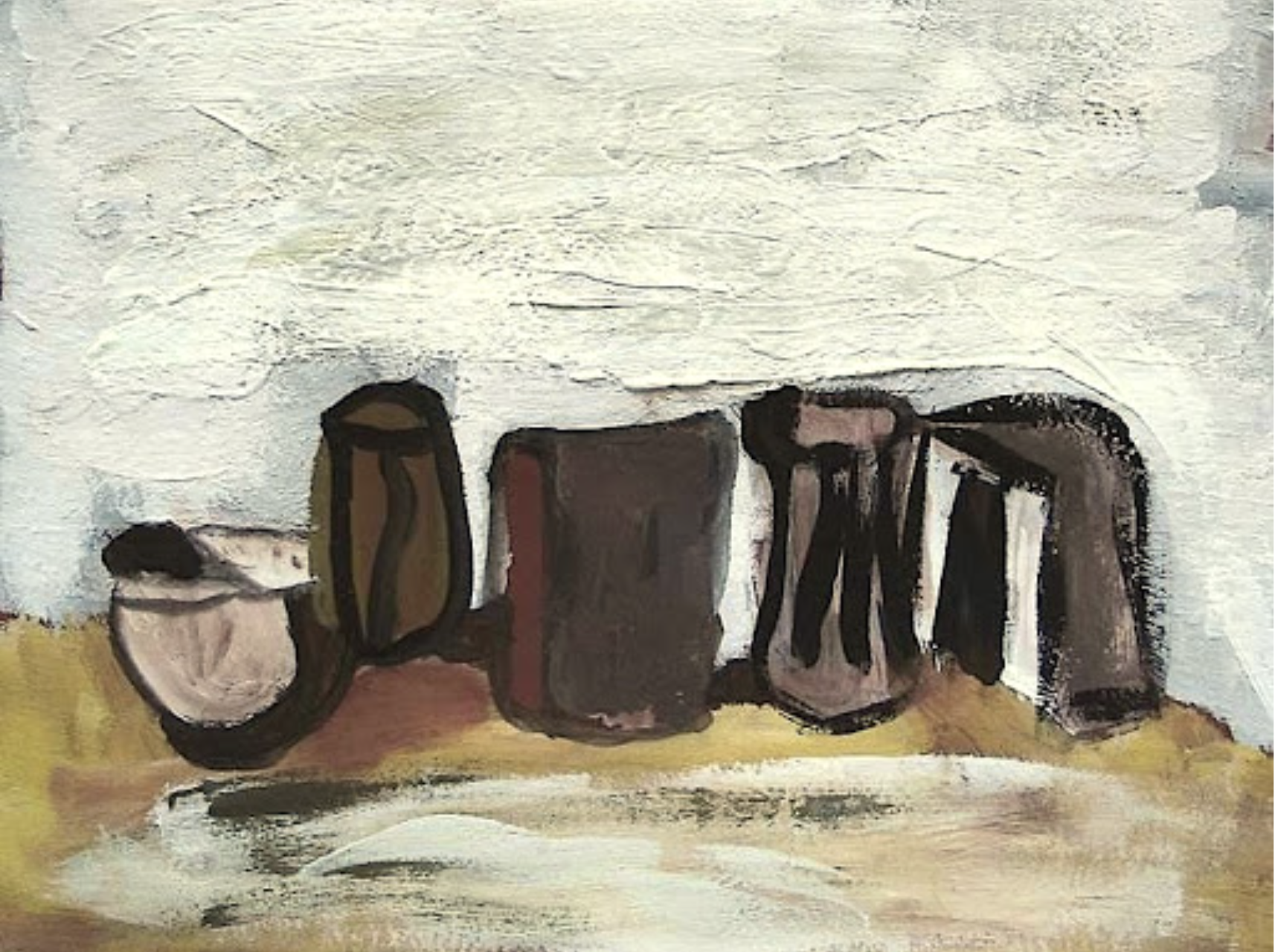
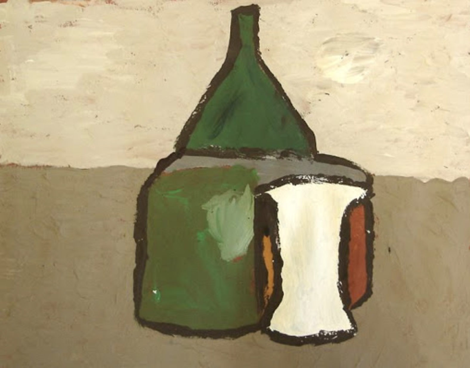
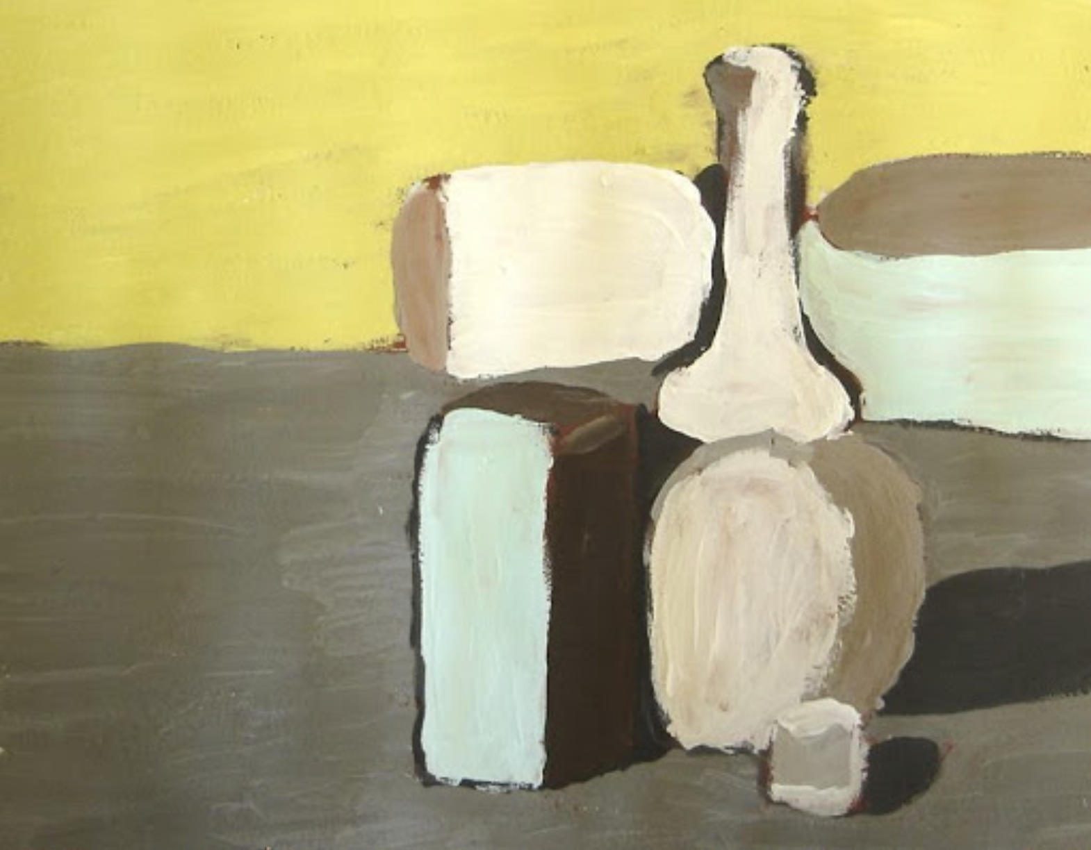
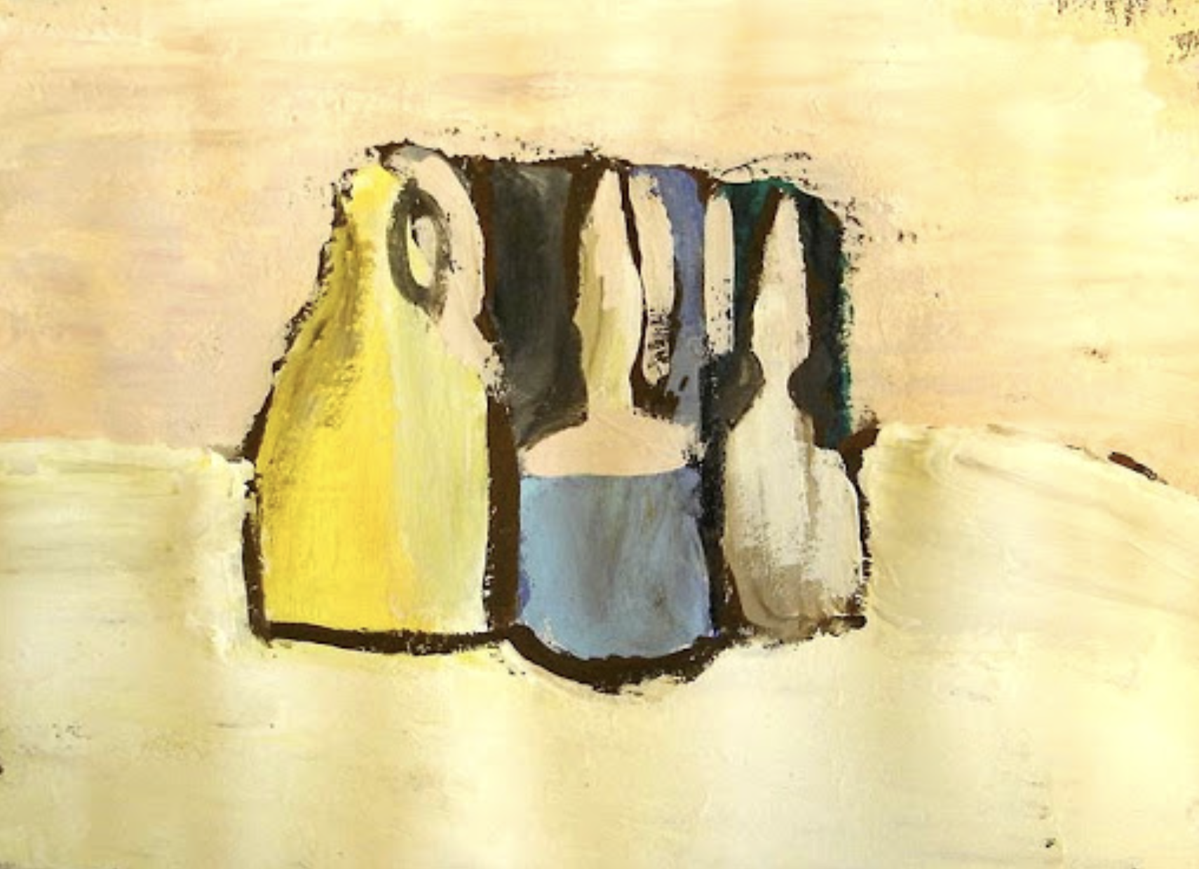
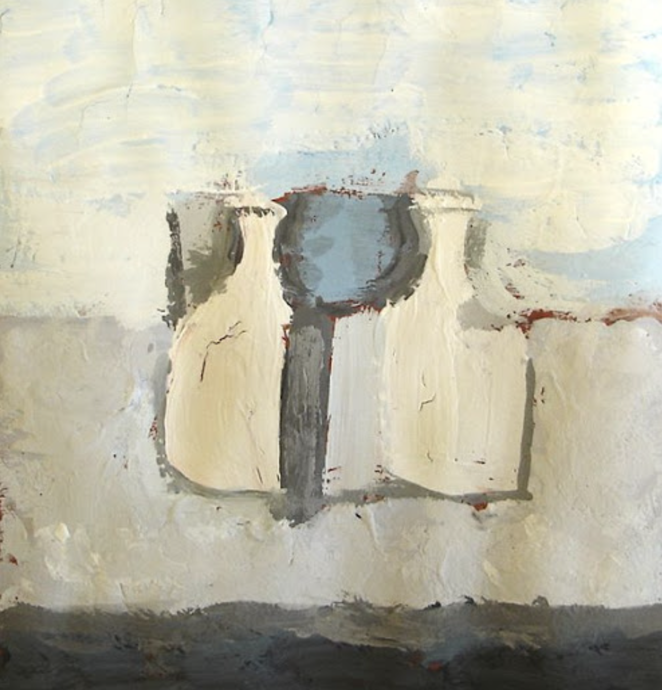
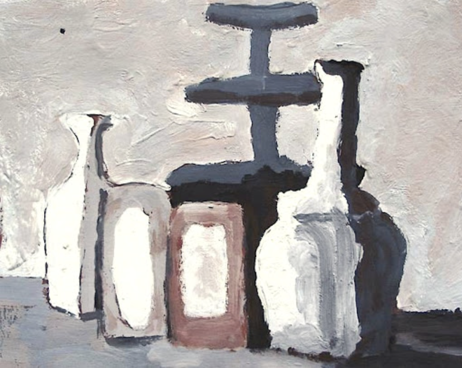
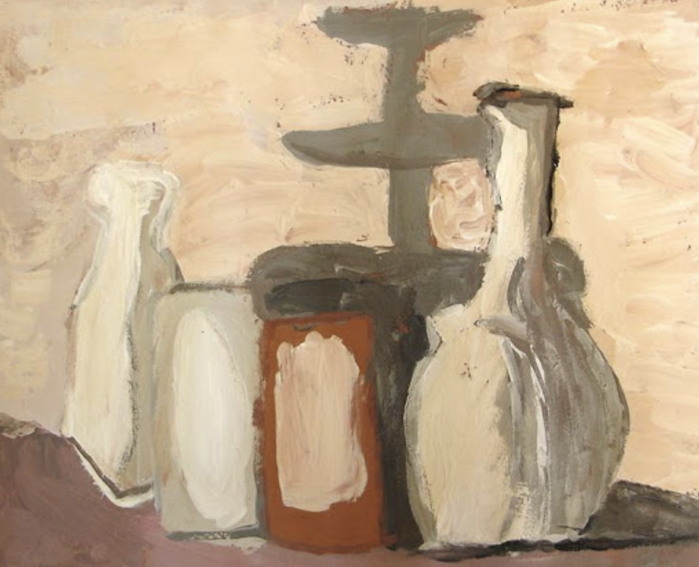
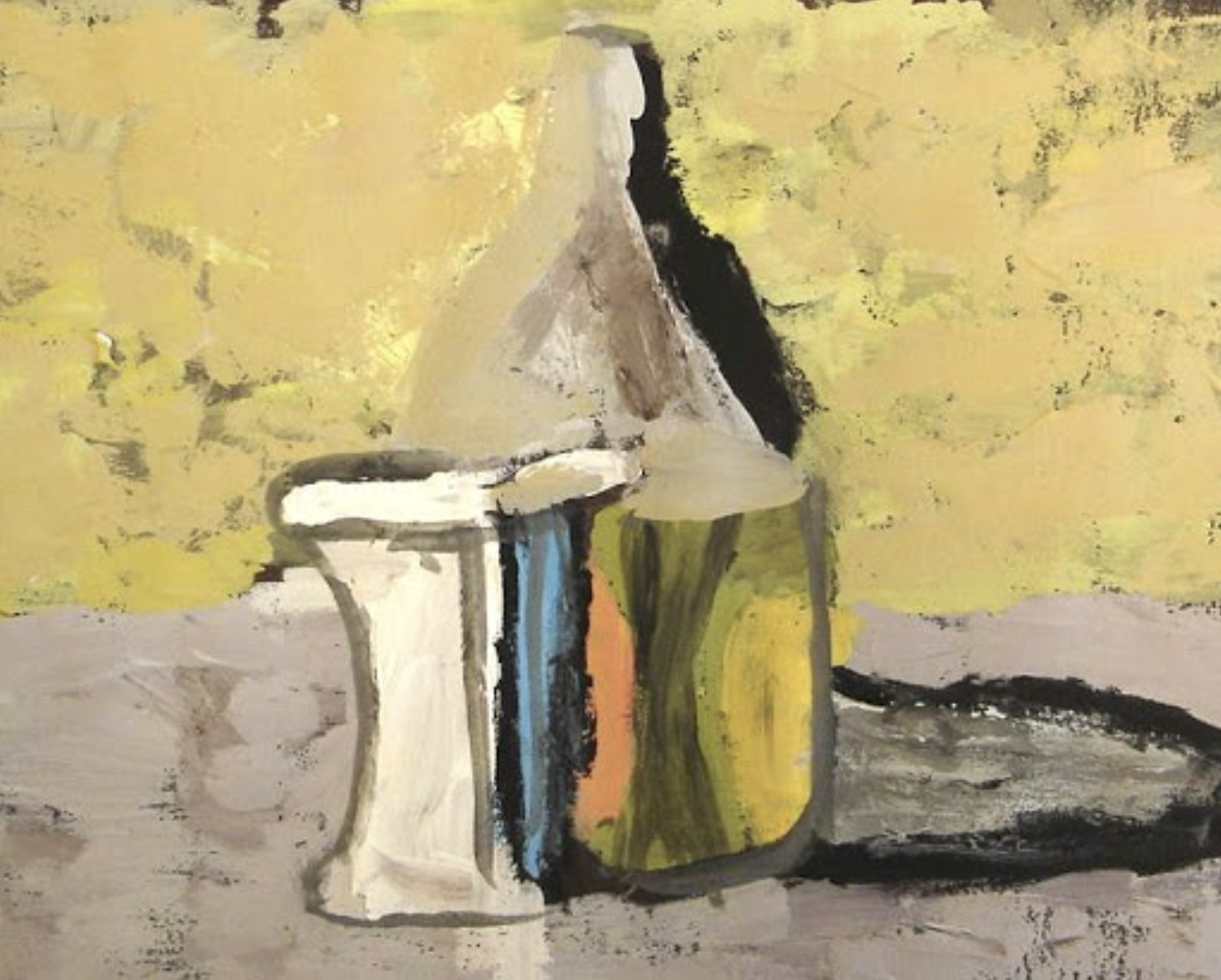
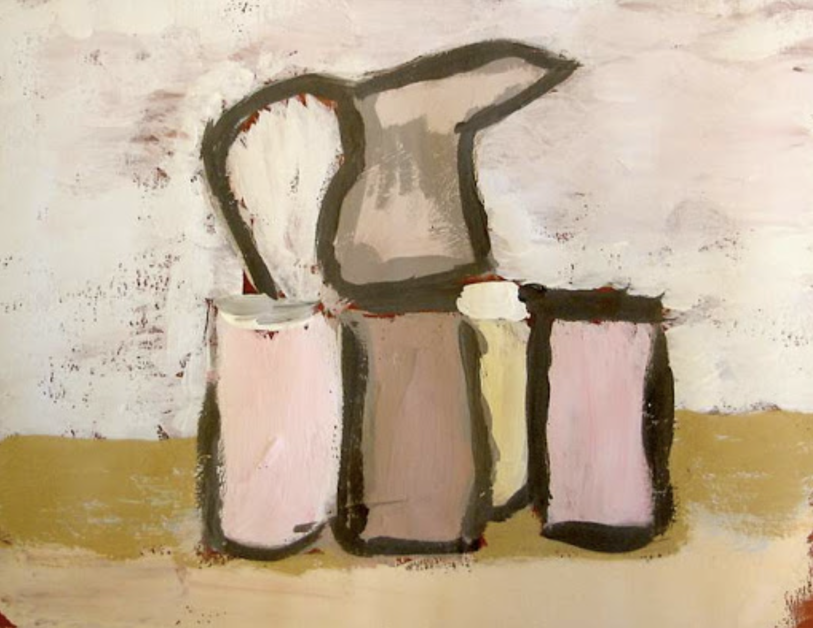
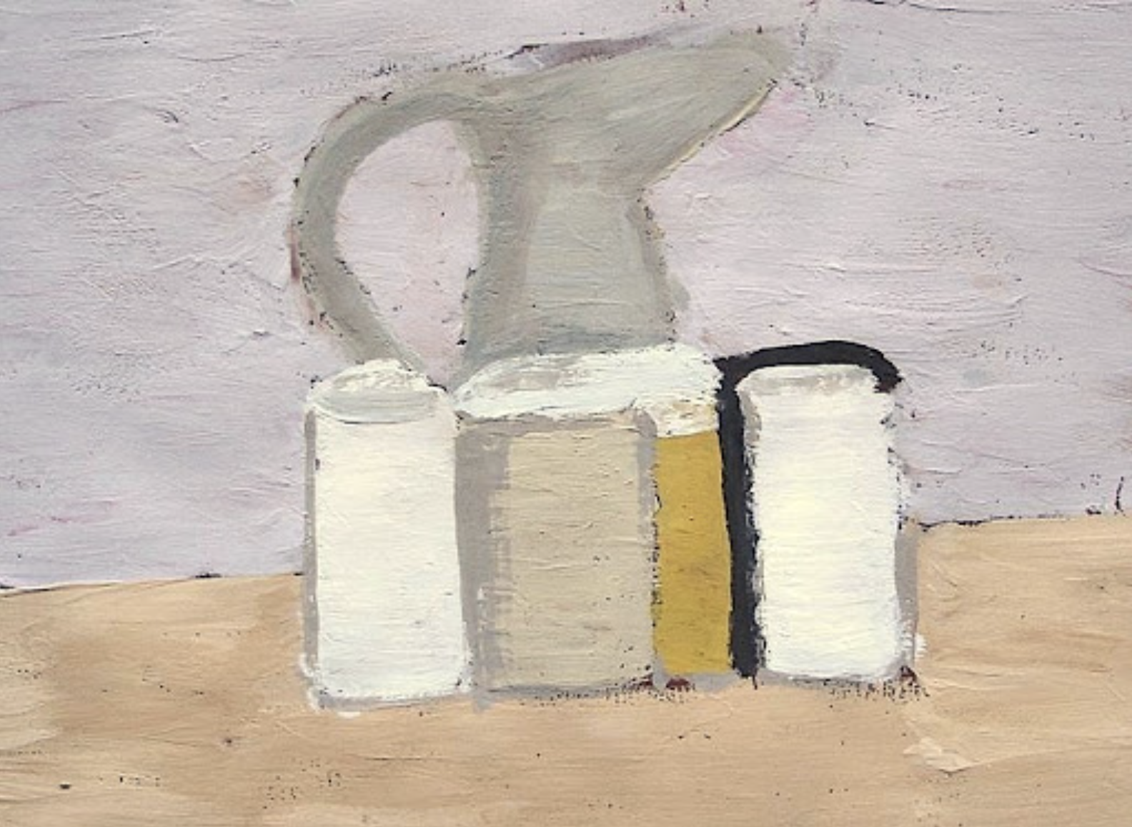
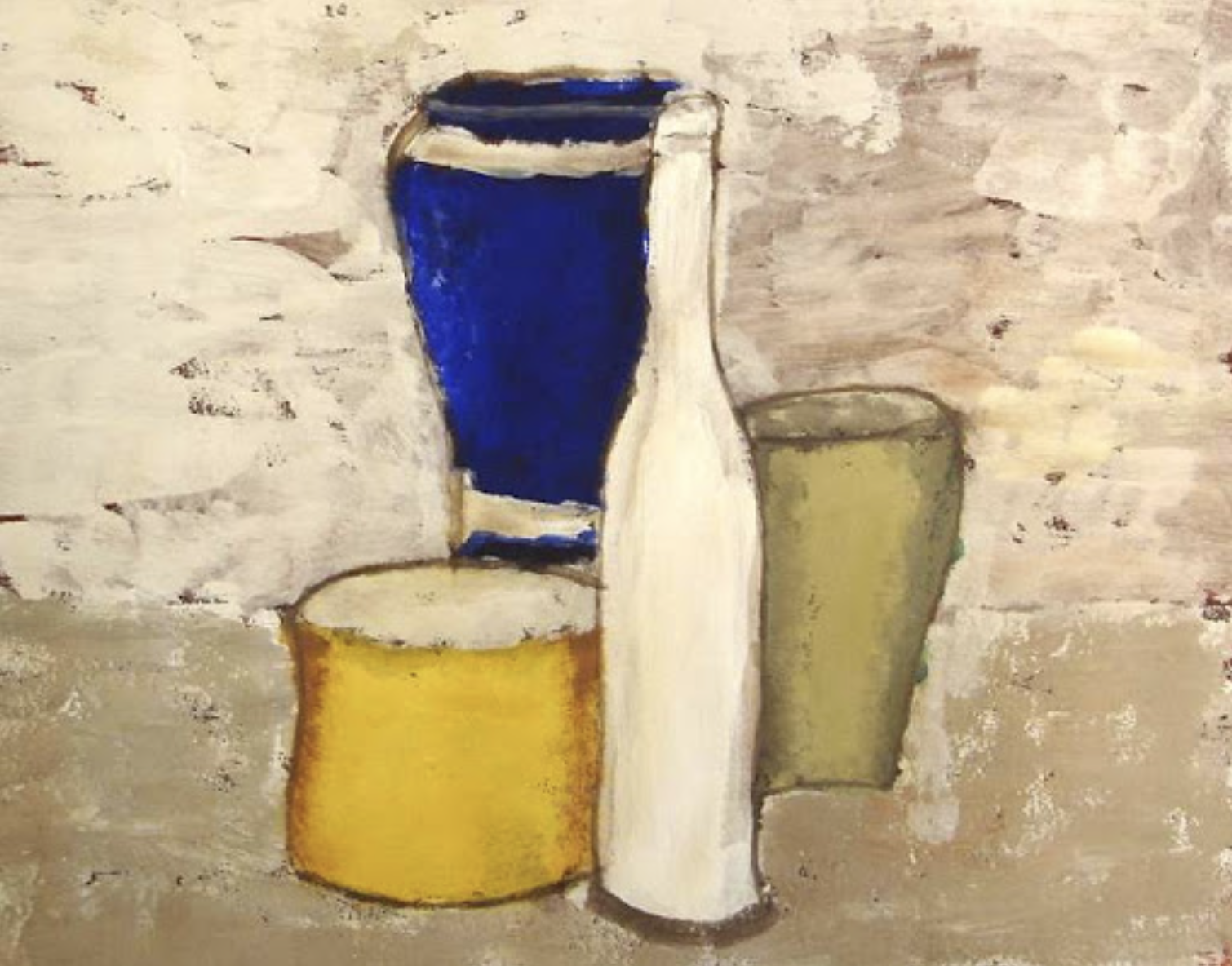
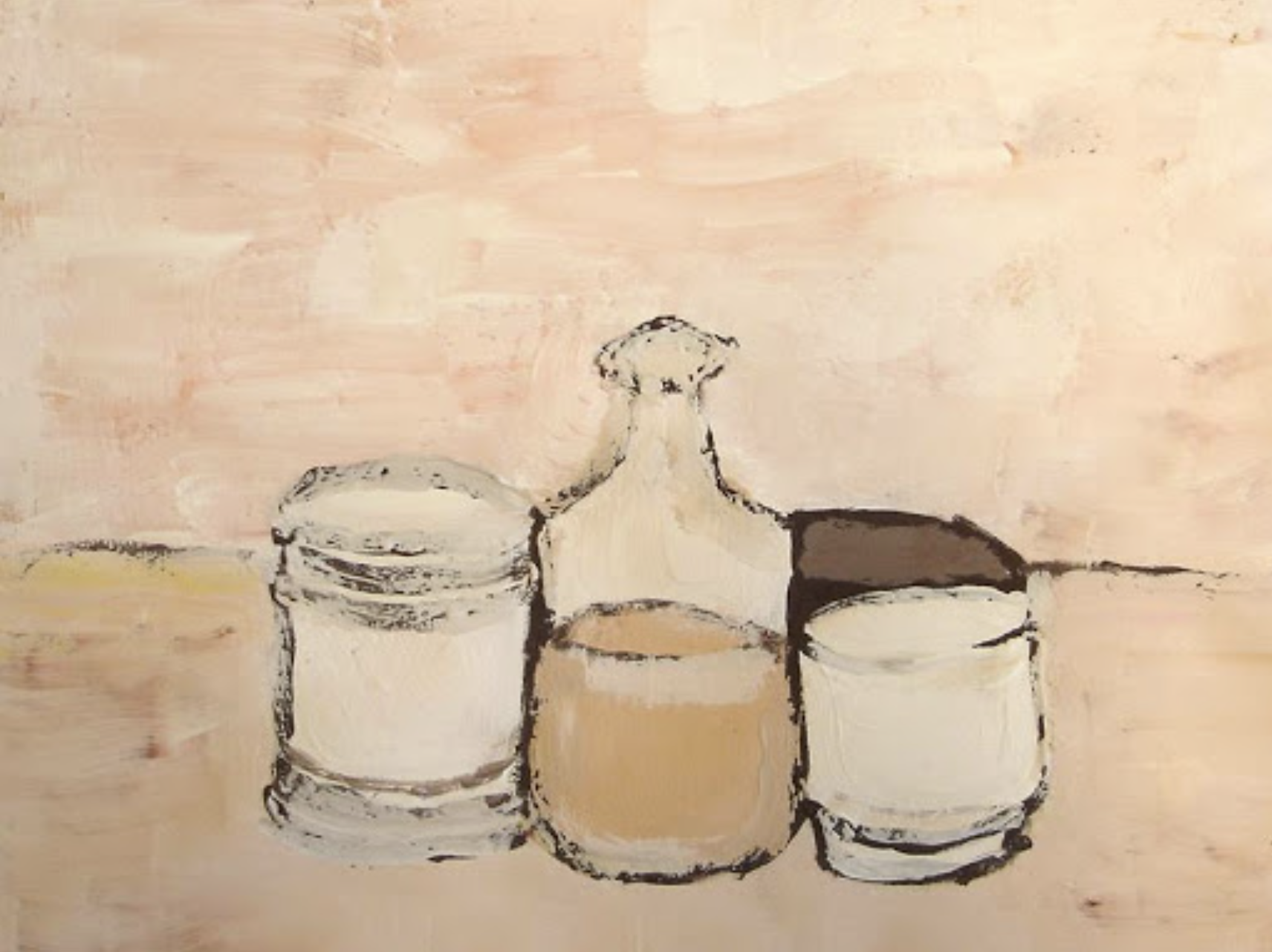
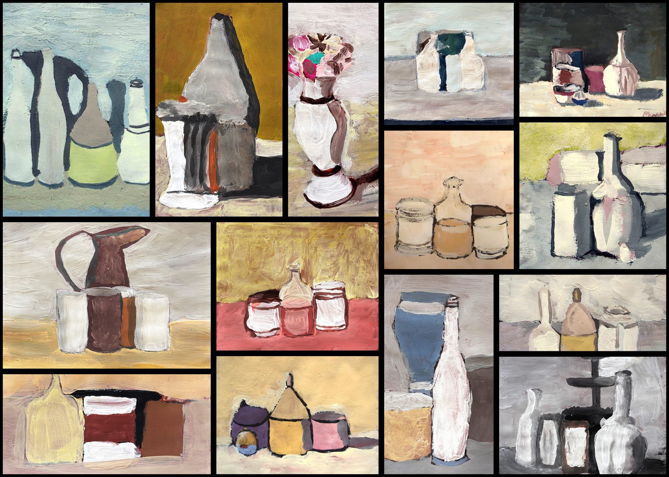
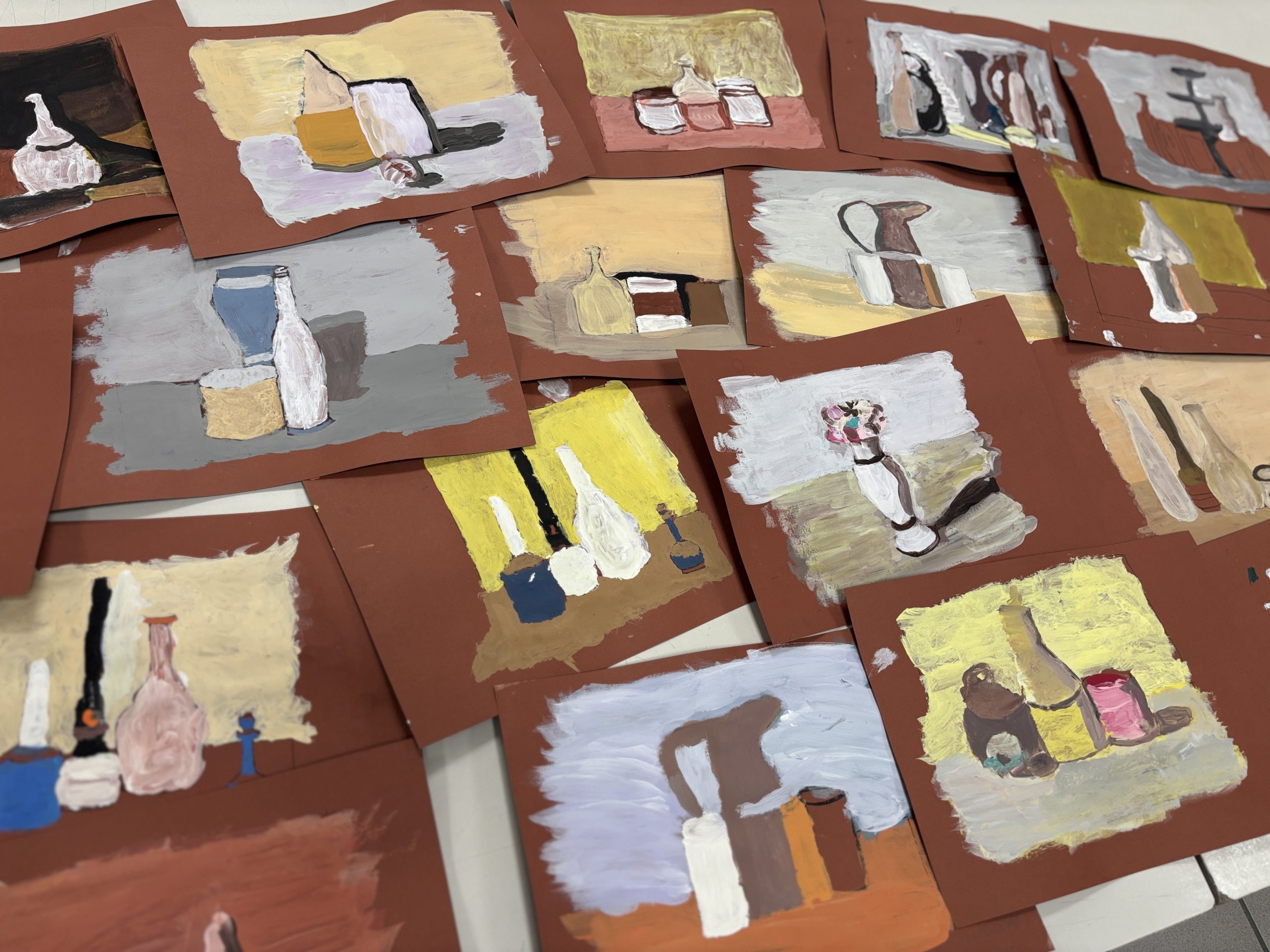
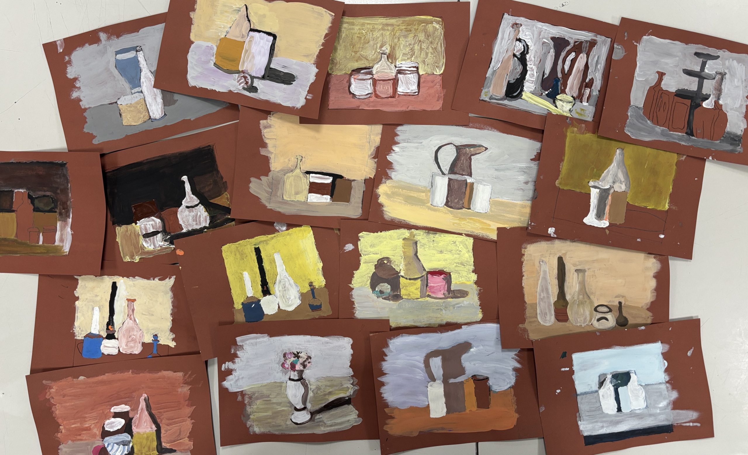
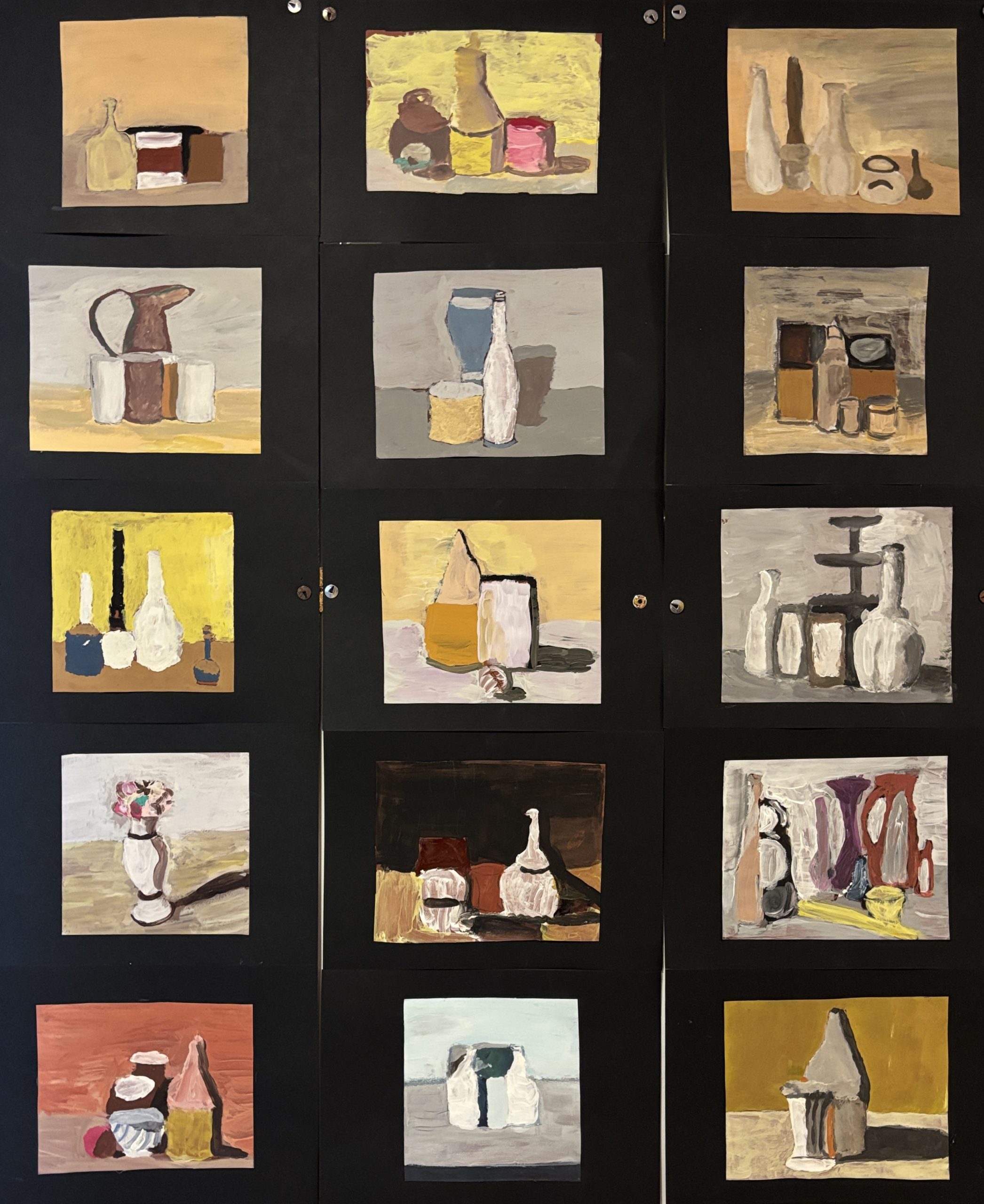
With our 7th-grade classes (Grade 7), we explored the poetic universe of Giorgio Morandi, immersing ourselves in his still lifes made of silence and suspension. This workshop allowed us to work on color skills, learning to observe tonal variations and manage volumes through color and light. In addition to technical skill, the activity stimulated a reflection on “learning how to look”: finding beauty and complexity in everyday, seemingly simple objects.
Materials needed:
- Photocopies of Morandi’s artworks
- Tracing paper and carbon paper
- Brown cardstock (for the background)
- Tempera paints and brushes
- Black cardstock (for the frame)
- Scissors and glue
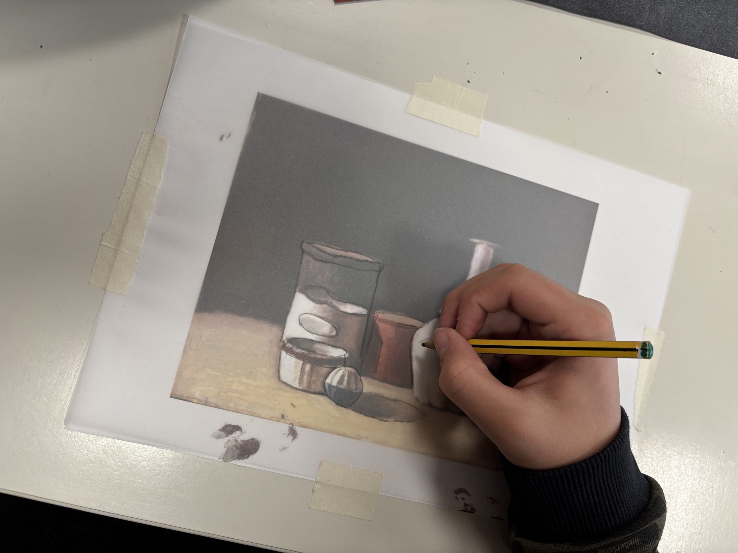
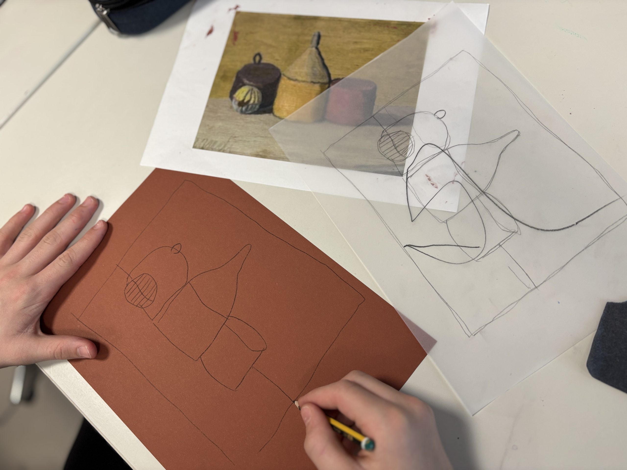
To begin, each student chose an artwork by the master. We worked on small-format photocopies to create “miniature” master copies. The first step was the study of shapes: we placed tracing paper over the photocopy and created a linear pencil drawing, identifying not only the outlines of the objects but also the perimeters of the shadows, highlights, and every color variation present in the painting.
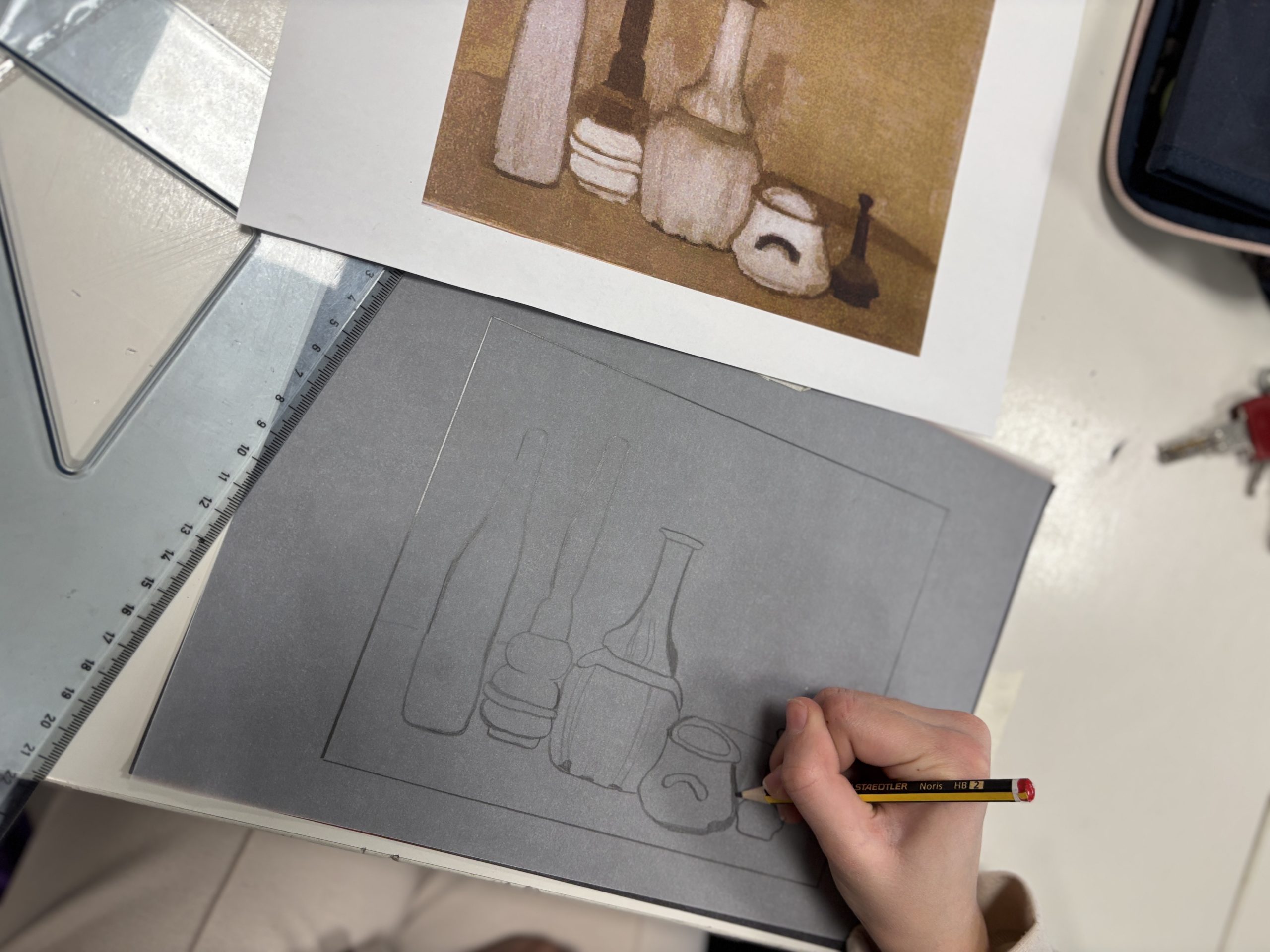
Once we obtained our “map” of lines, we transferred the drawing onto the brown cardstock using carbon paper. In this phase, we were very precise in transferring both the outer edge of the painting and all the previously identified internal traces, creating a perfect base for the subsequent painting phase on the colored background.
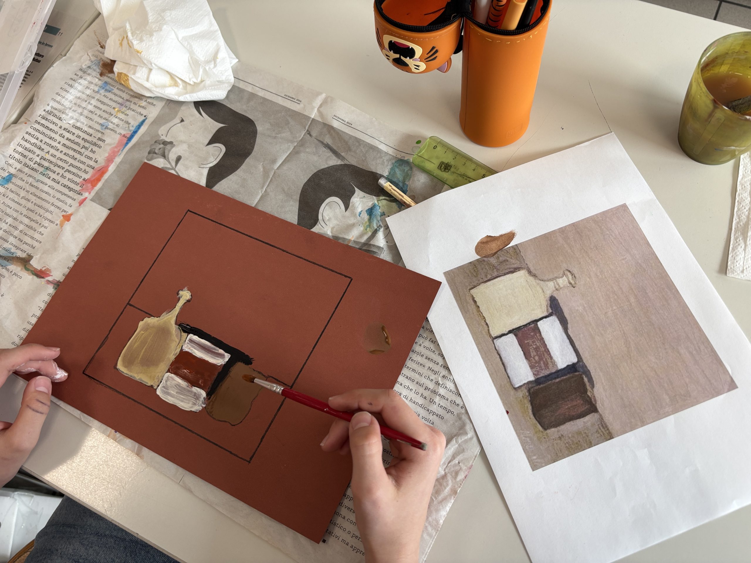
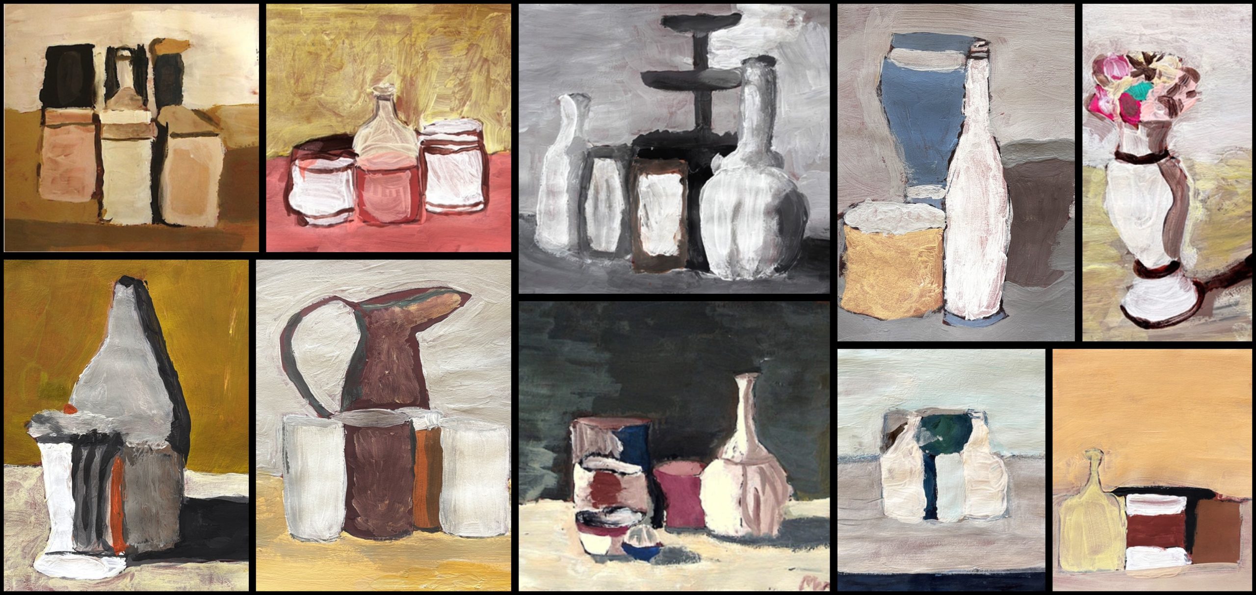
We then moved on to using tempera paints, trying to imitate Morandi’s thick, doughy texture (impasto) and subdued tones. The main challenge was creating the palette: we put our knowledge of color mixing into practice, giving life to “colored grays” and delicate tonal gradations through a clever use of black and white, striving for maximum chromatic fidelity to the original.
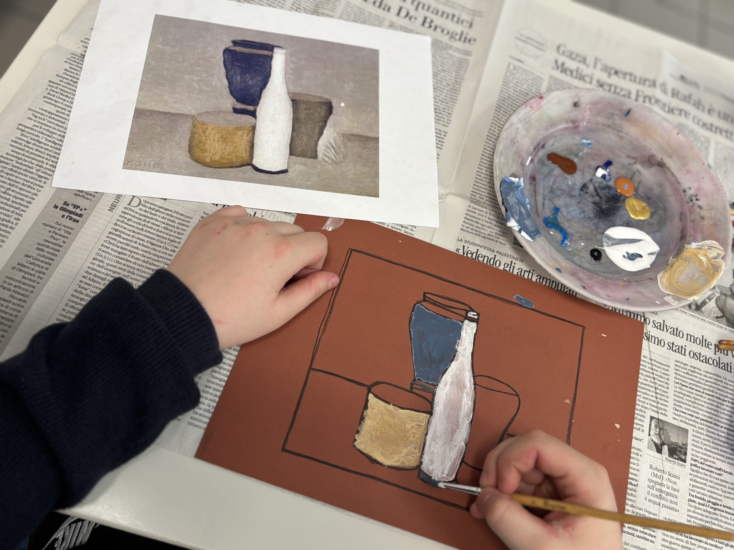
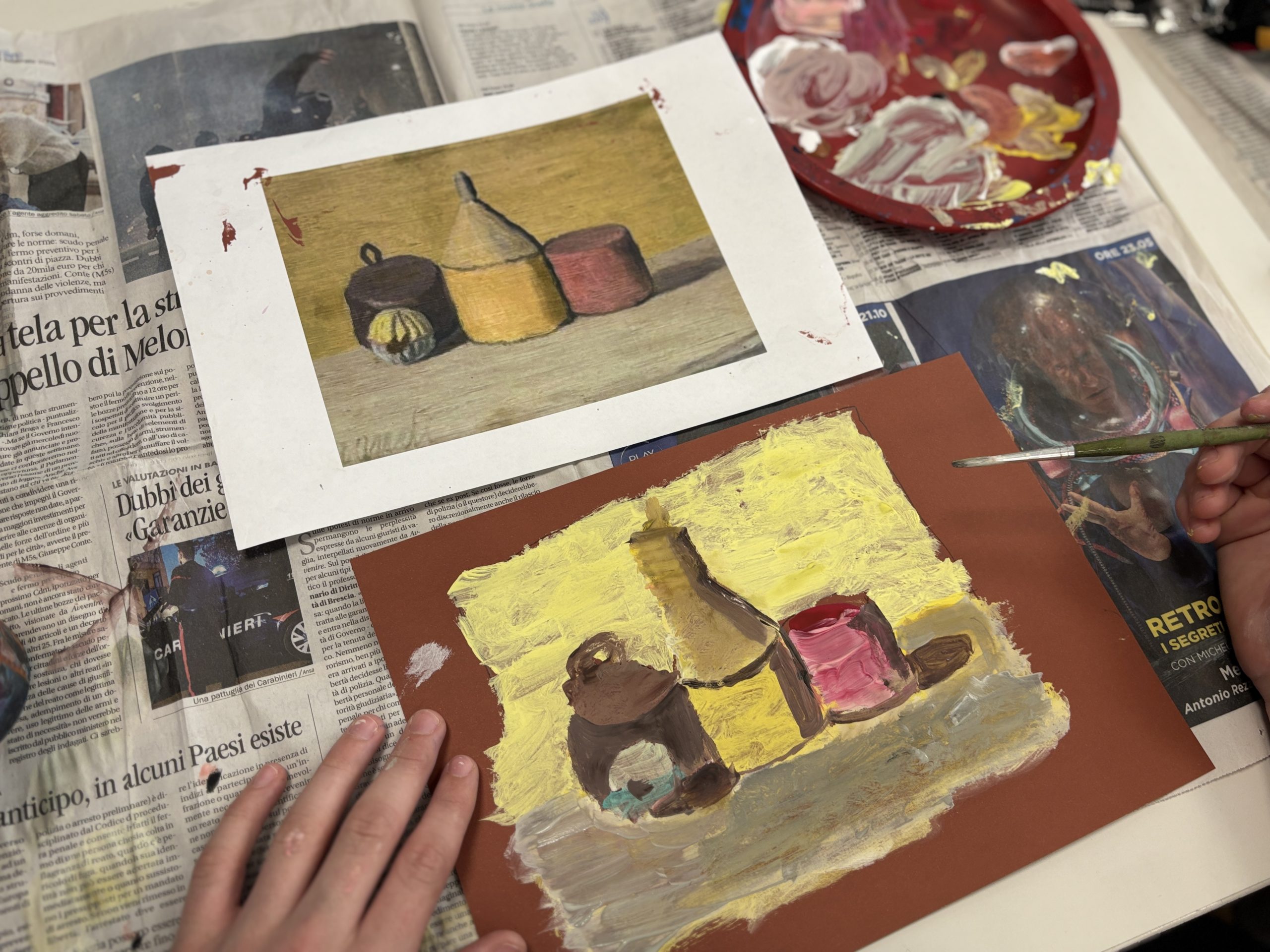
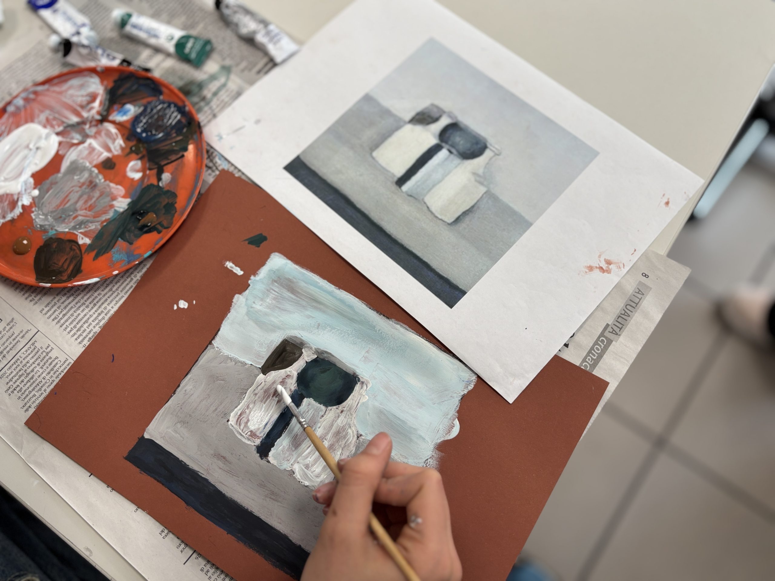
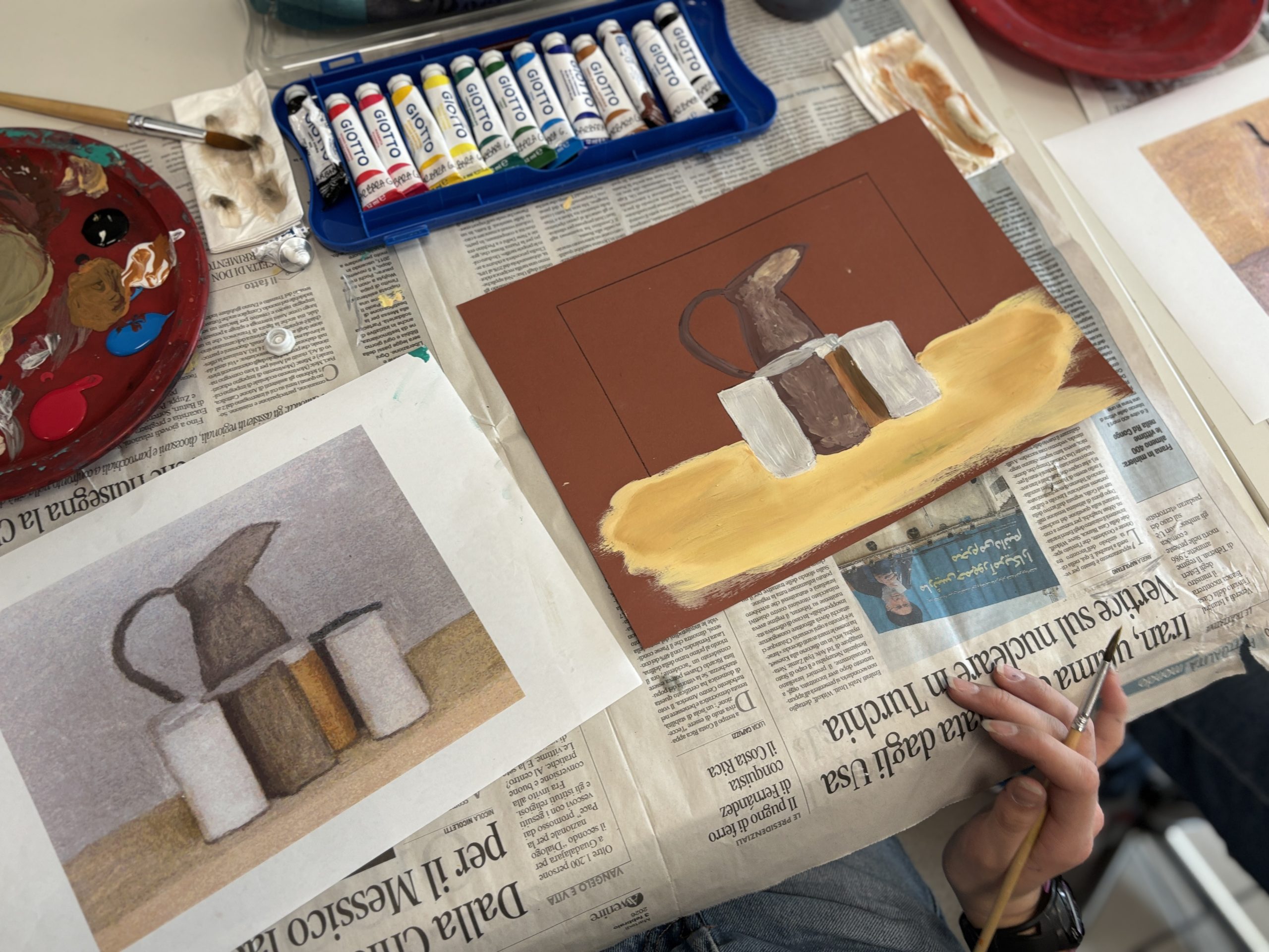
Finally, to highlight the compositional rigor of our works, we cut out the painting following the edges traced at the beginning. We then glued the finished work onto black cardstock, creating a dark frame that enhances, by contrast, the soft colors and the “poetics of silence” typical of Morandi’s still lifes.
How to create “Morandi Grays”
To prevent the grays from looking like mud or simple ash, we learned to create them starting from primary colors and their complements, instead of just using black.
- Neutral Gray: We started by mixing the three primaries (Yellow, Red, Blue) in equal parts to obtain a dark brown, almost black, to which we added White.
- Tonal Variations: To make the gray warmer or cooler, we added a touch of extra color:
- Warm Gray: A hint of red or orange for the reflections of terracotta.
- Cool Gray: A hint of blue or violet for the shadows of glass bottles.
- Greenish Gray: A hint of yellow and blue for the duller, dustier areas.
- The Touch of White: Essential for achieving that thick consistency typical of Morandi; white is not just for lightening, but for giving body to the brushstroke.