This workshop was designed to help 6th grade students reflect on their identity, tastes, and emotions, transforming these abstract elements into a visible and concrete landscape: their “inner island.” It’s a perfect activity for the start of the school year or for identity-related orientation programs. The objectives of the activity touch on various educational themes:
- Develop self-analysis and emotional awareness.
- Understand and apply the basic principles of cartography (readability, naming, use of color).
- Experiment with mixed media (colored pencils and “wet-on-wet” watercolors).
- Use shape as an expressive element (the initial letter of the name).
Materials and methods
- drawing paper A4 or A3
- Colored pencils
- Pencils, eraser
- Watercolors, paintbrushes, water
- Fine-tip black marker
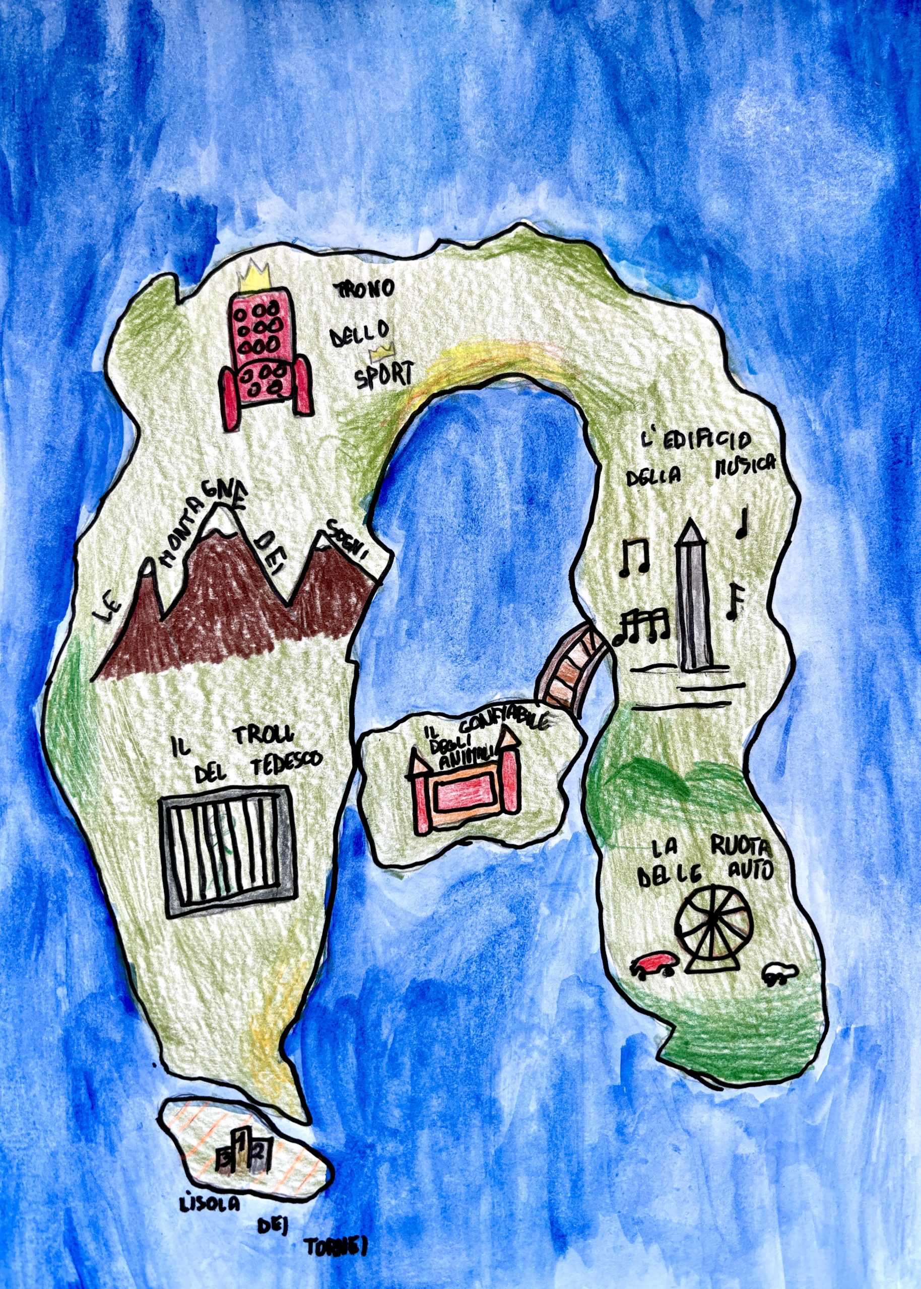
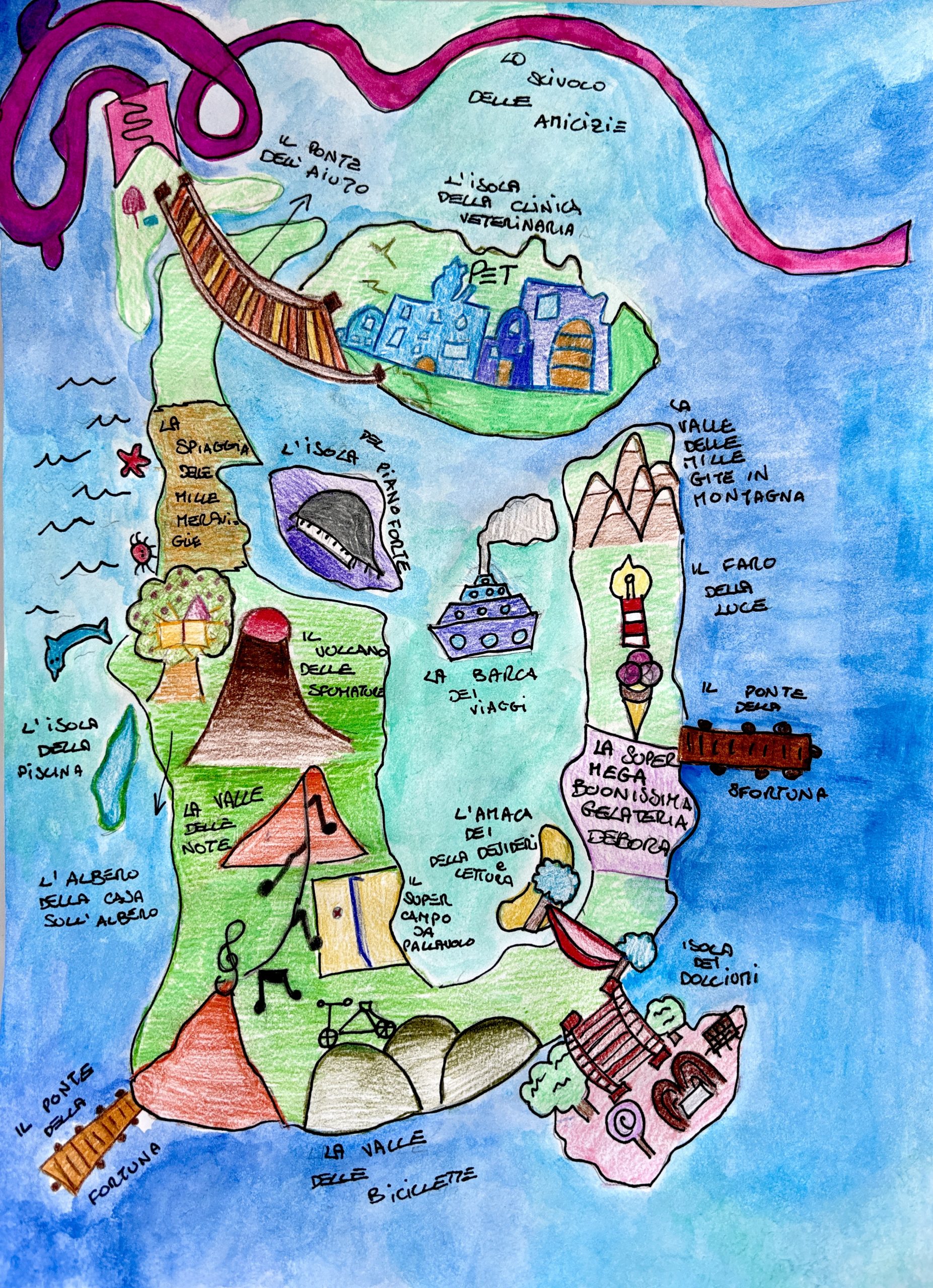
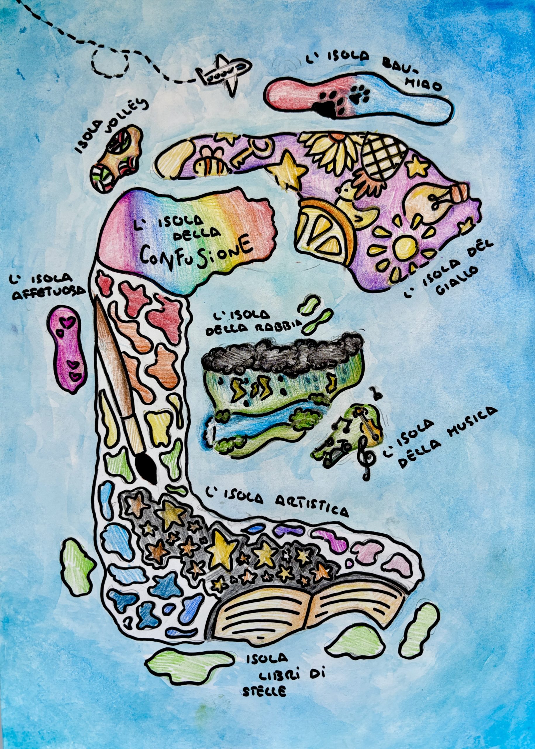
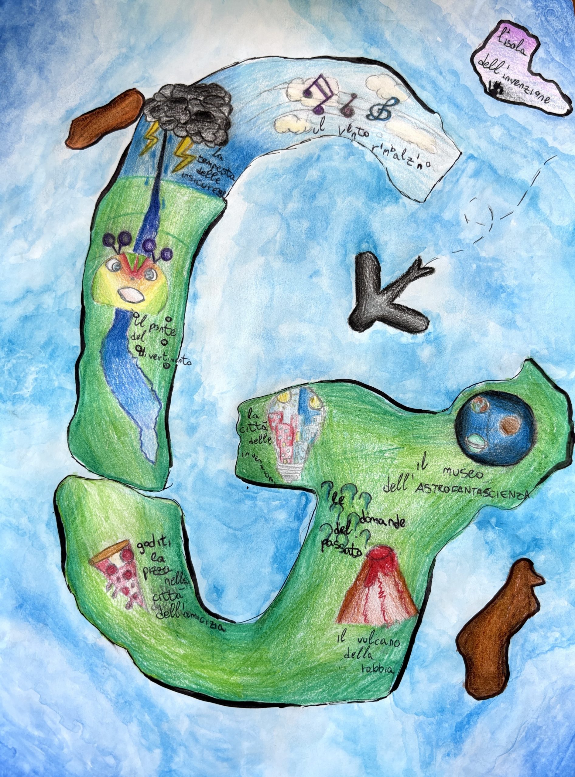
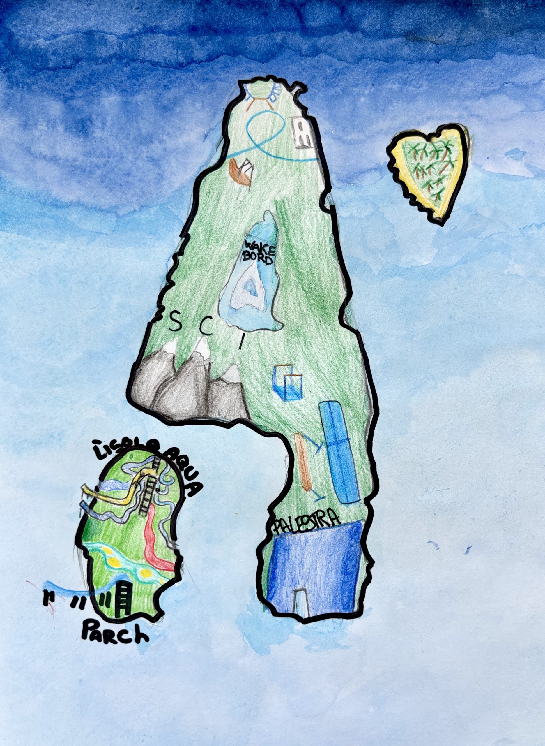
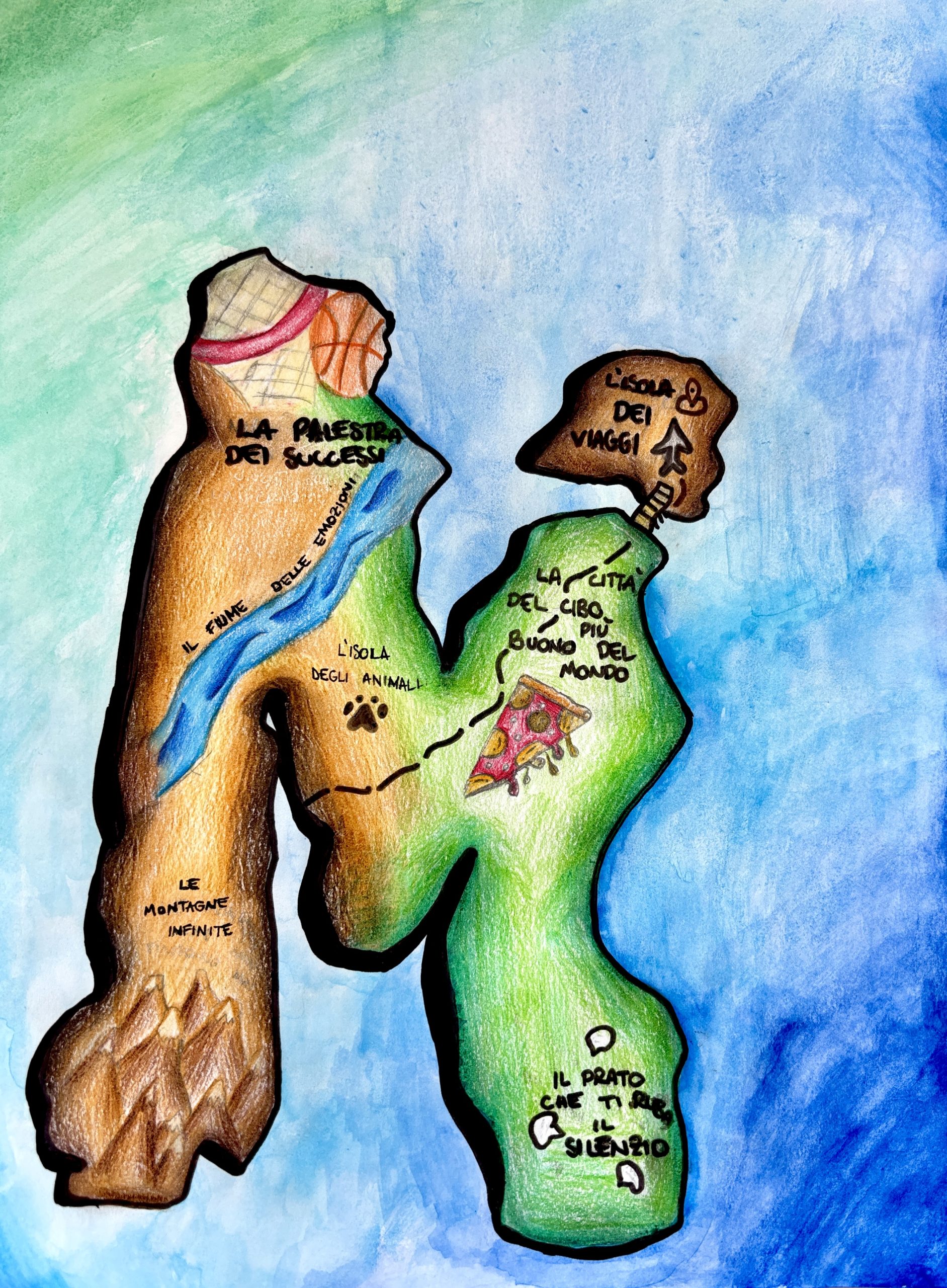
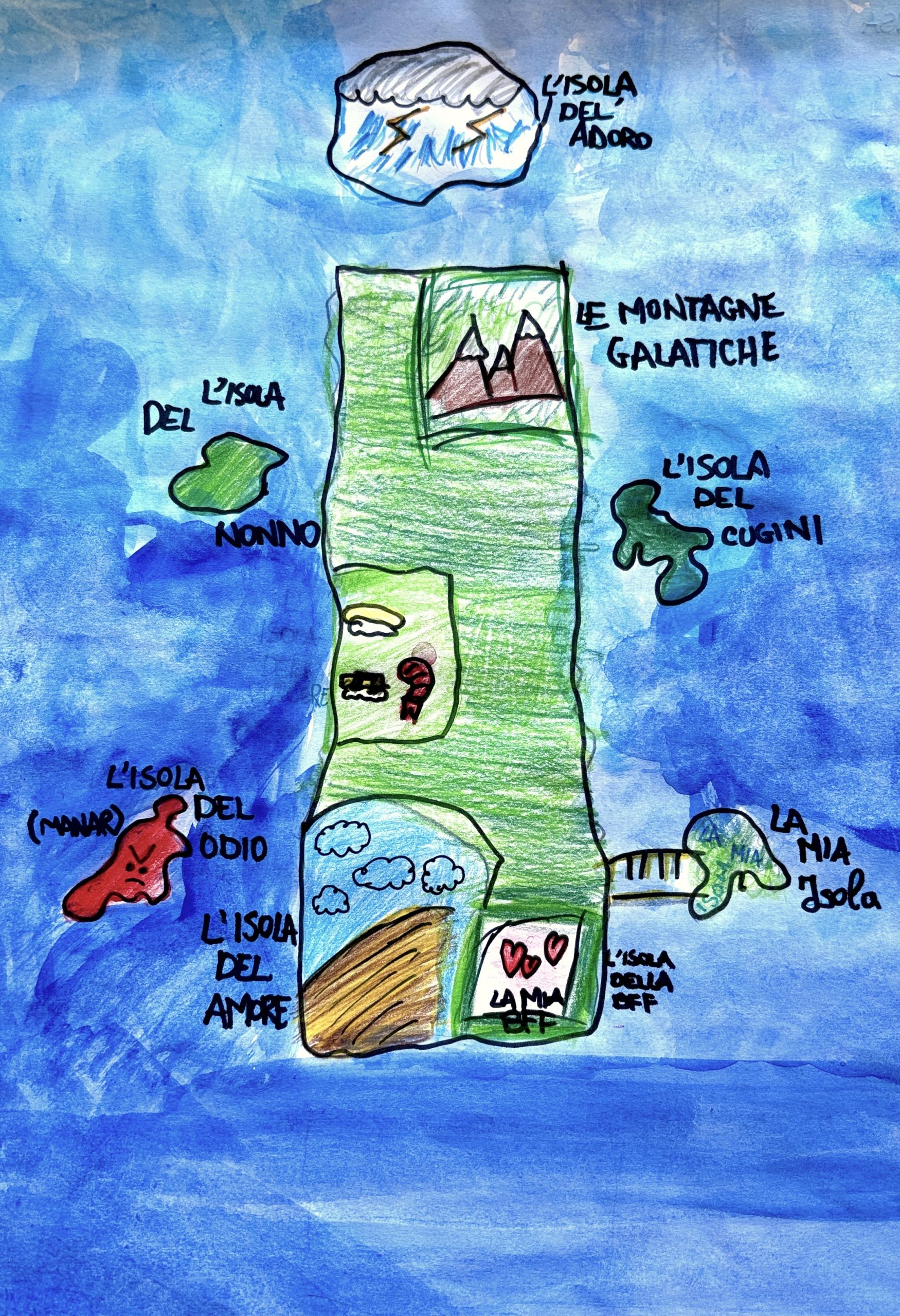
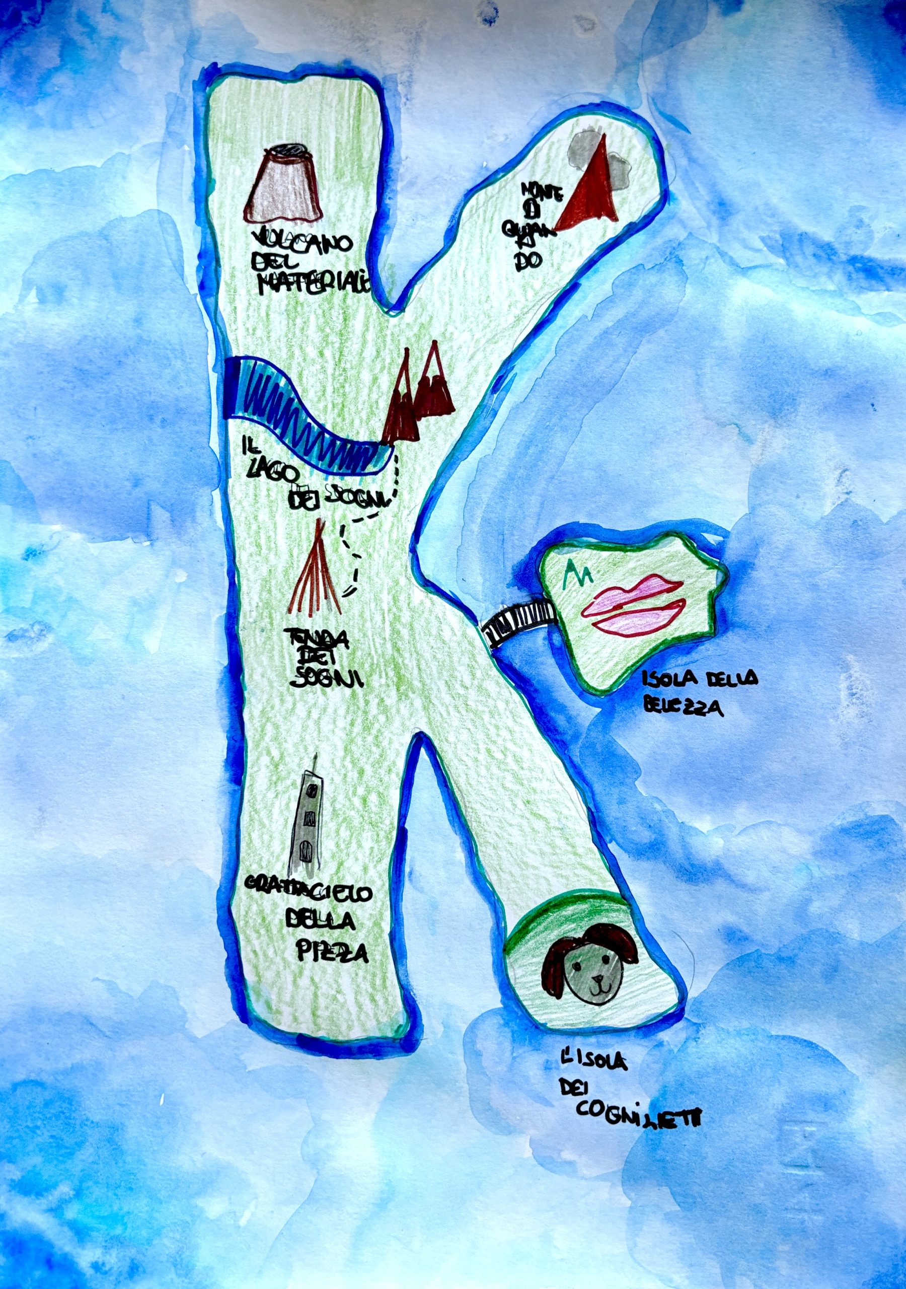
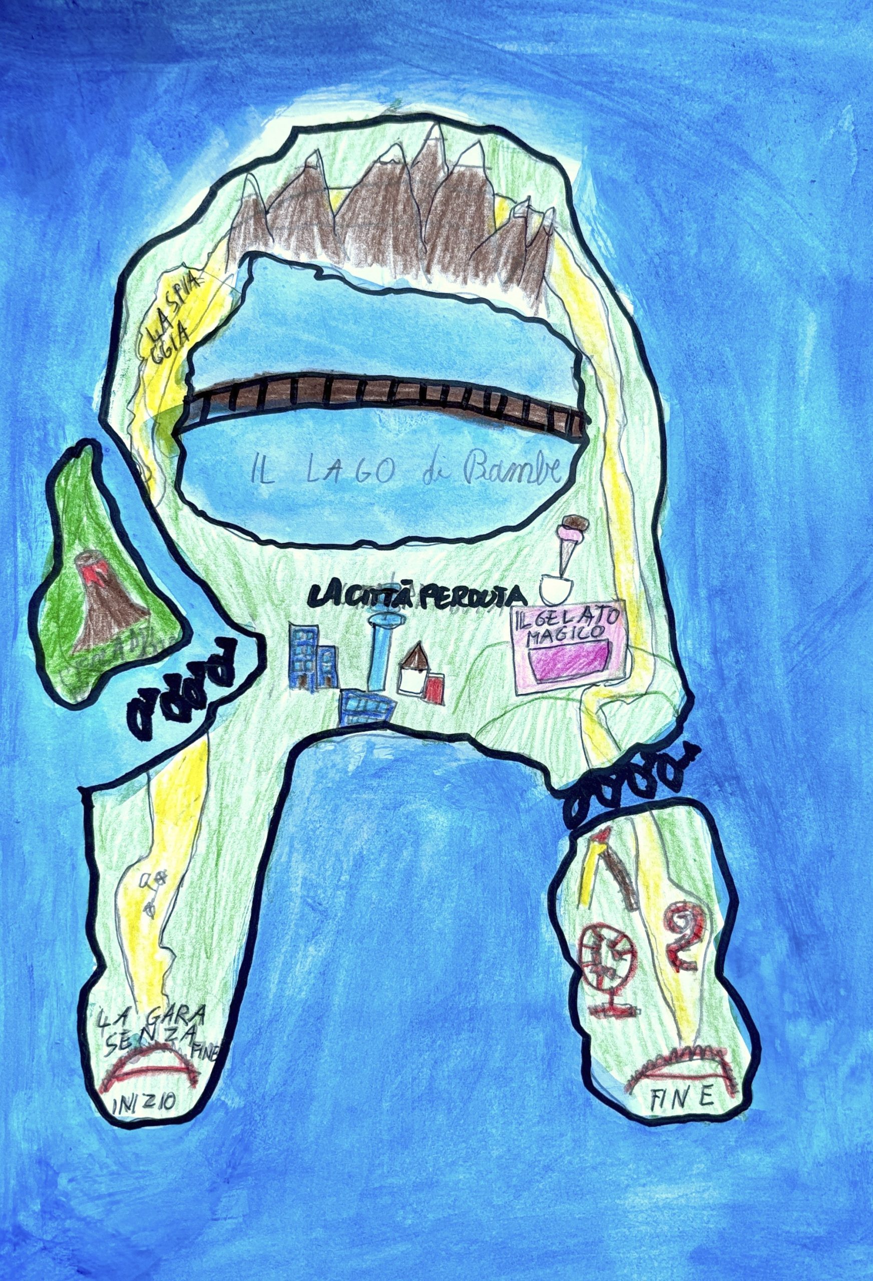
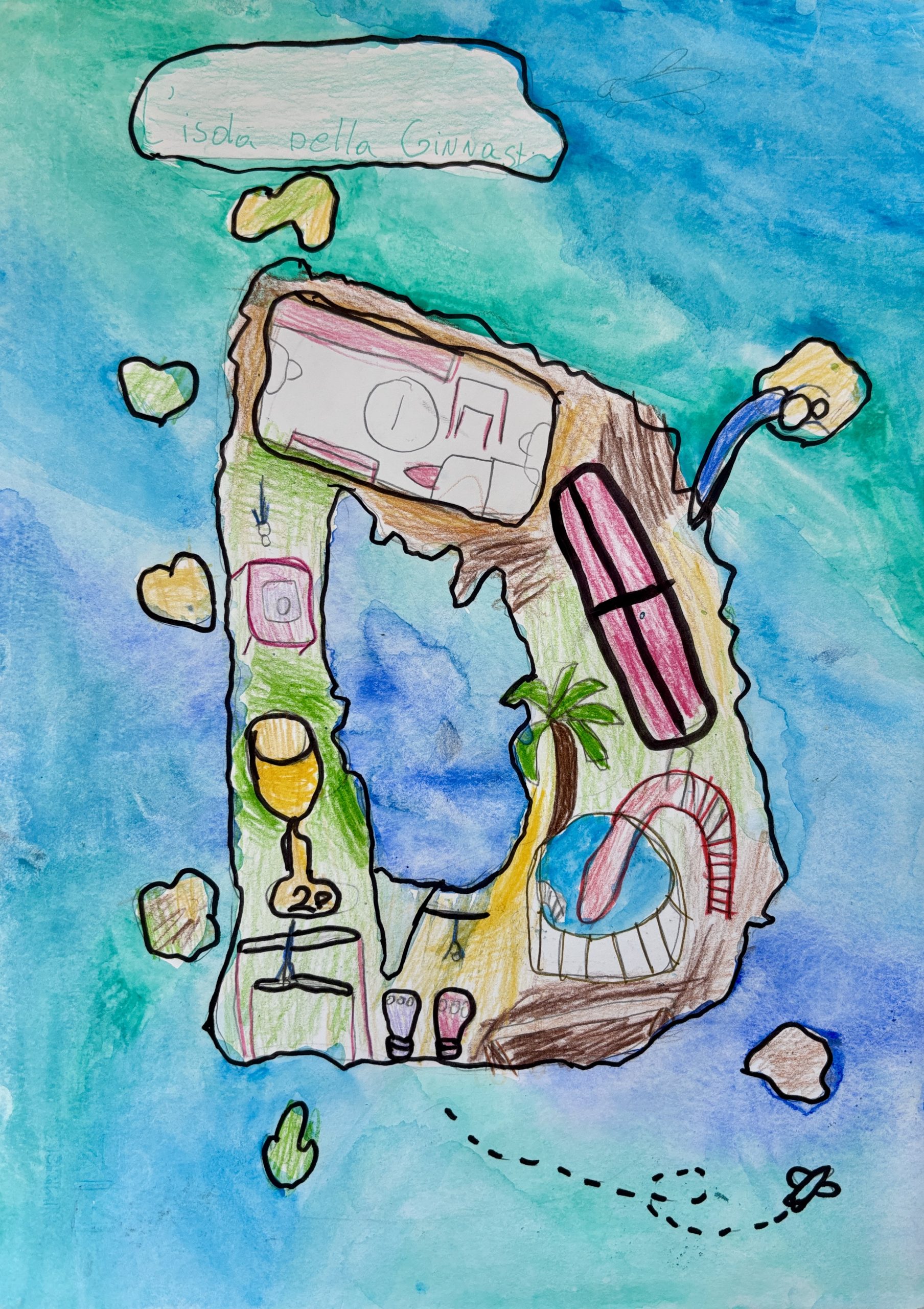
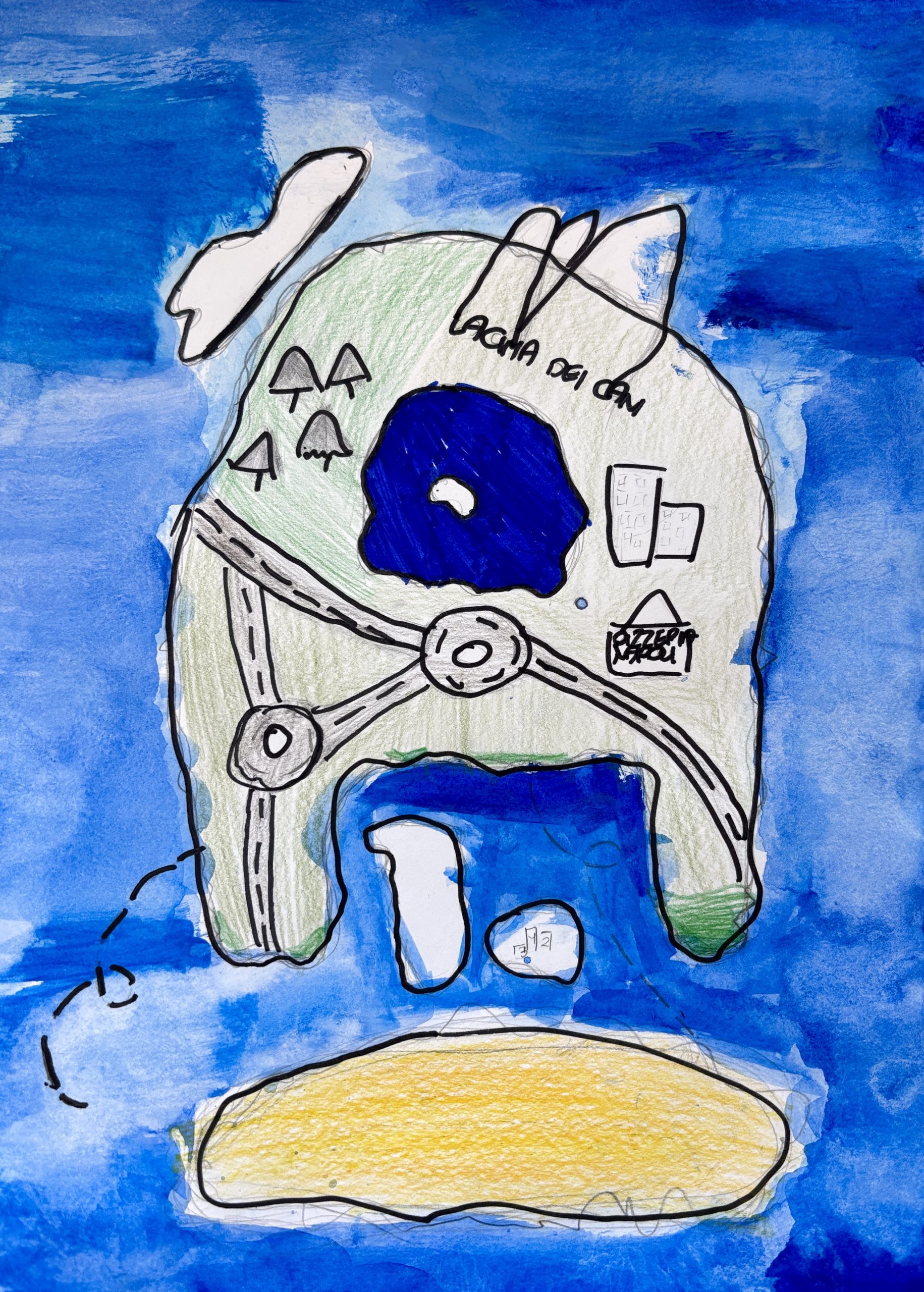
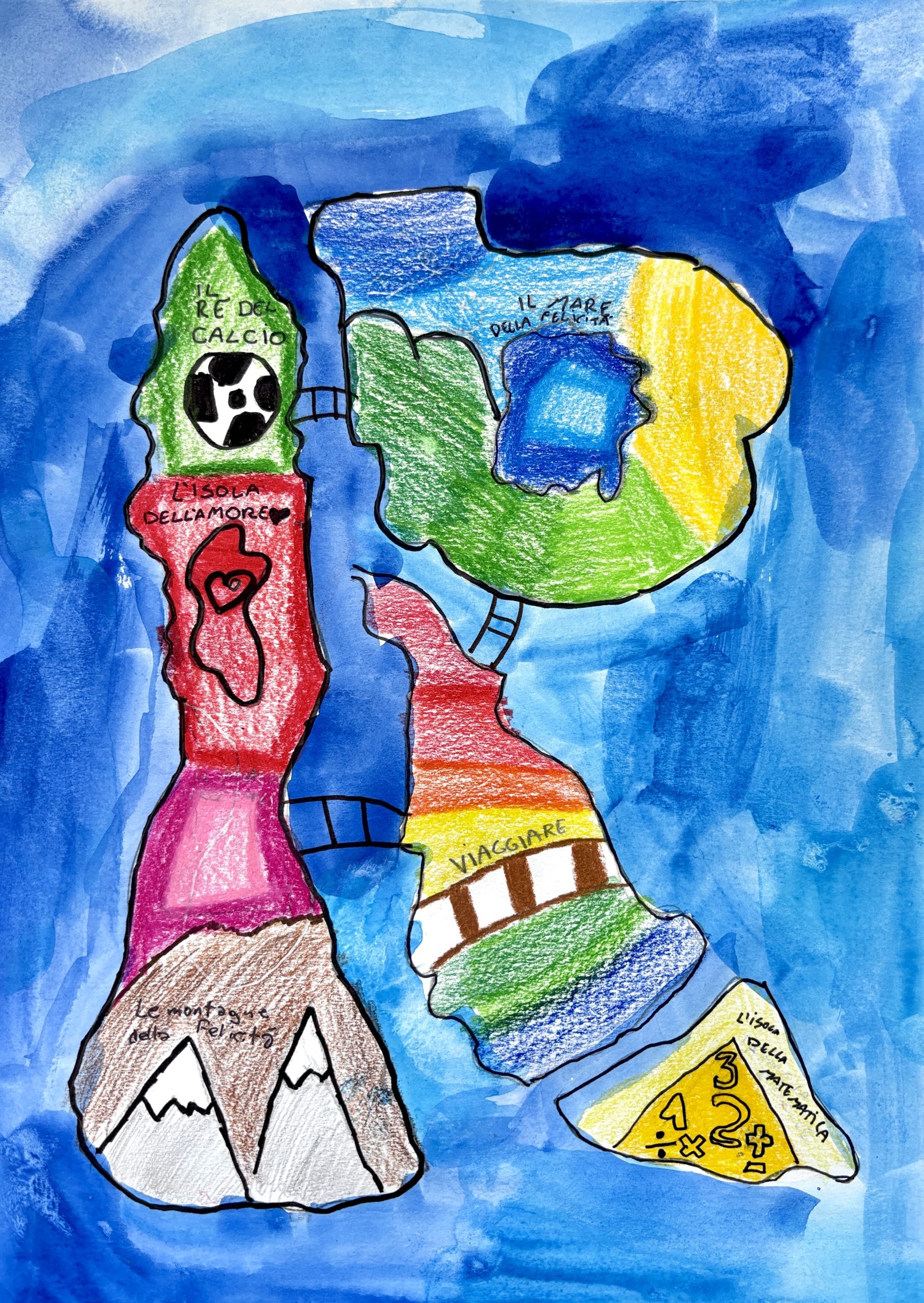
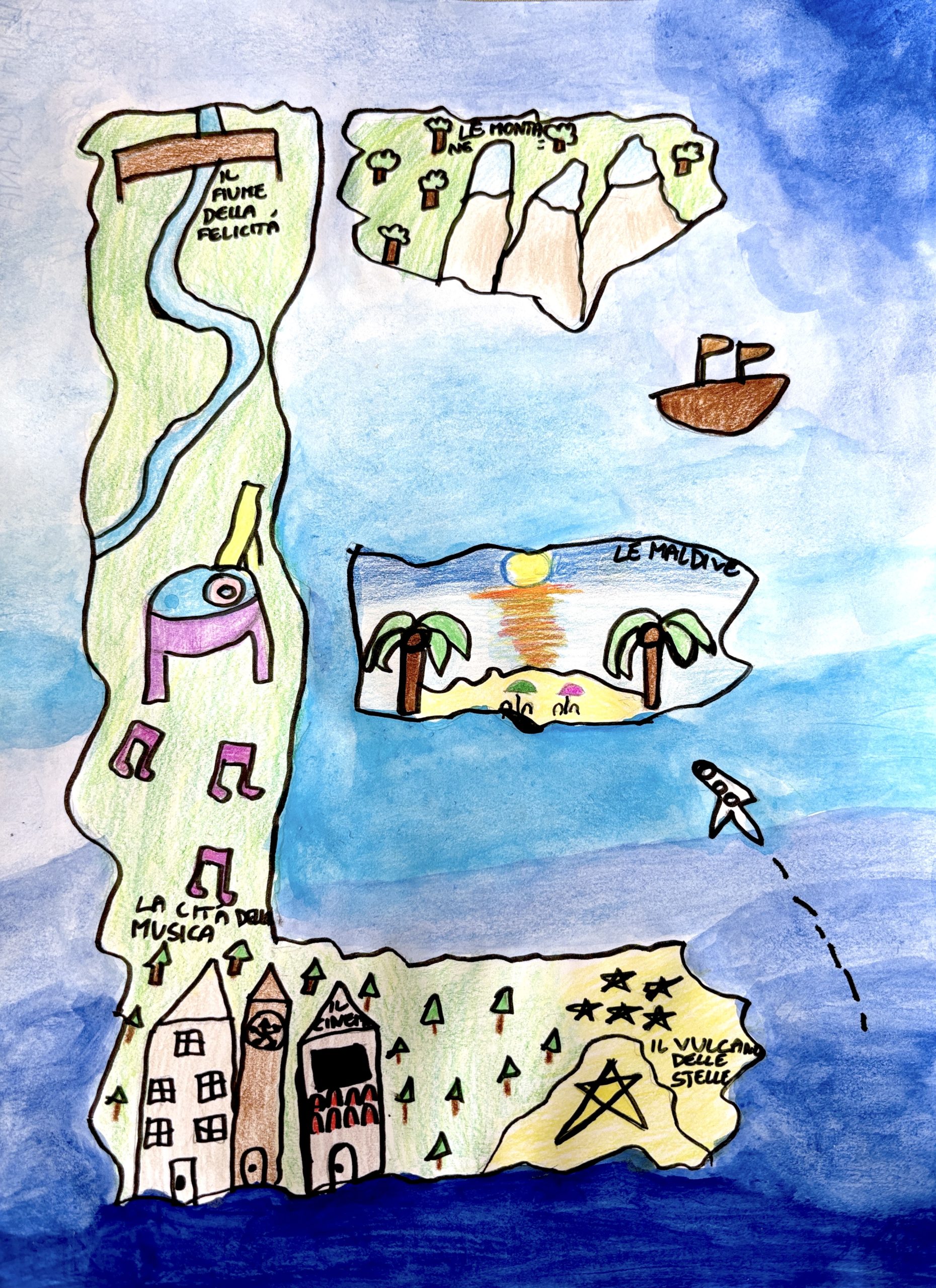
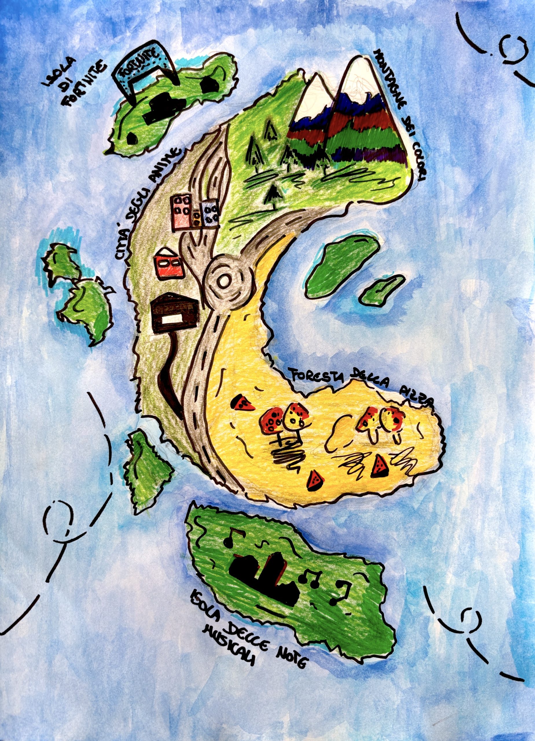
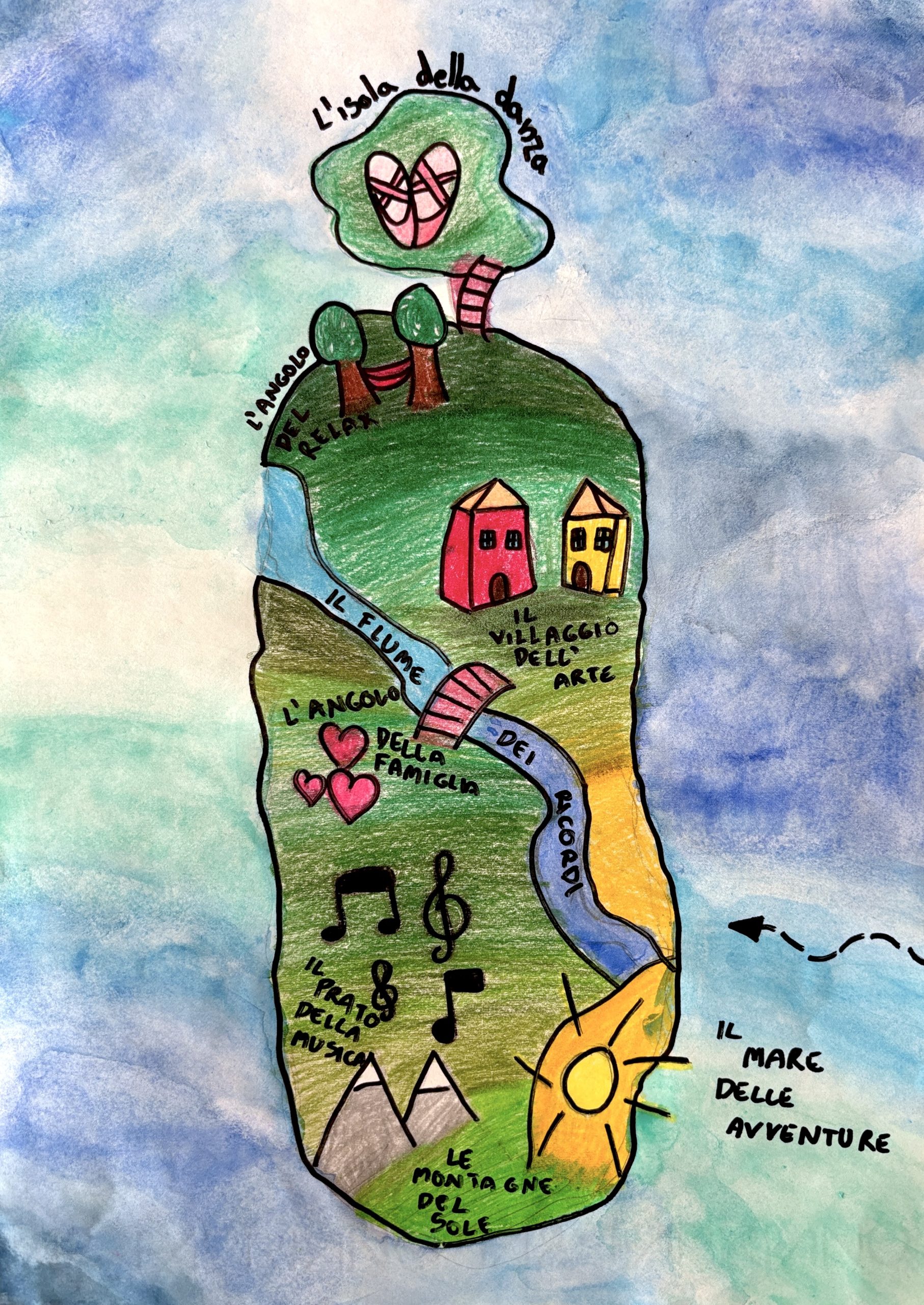
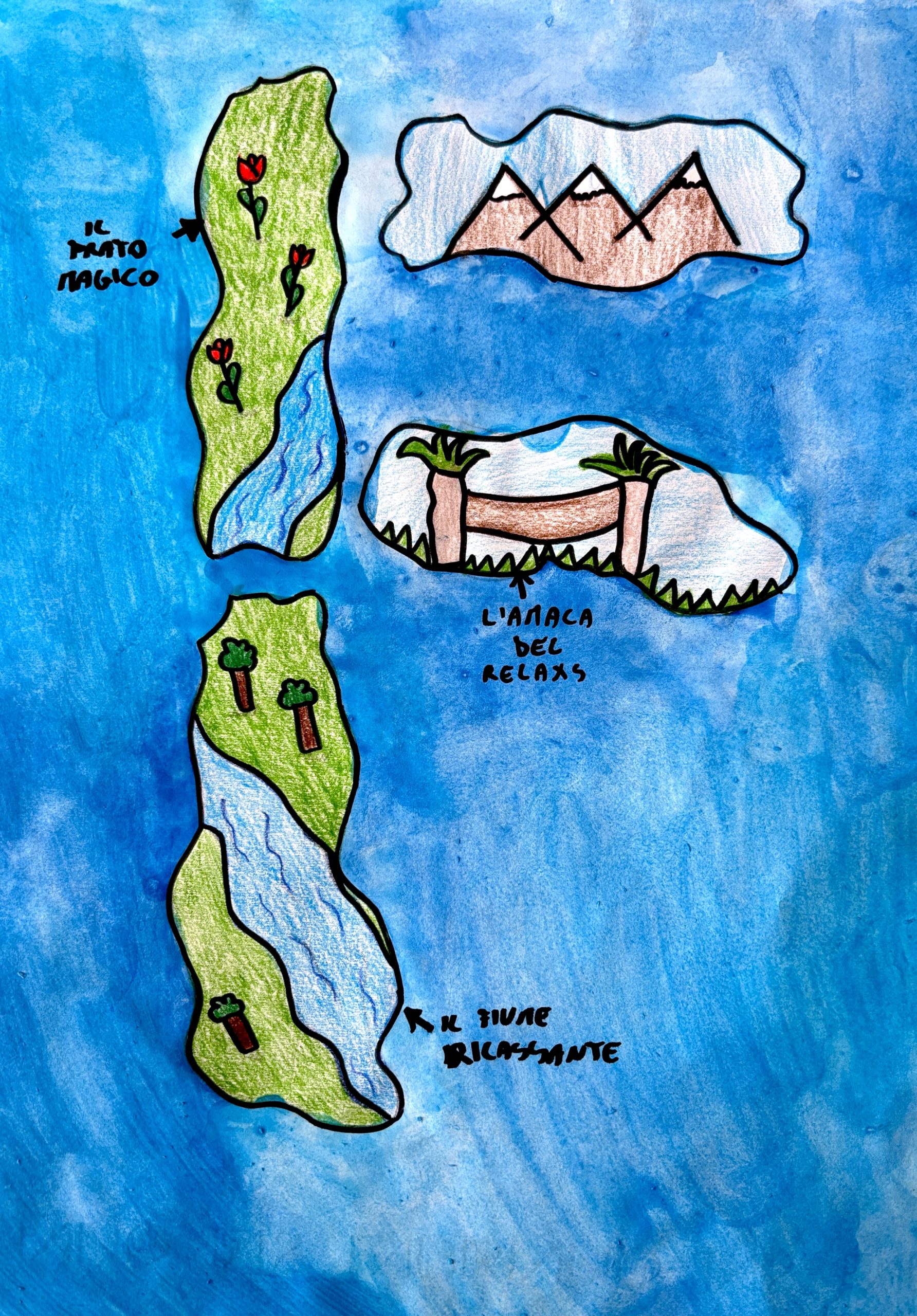
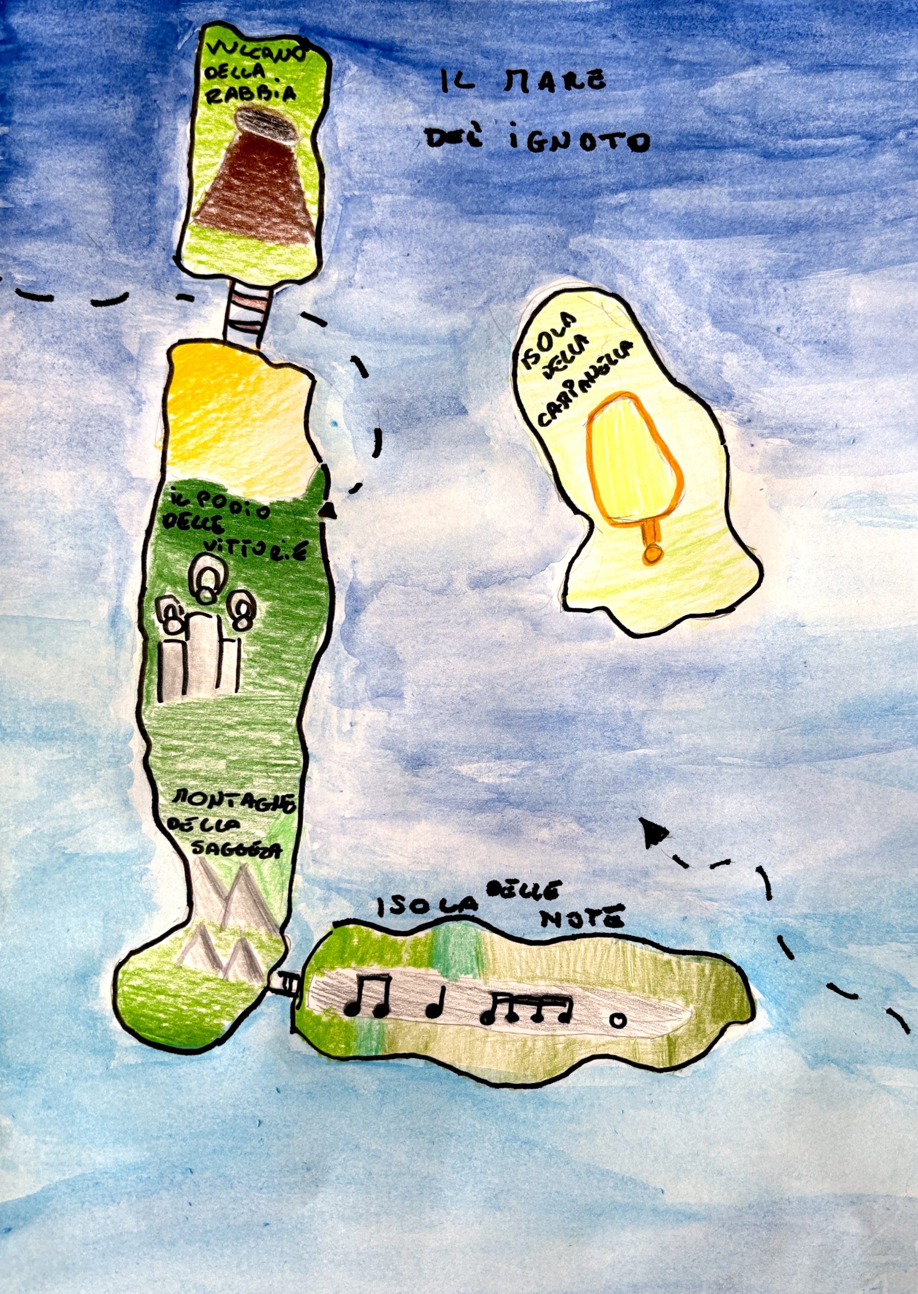
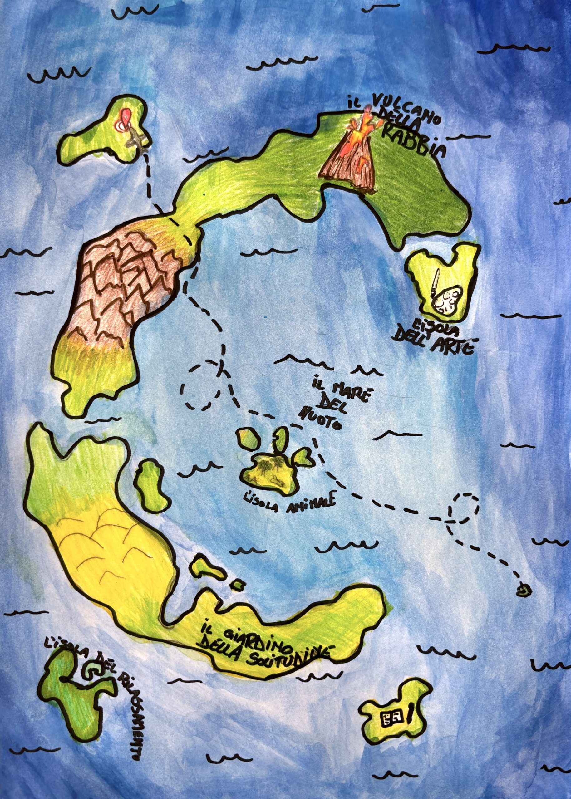
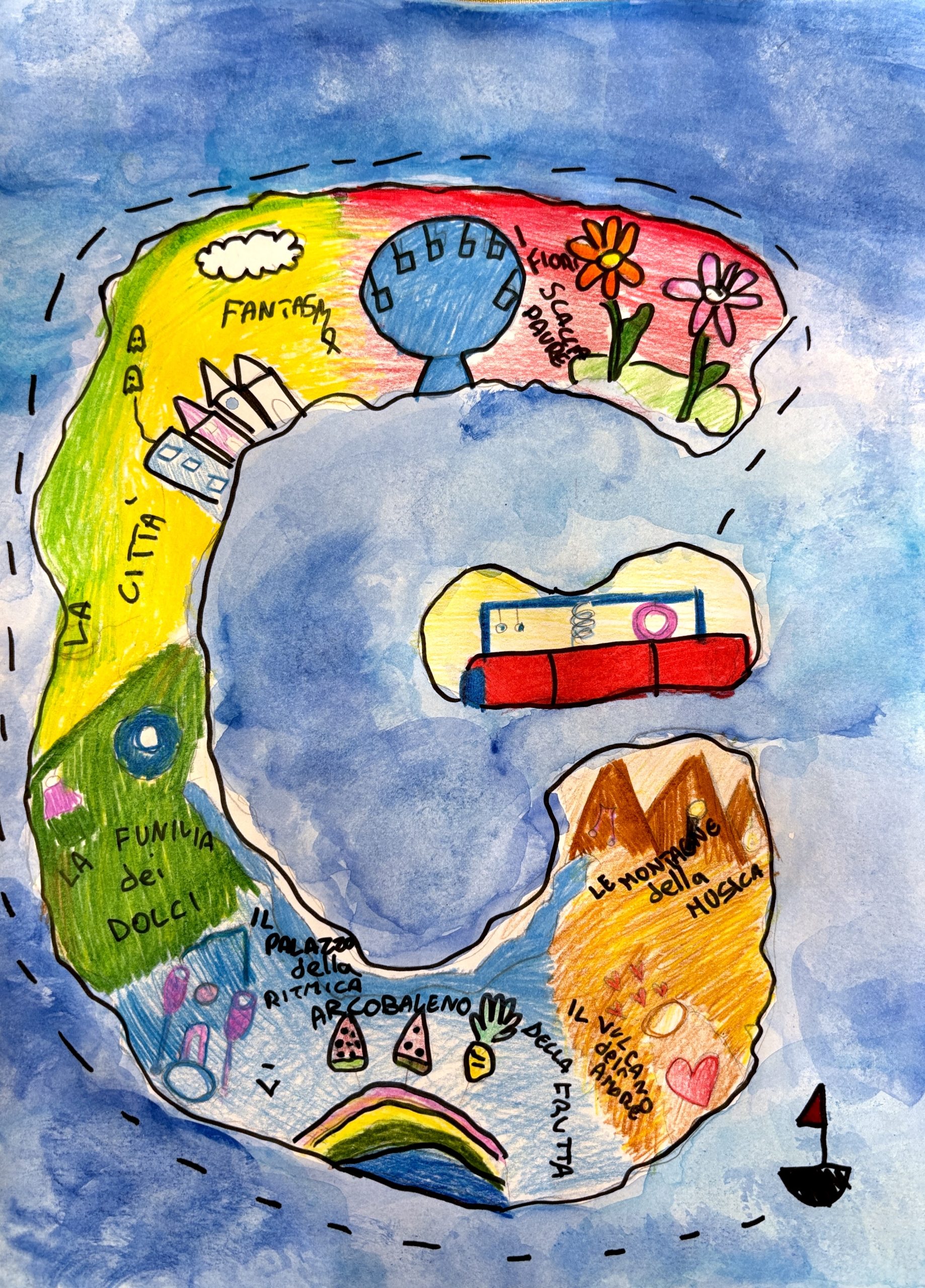
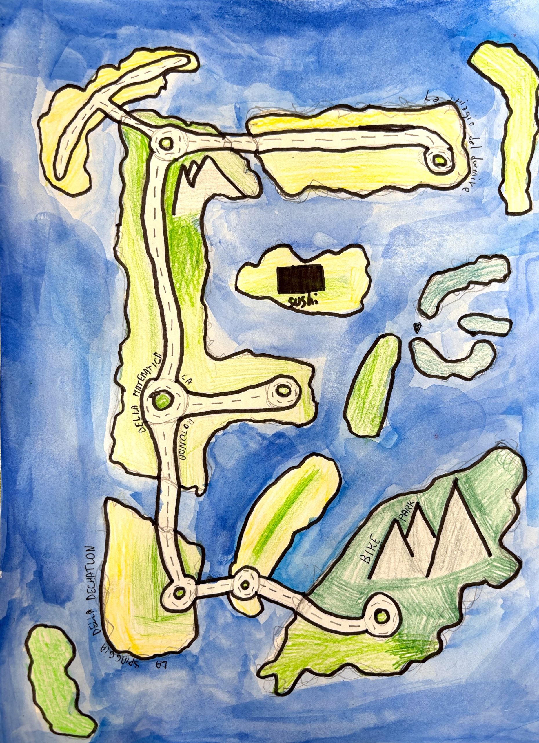
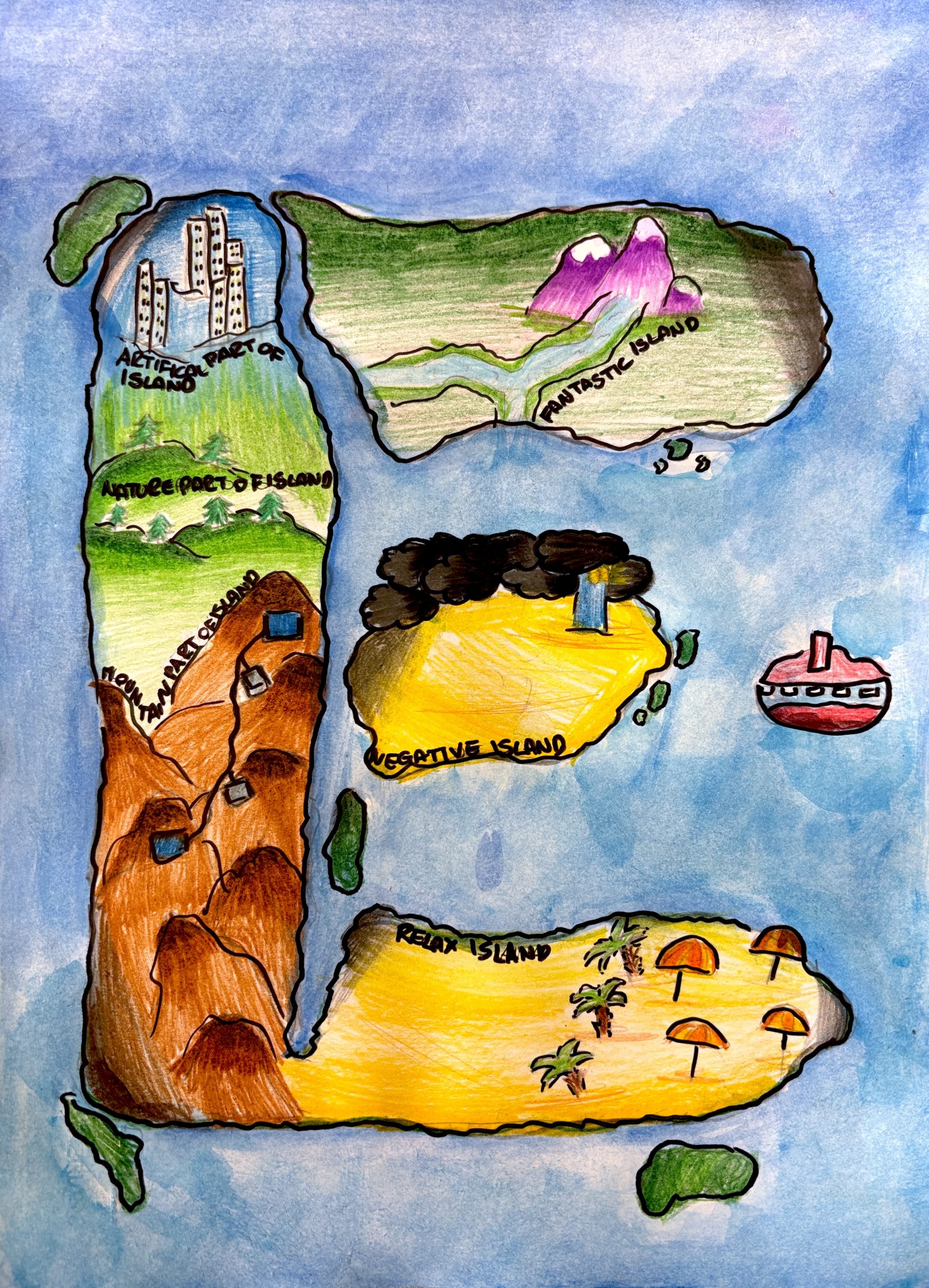
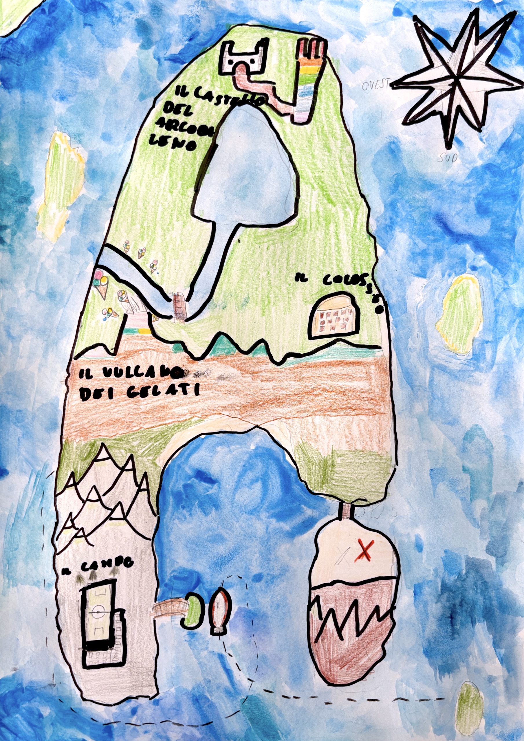
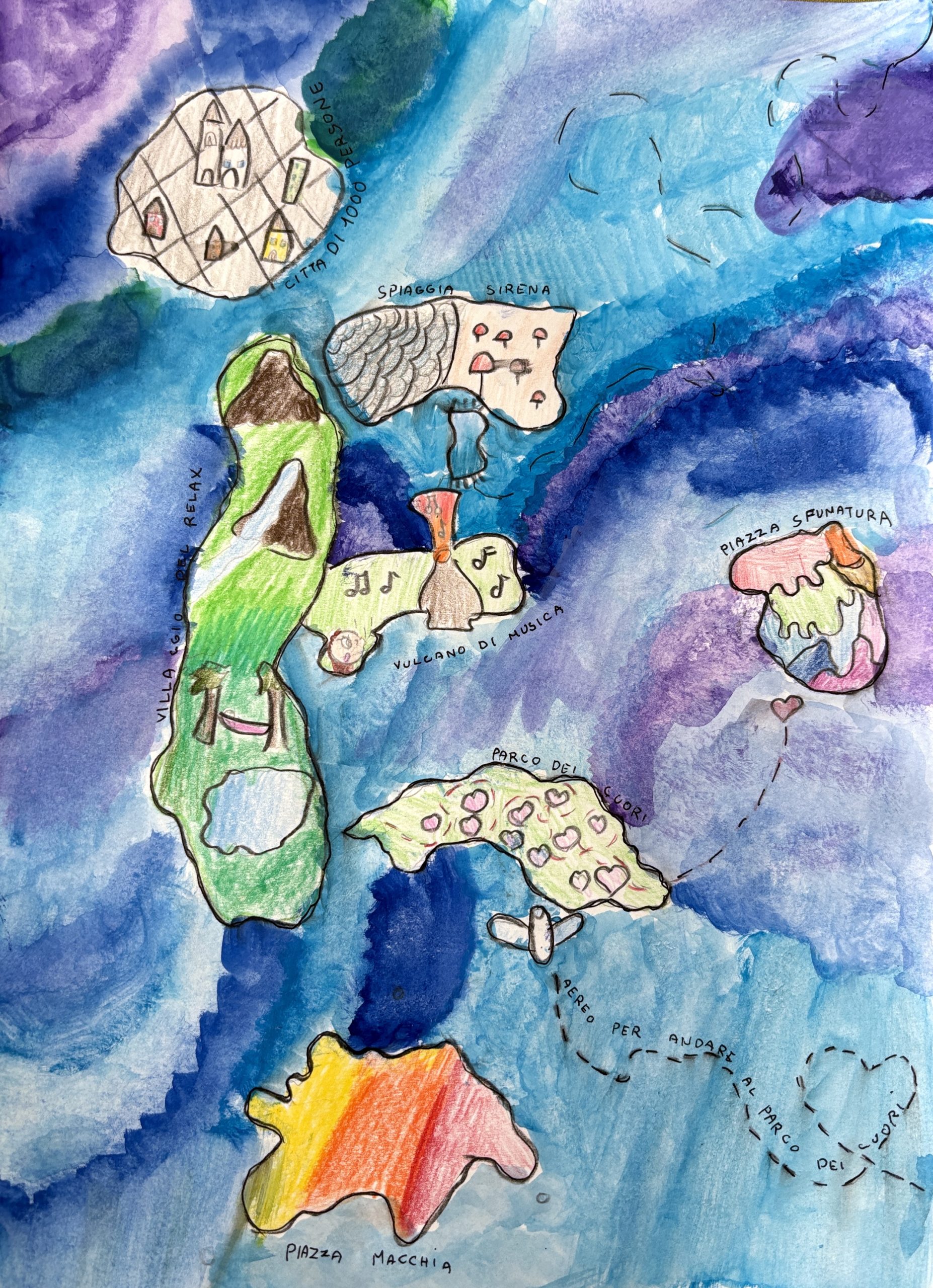
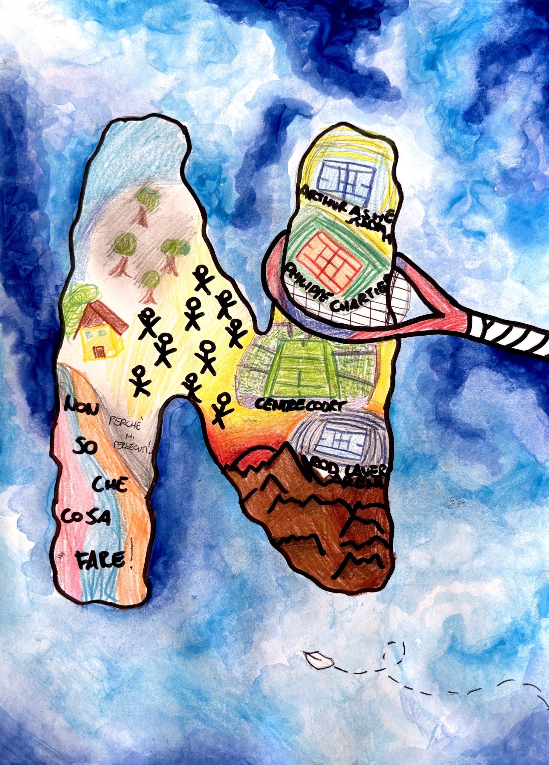
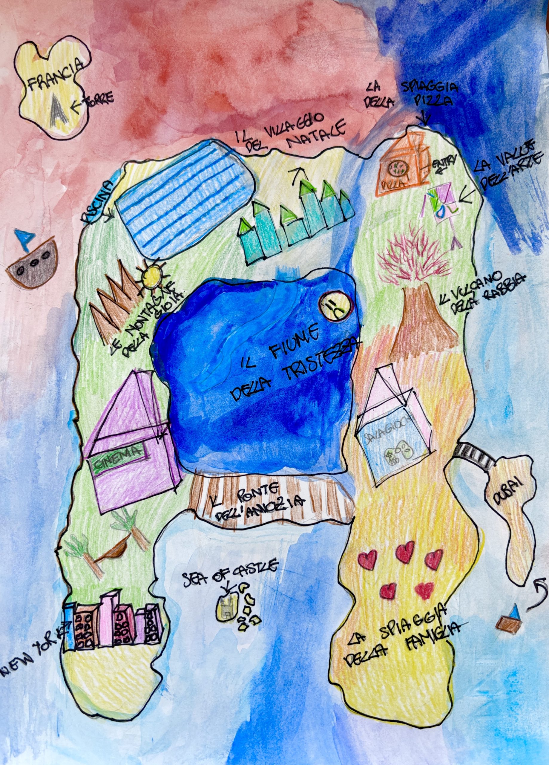
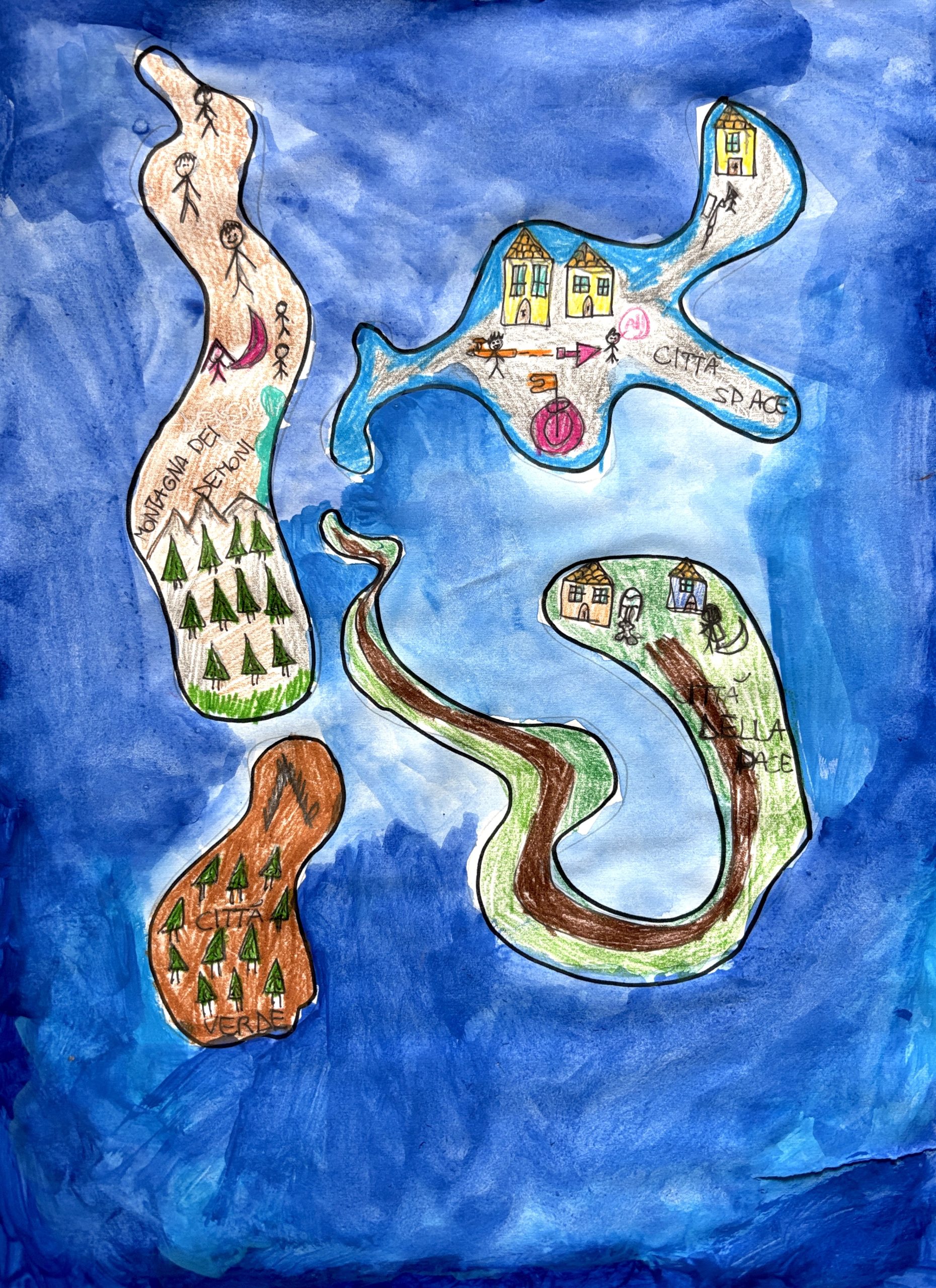
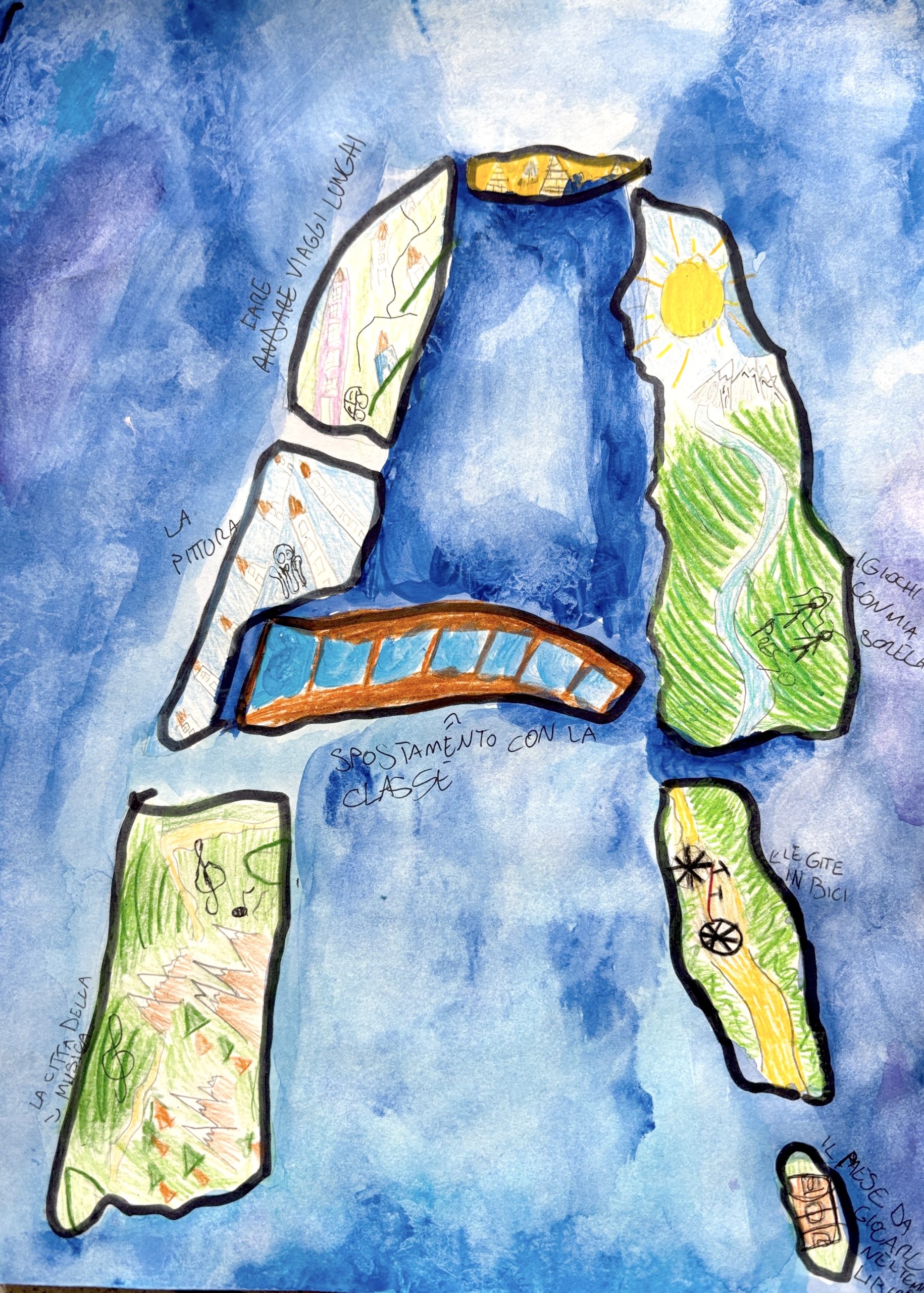
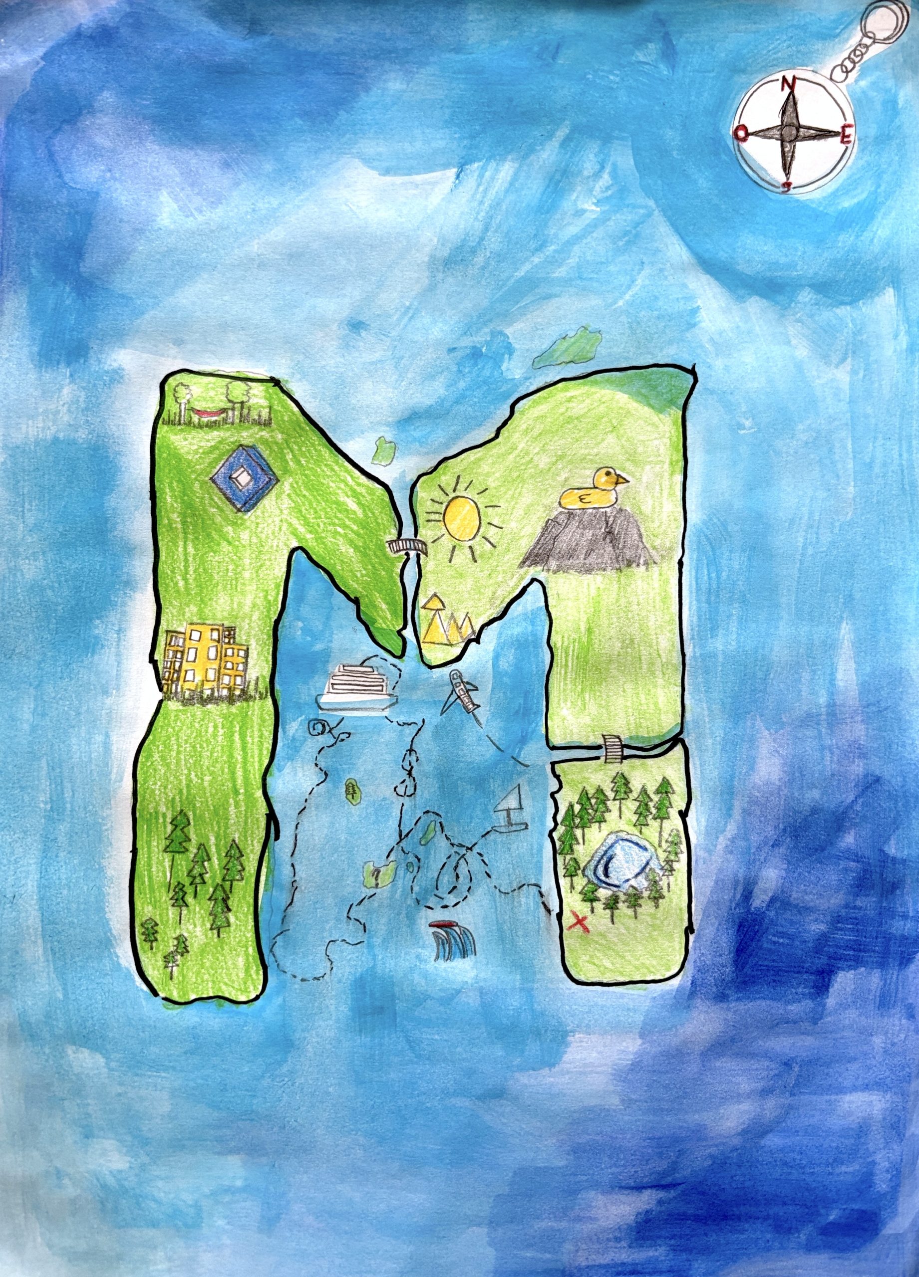
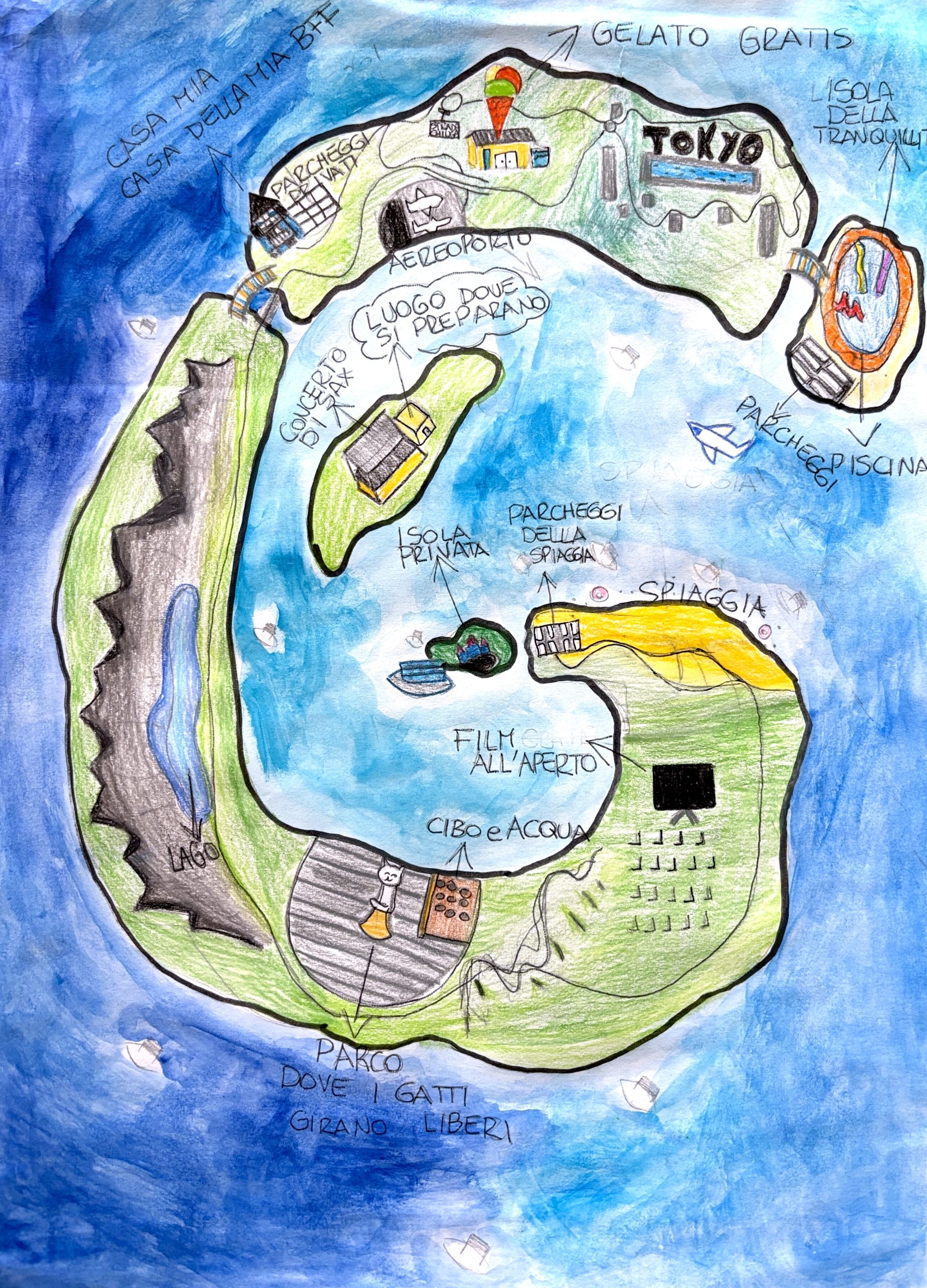
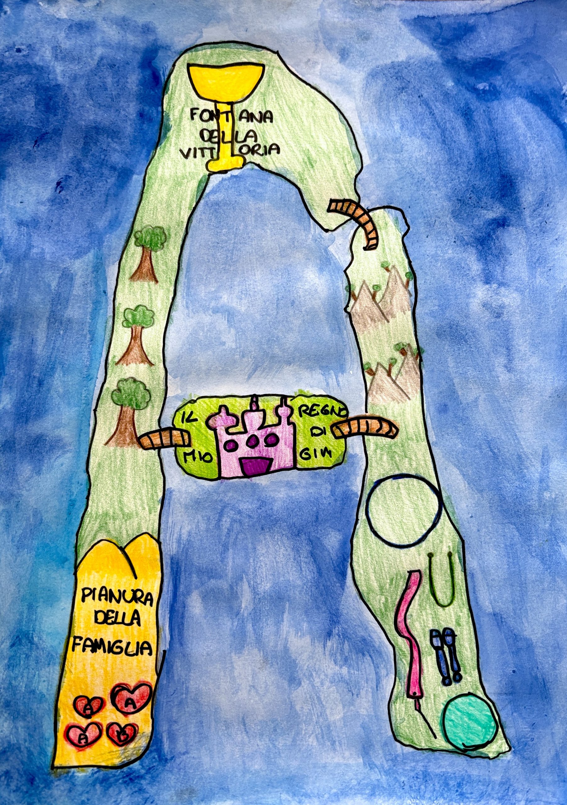
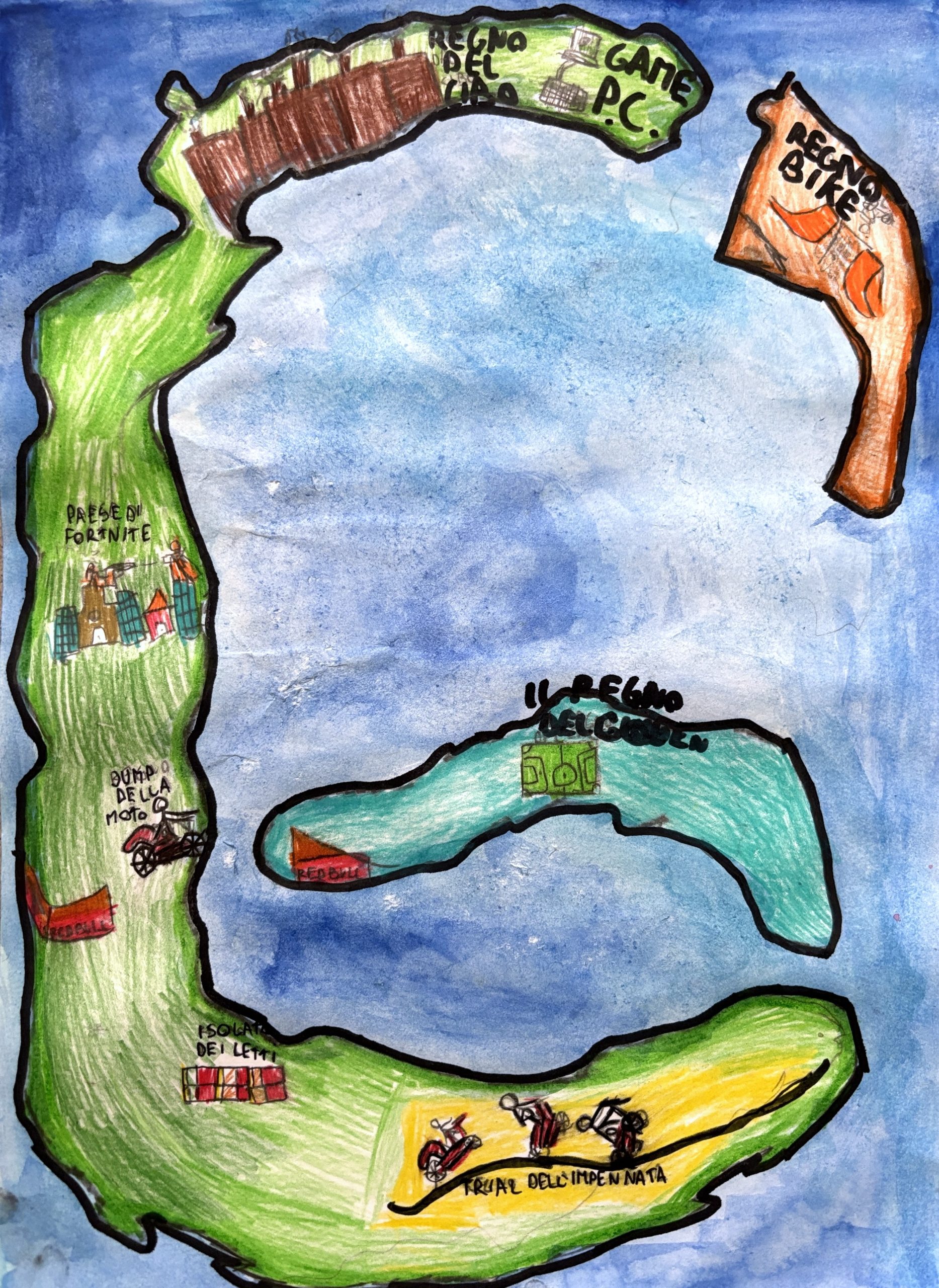
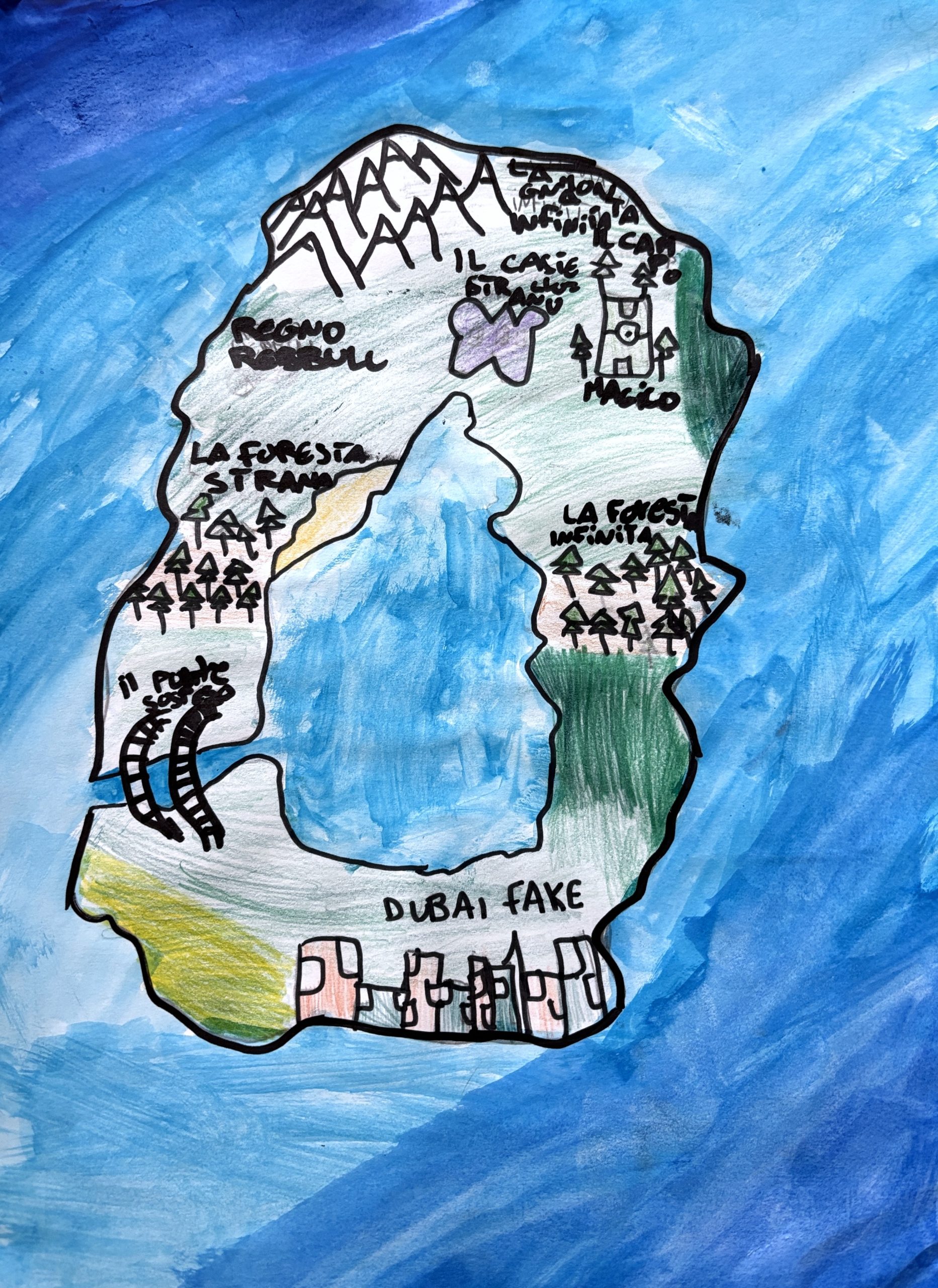
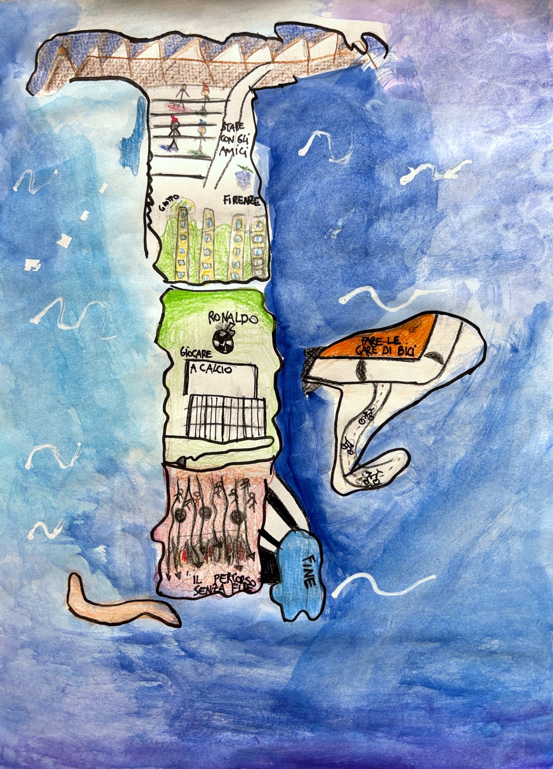
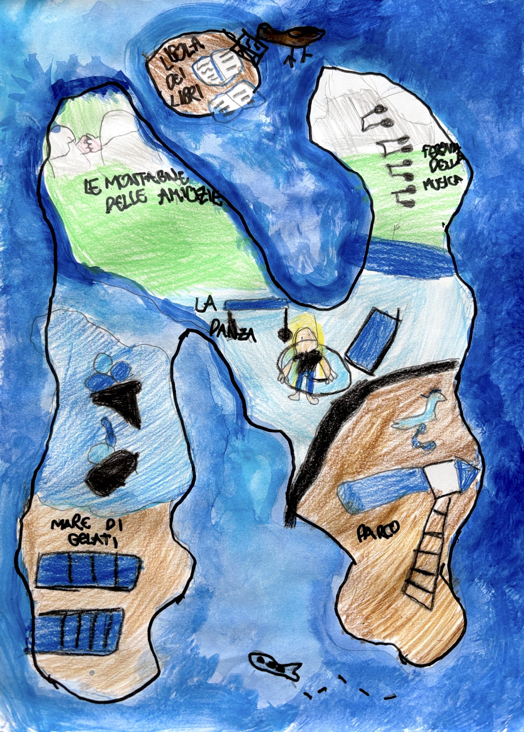
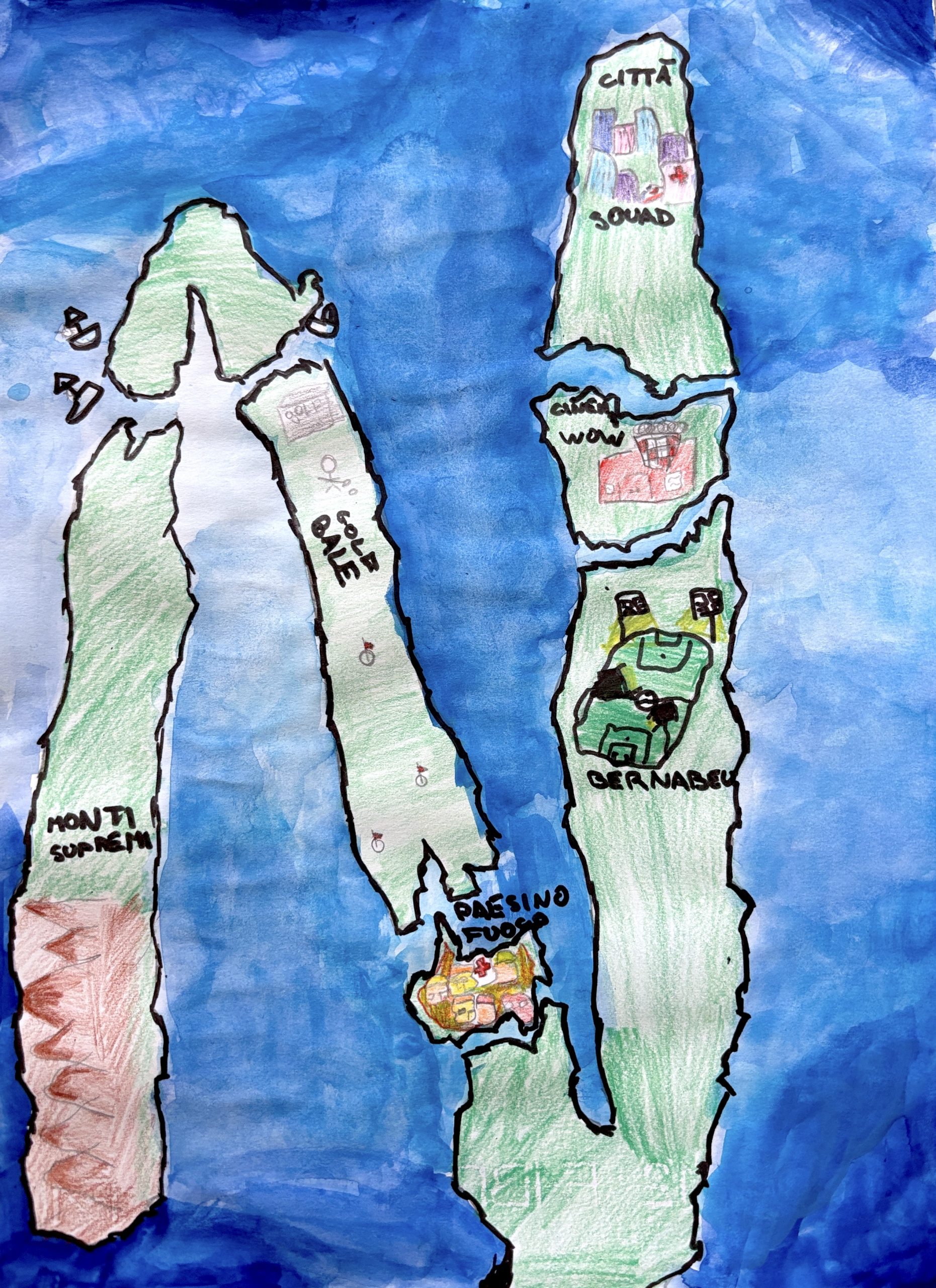
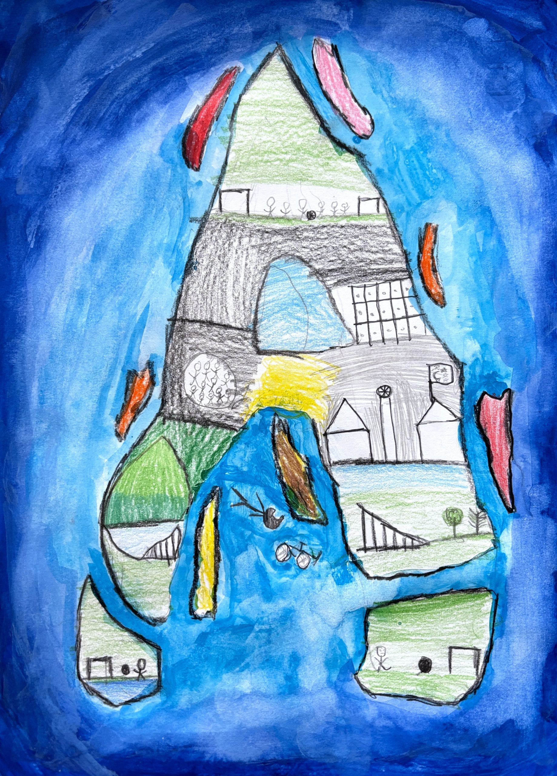
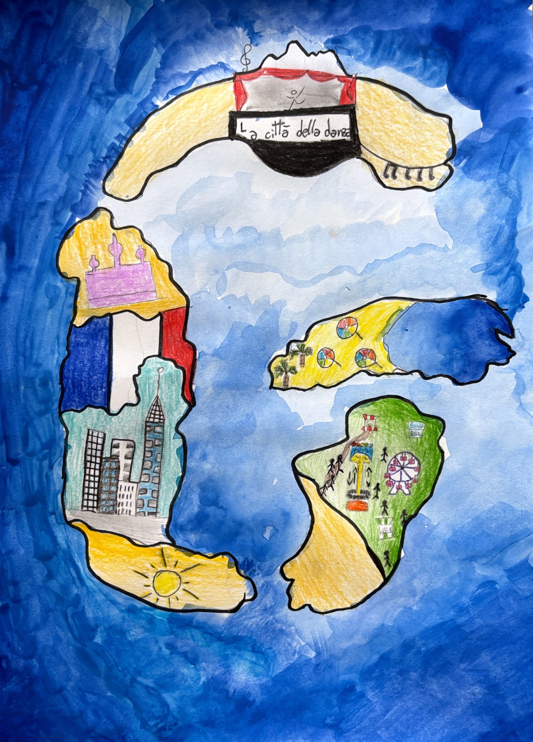
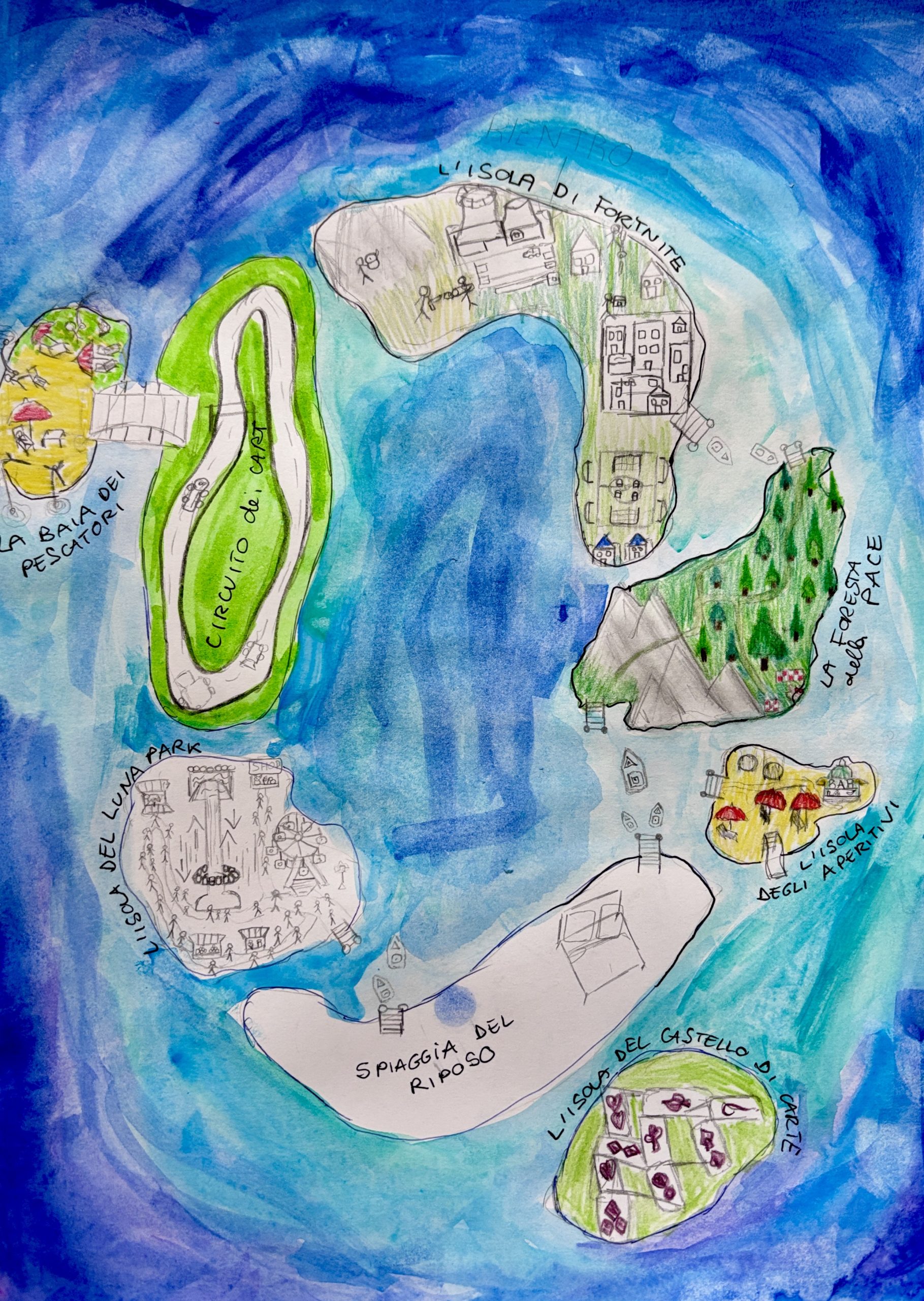
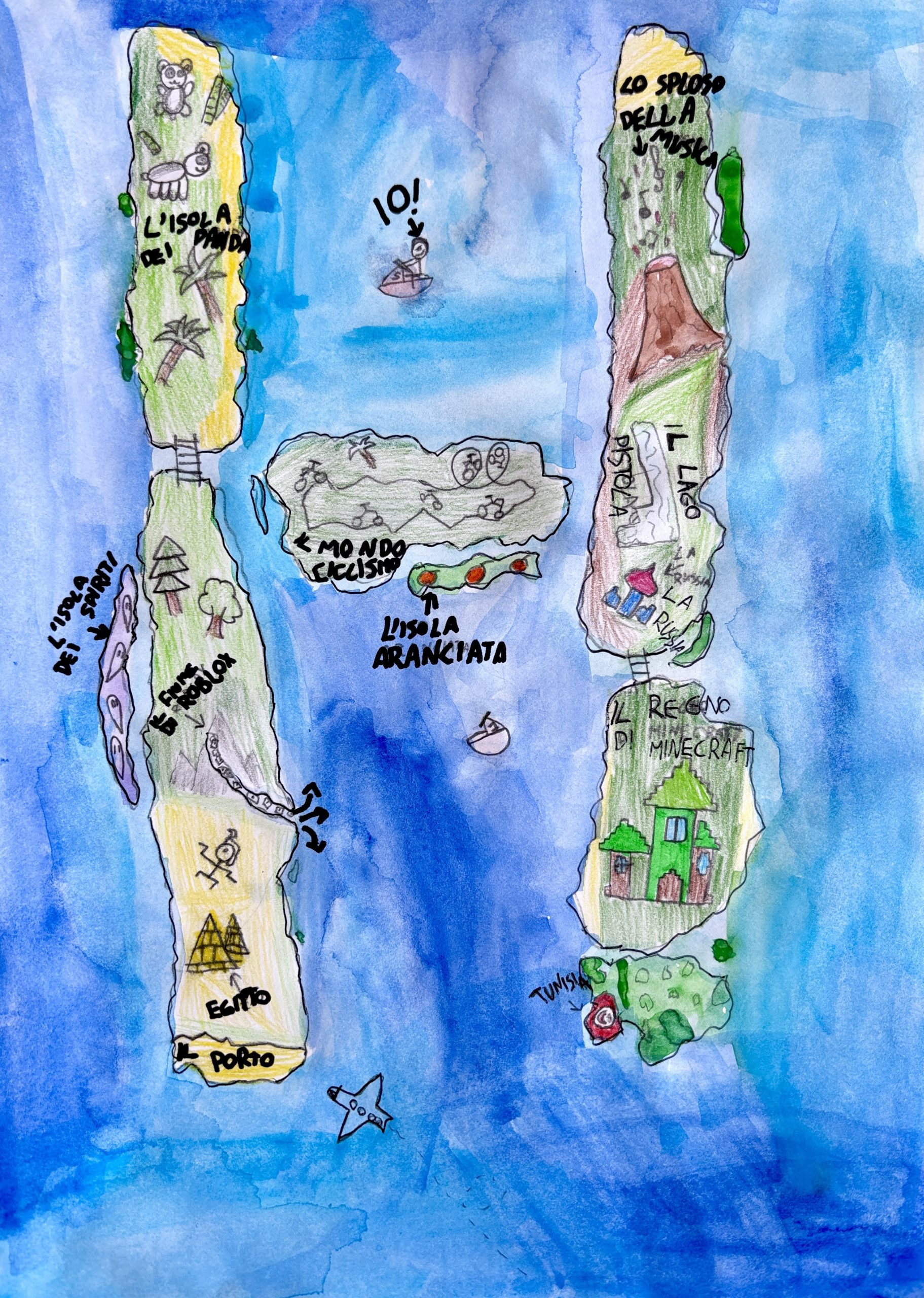
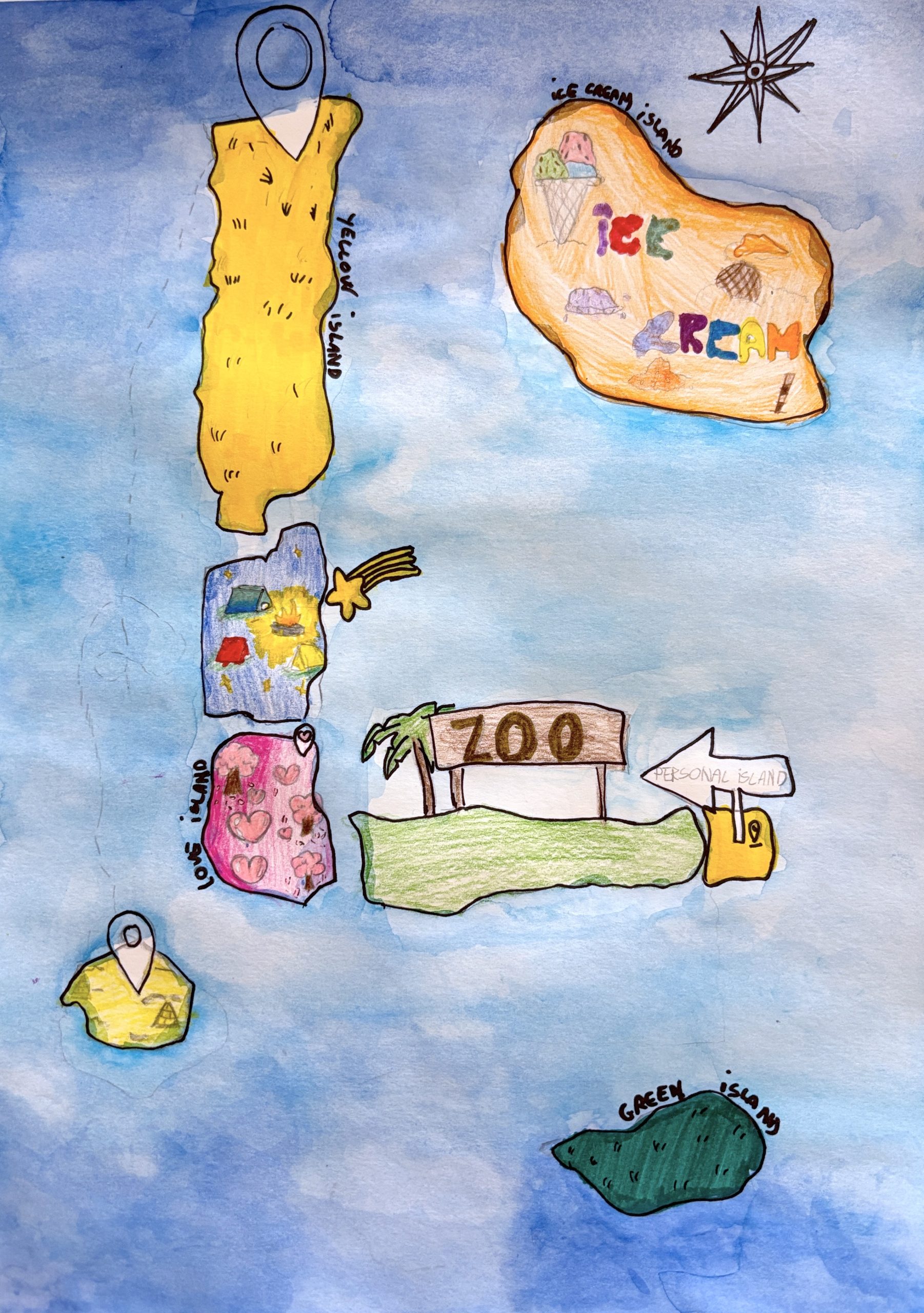
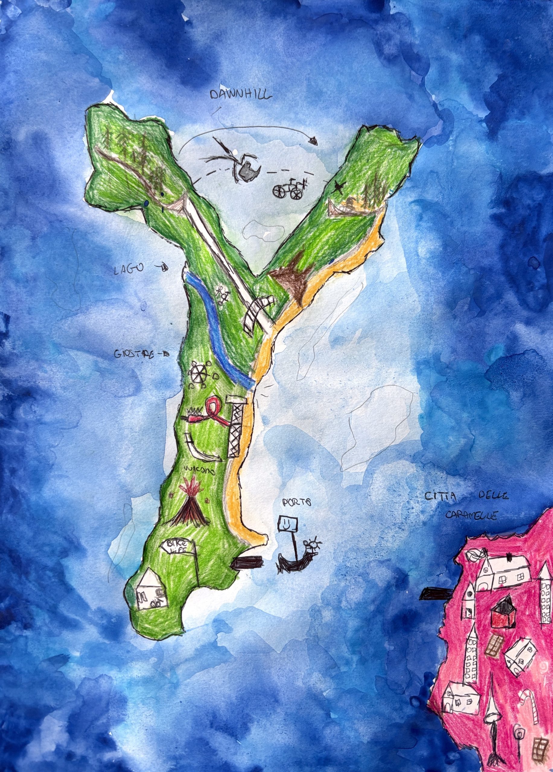
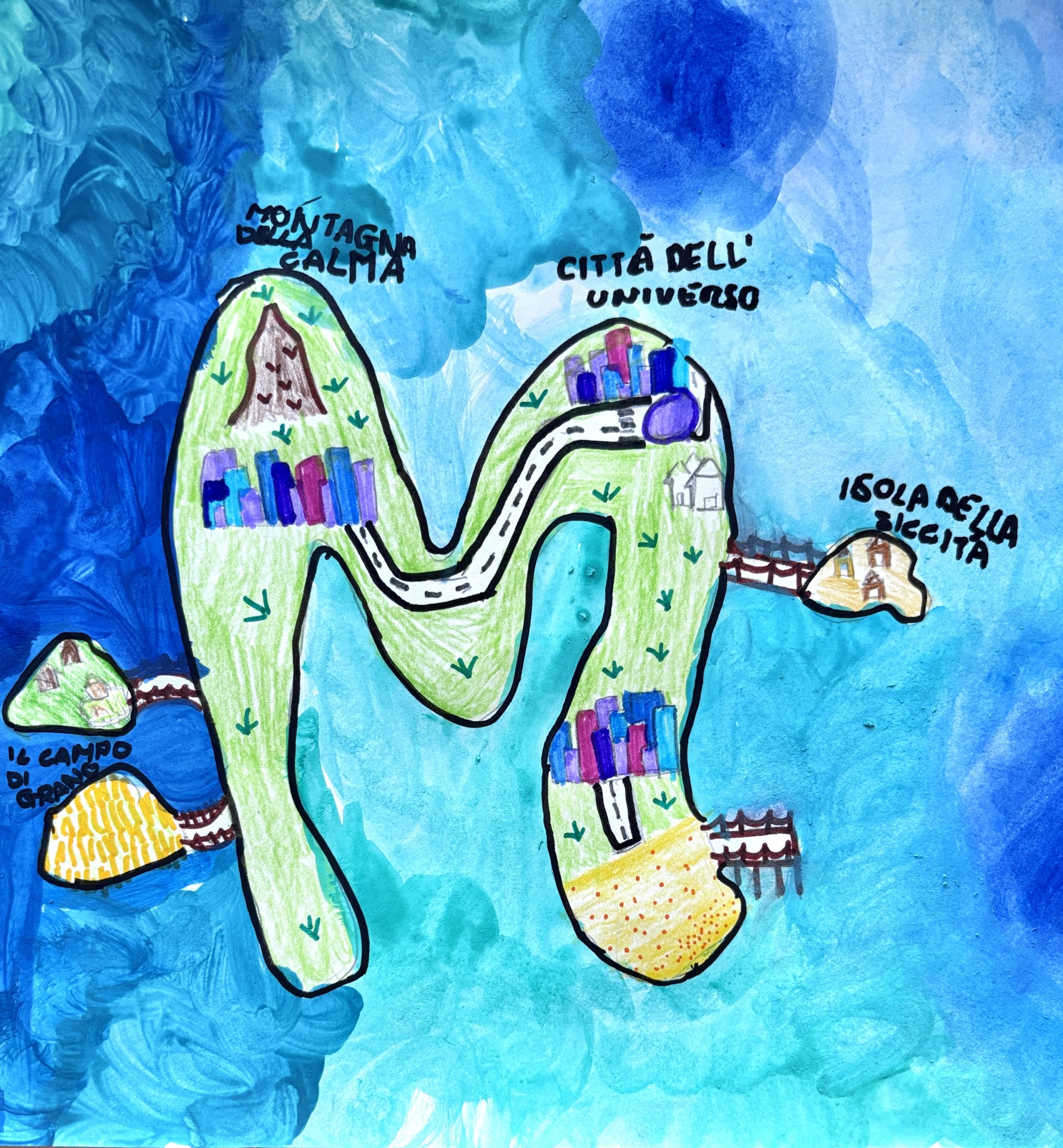
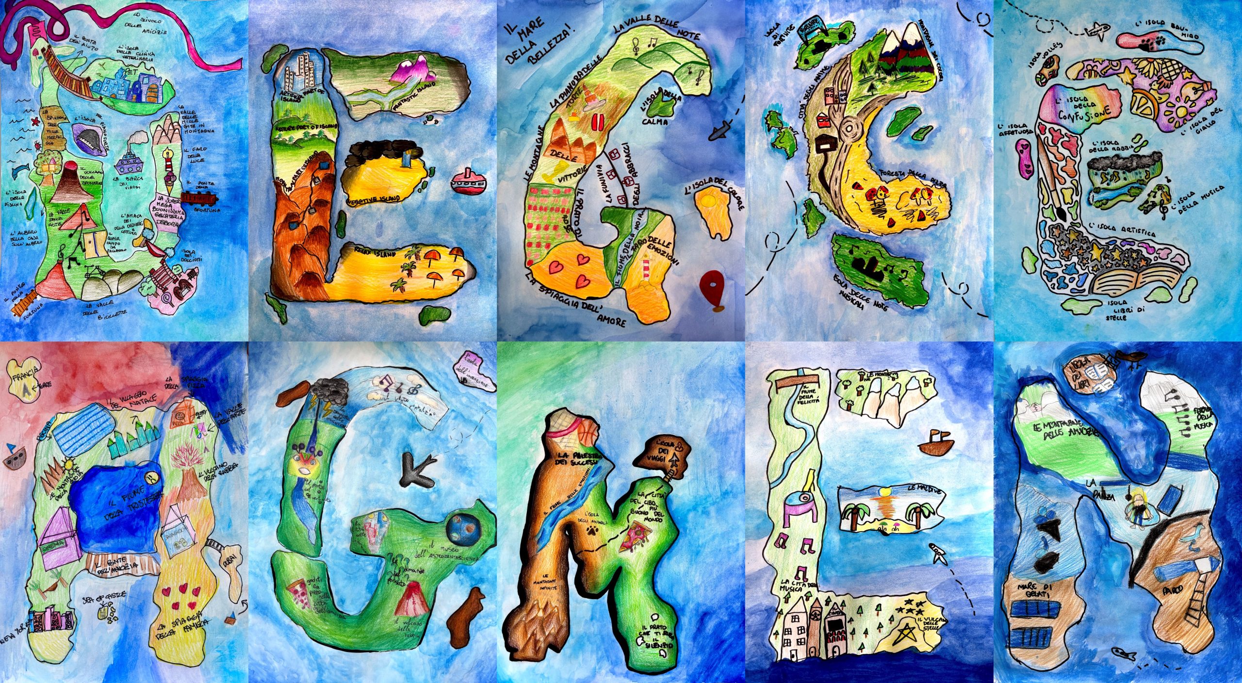
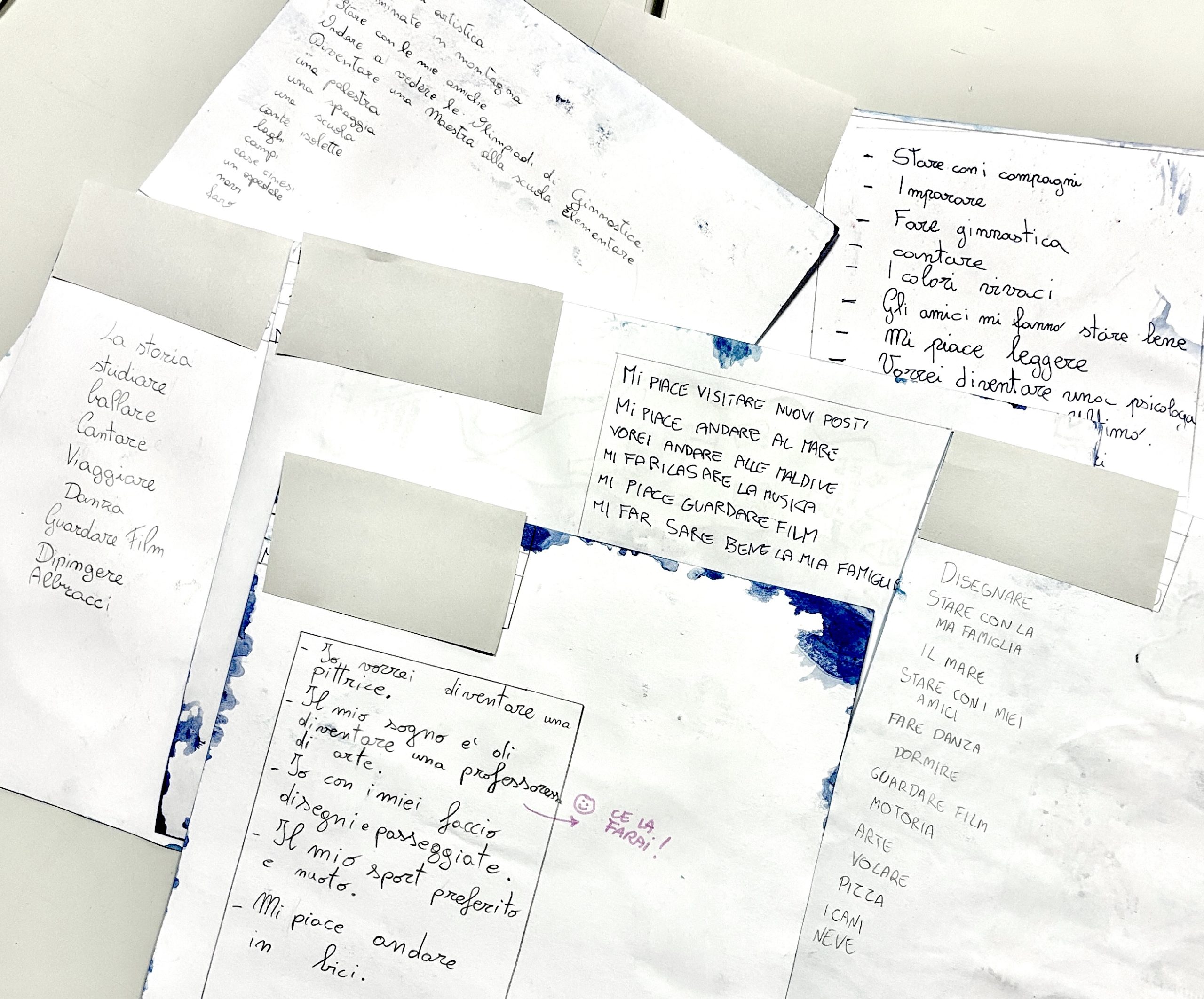
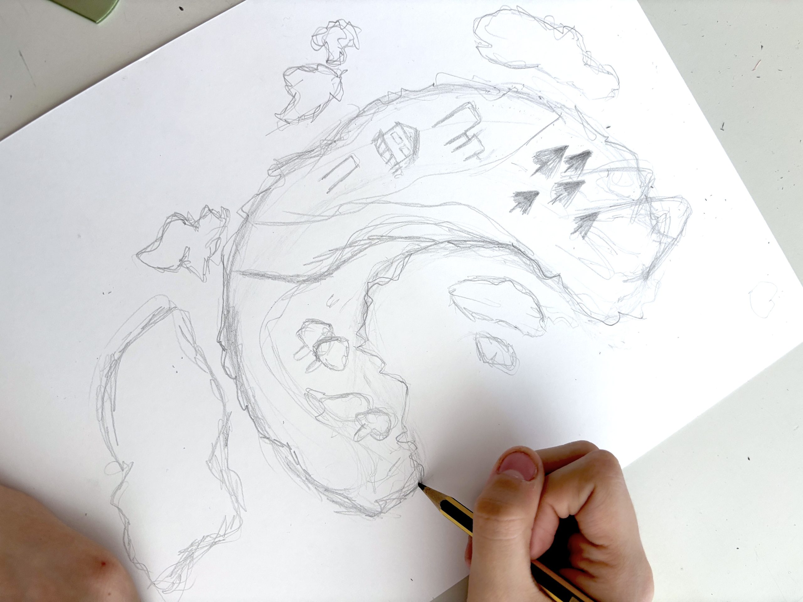
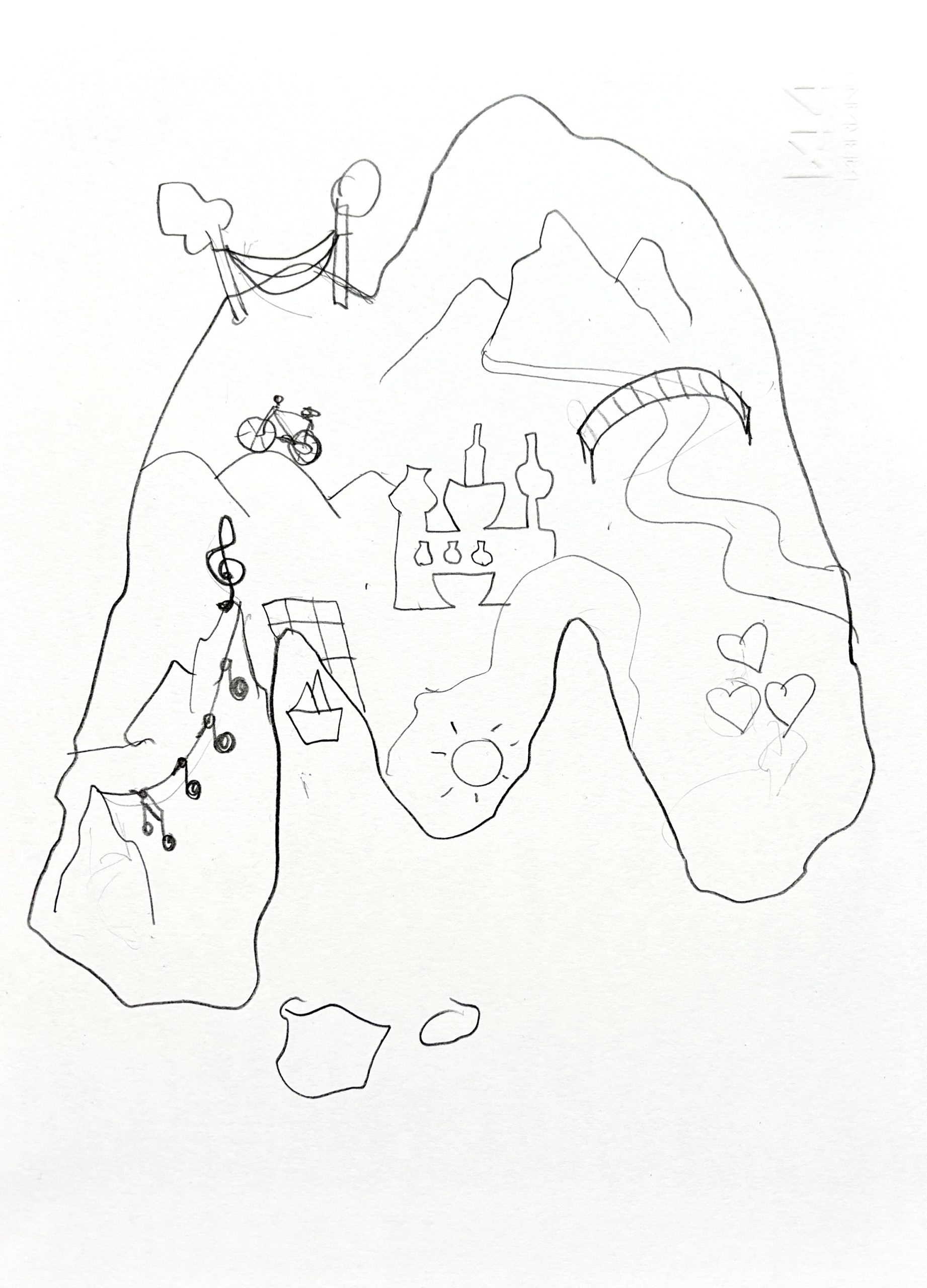
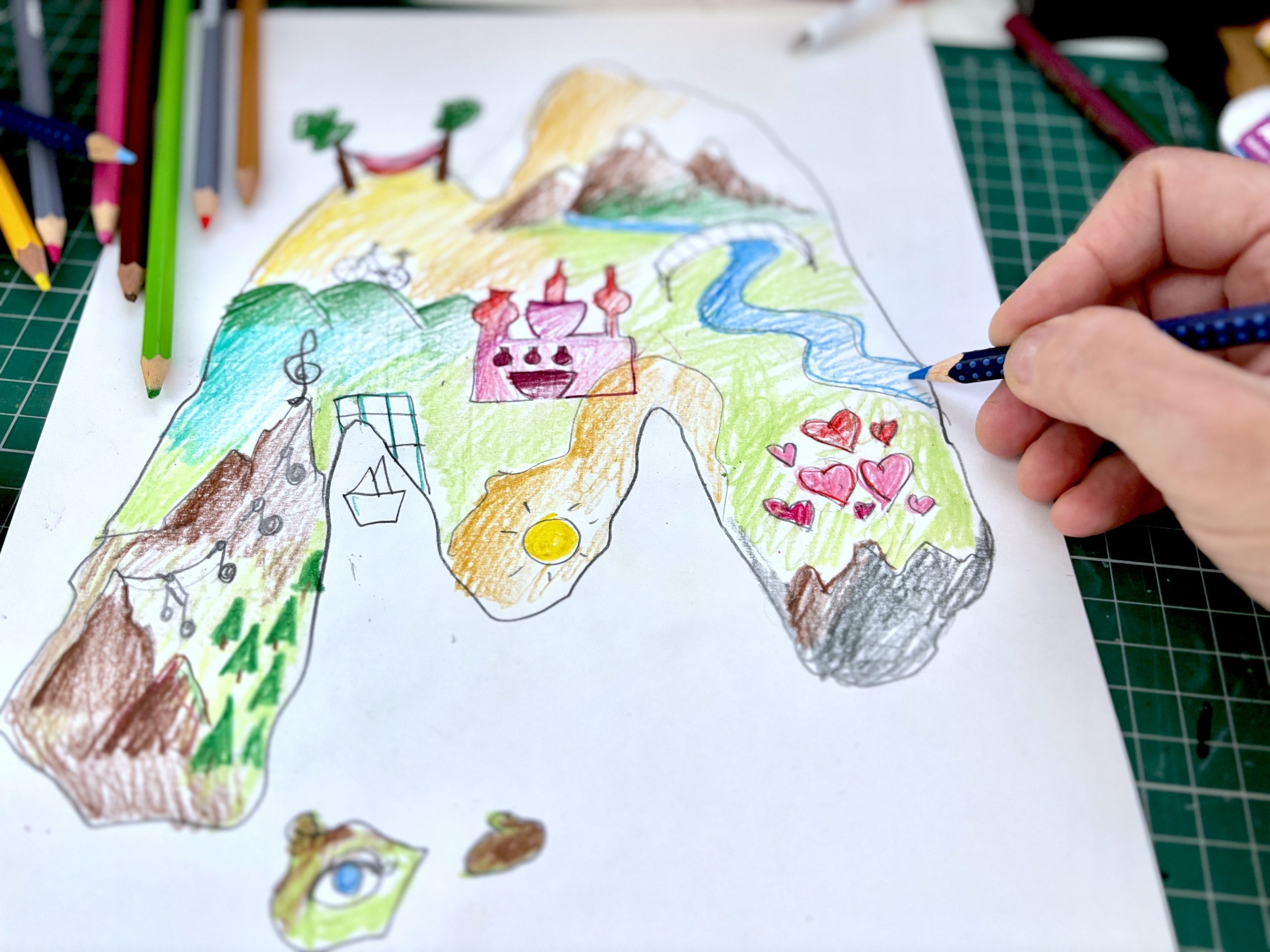
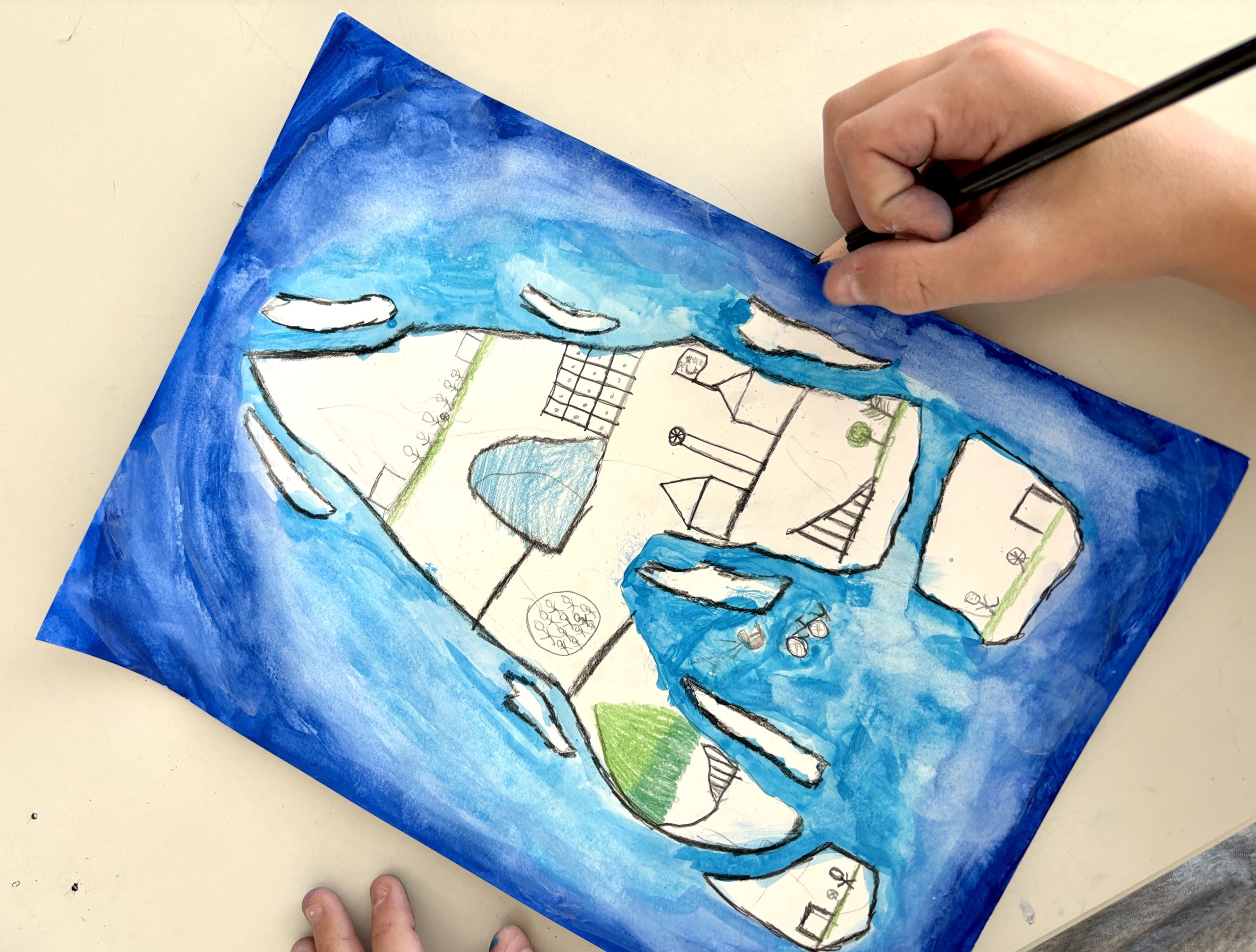
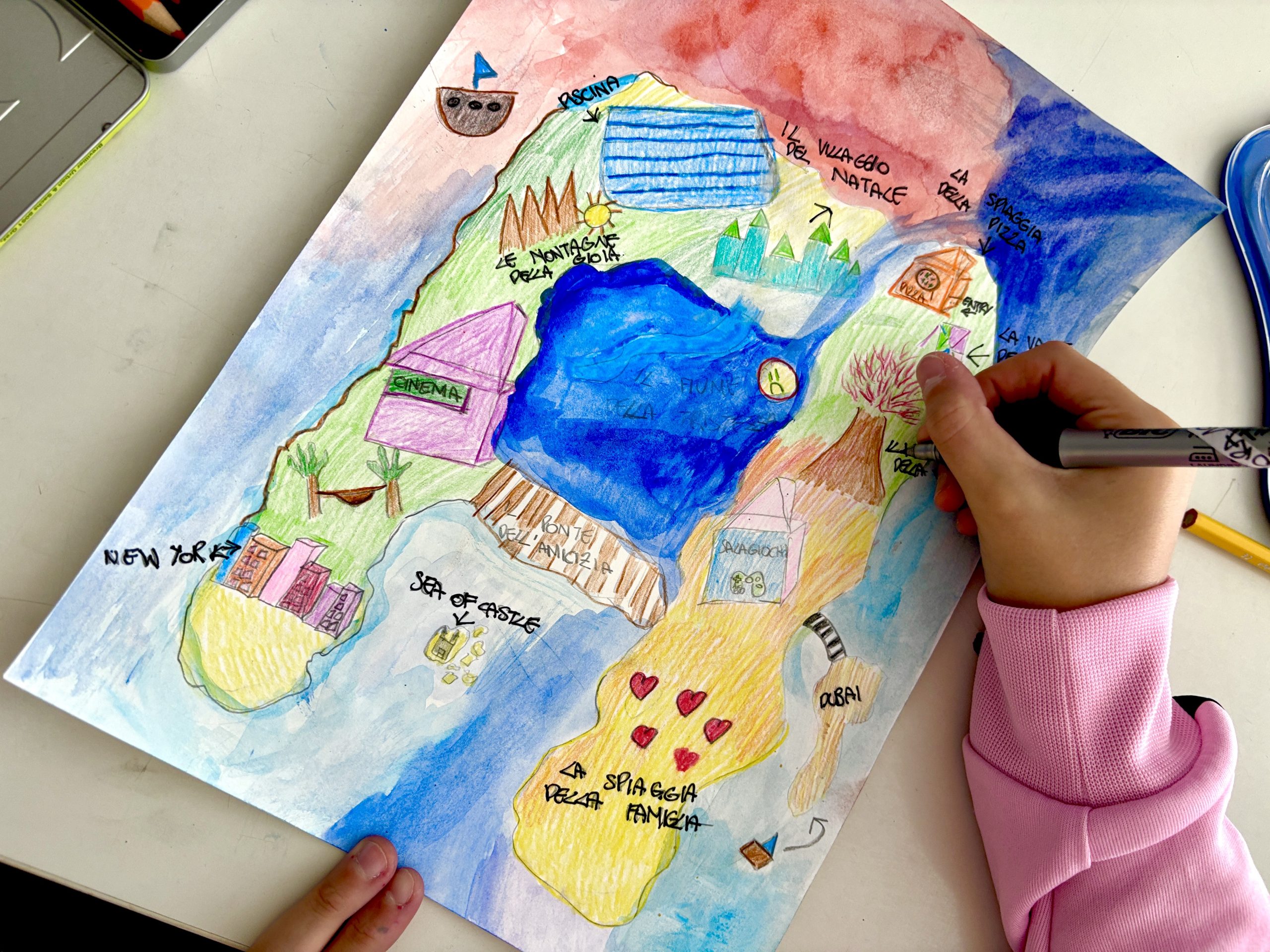
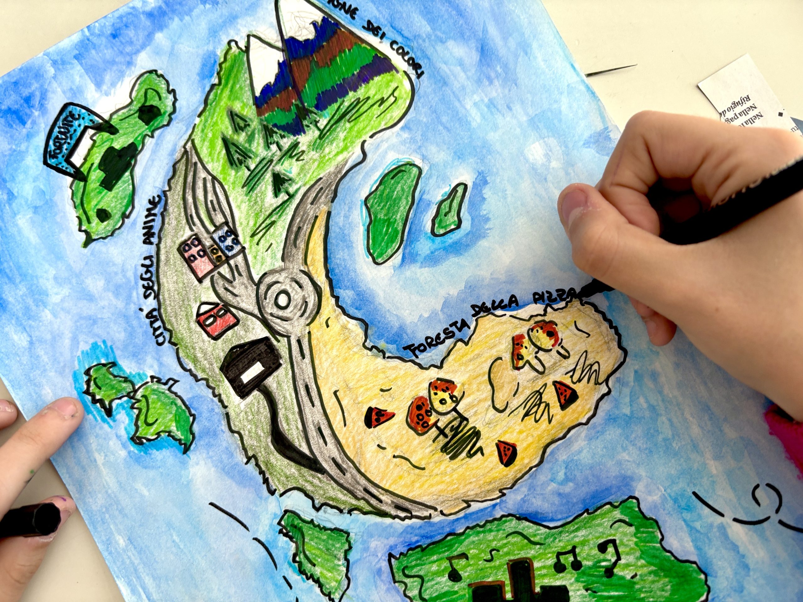
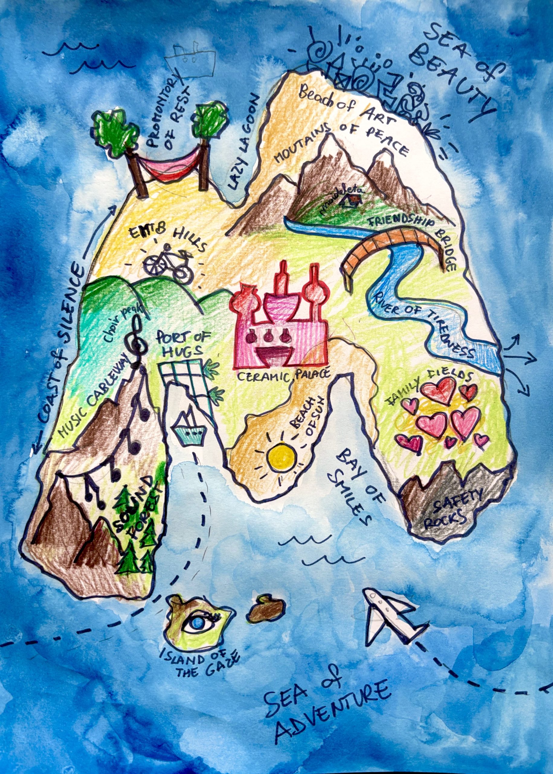
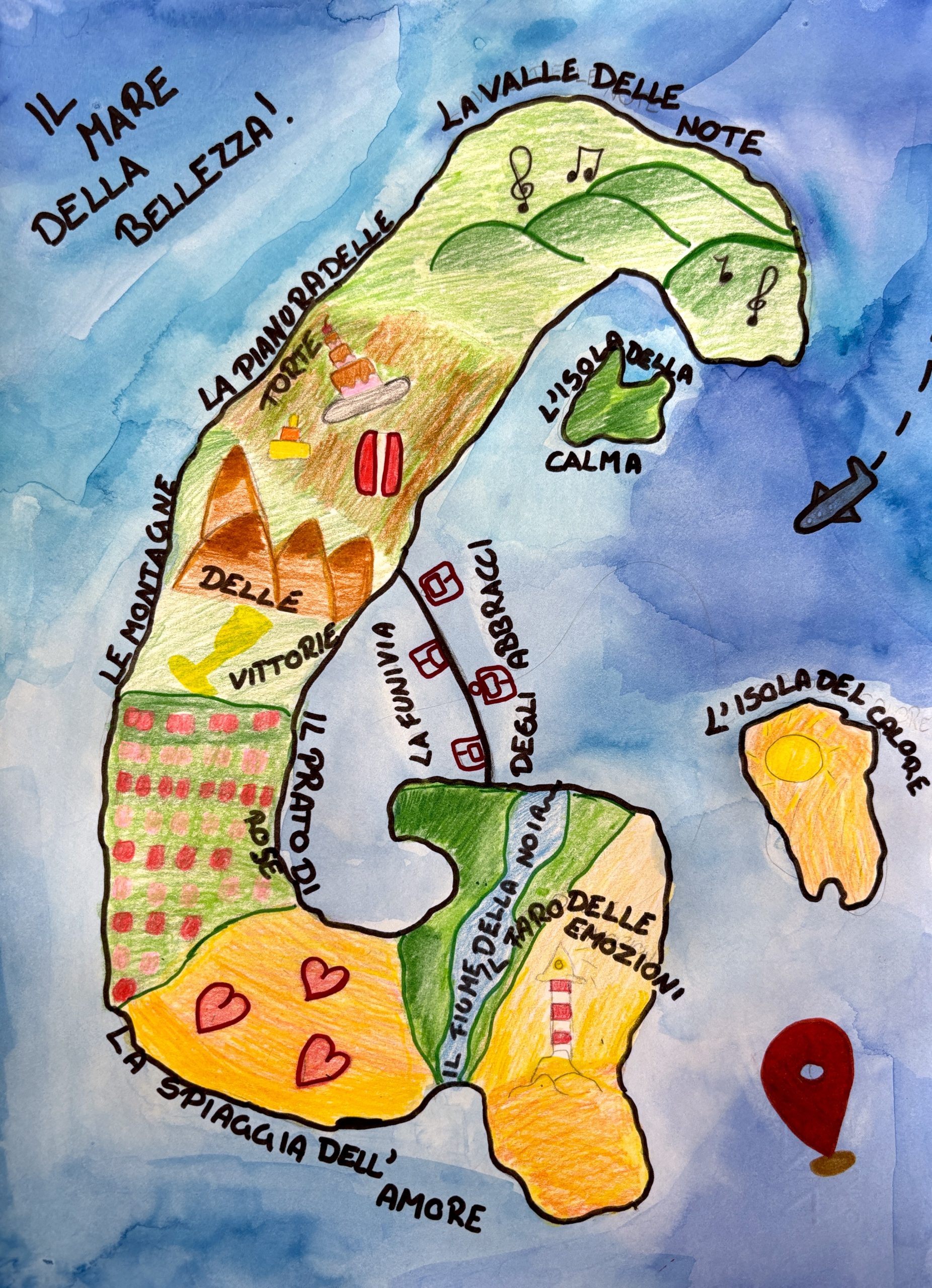
We began with a moment of reflection. On the back of the sheet of paper, we wrote down all the things we like and that are important to us: passions, friends, dreams, favorite foods, interests at school and outside of school, activities with friends/family, sources of well-being, dreams, emotions (sadness, anger, joy). This list, which we created by answering personal questions, became the heart of our island. Then we moved on to the creative phase, matching these words with geographical locations or landscape features. We tried to transform each passion into a piece of map or toponym (such as a mountain, a valley, a bay, a building), matching each interest with a place (natural or man-made) and giving it a creative name. Thus, for example, “The Valley of Bicycles,” “The Mountain of Notes,” or “The City of Gymnastics” were born on our island.
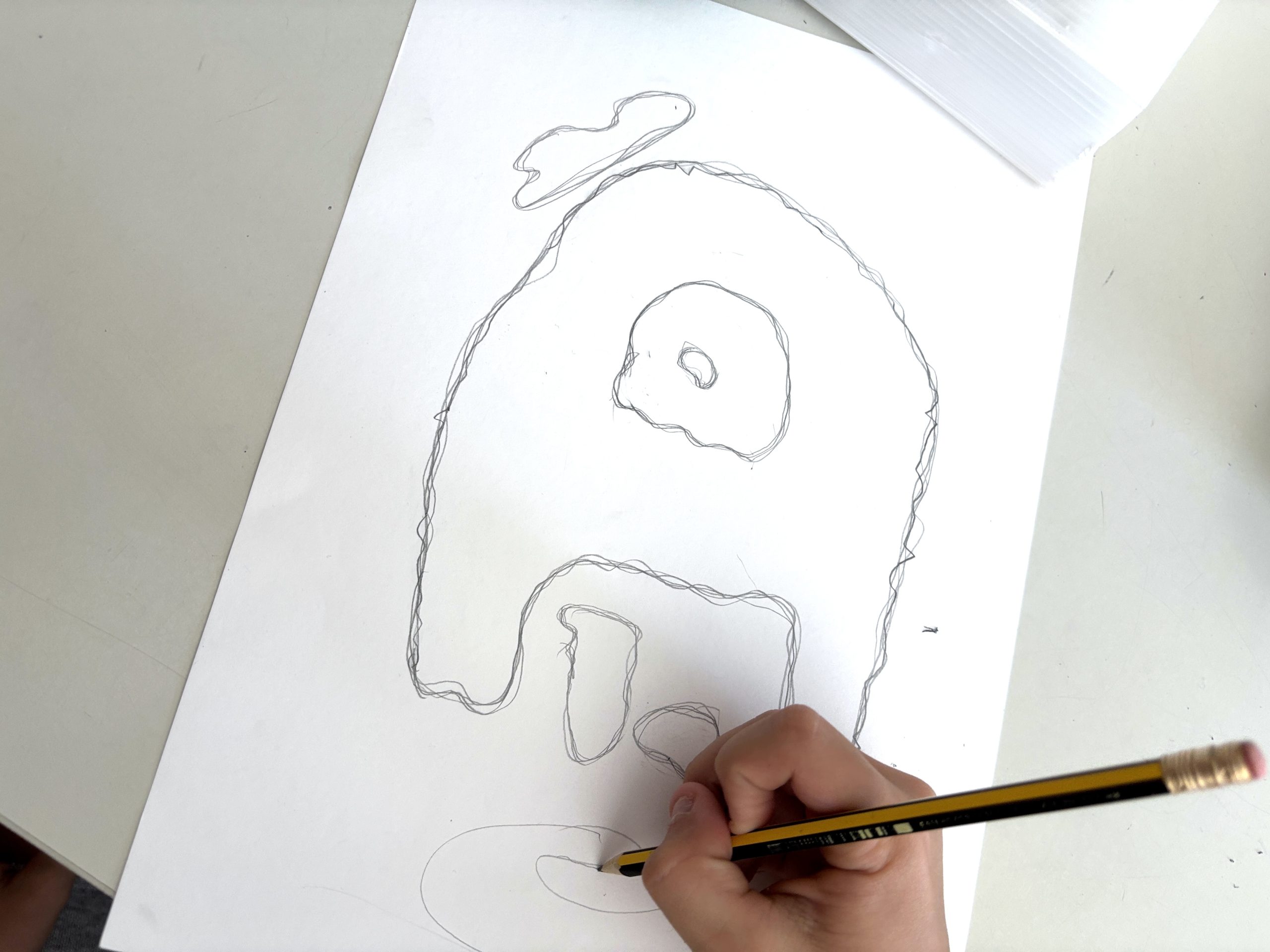
For the outline and shape of the island, we chose to use the initial of our first name (for example, the letter “C” or “M”) and drew it in pencil on the paper. Within this unique outline, we traced the elements that represent us.
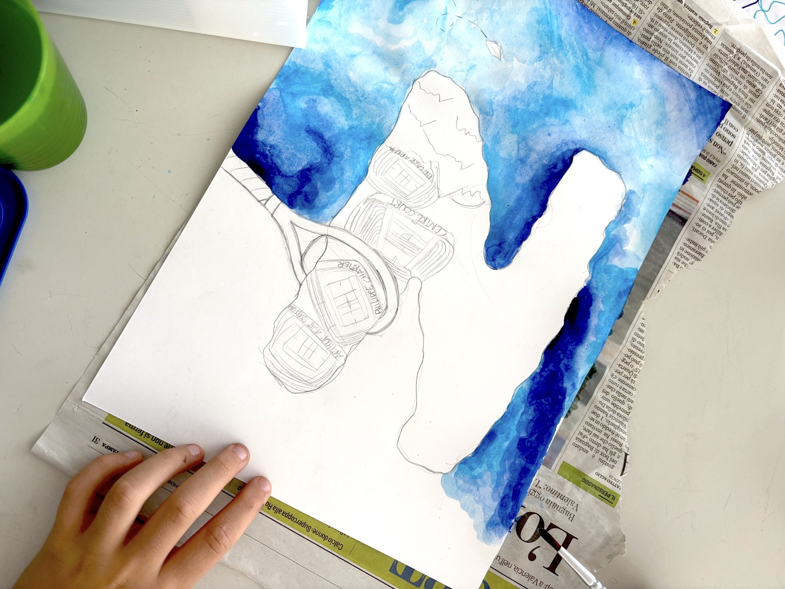
To color the drawing, we used two different techniques. We colored the landforms and elements (mountains, buildings, etc.) with colored pencils, using the classic colors of physical maps (green, brown, yellow). For the sea, we applied watercolors using the “wet-on-wet” technique: we first applied clean water to the sea, followed by blue or light blue paint, to achieve nuanced tones.
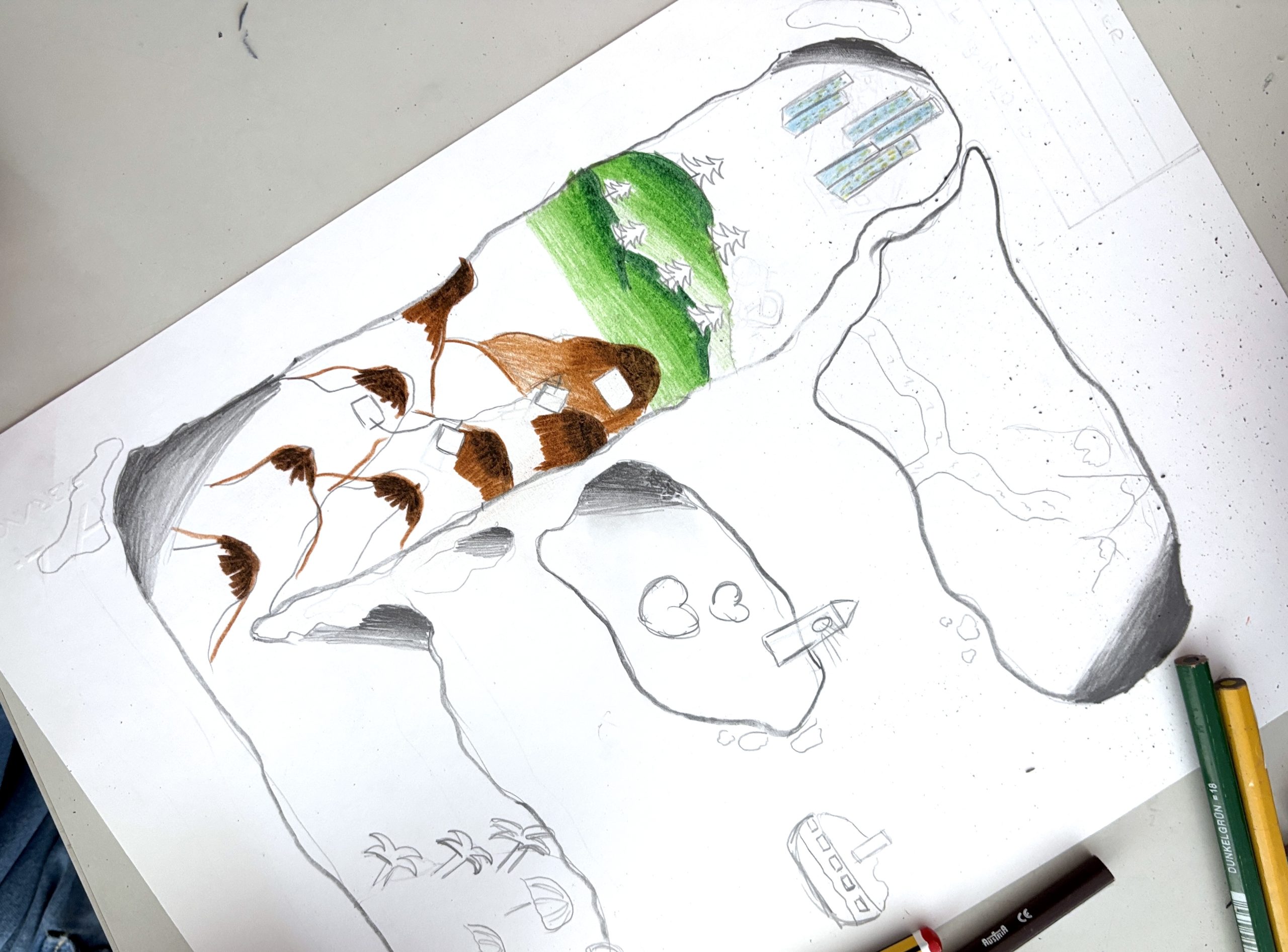
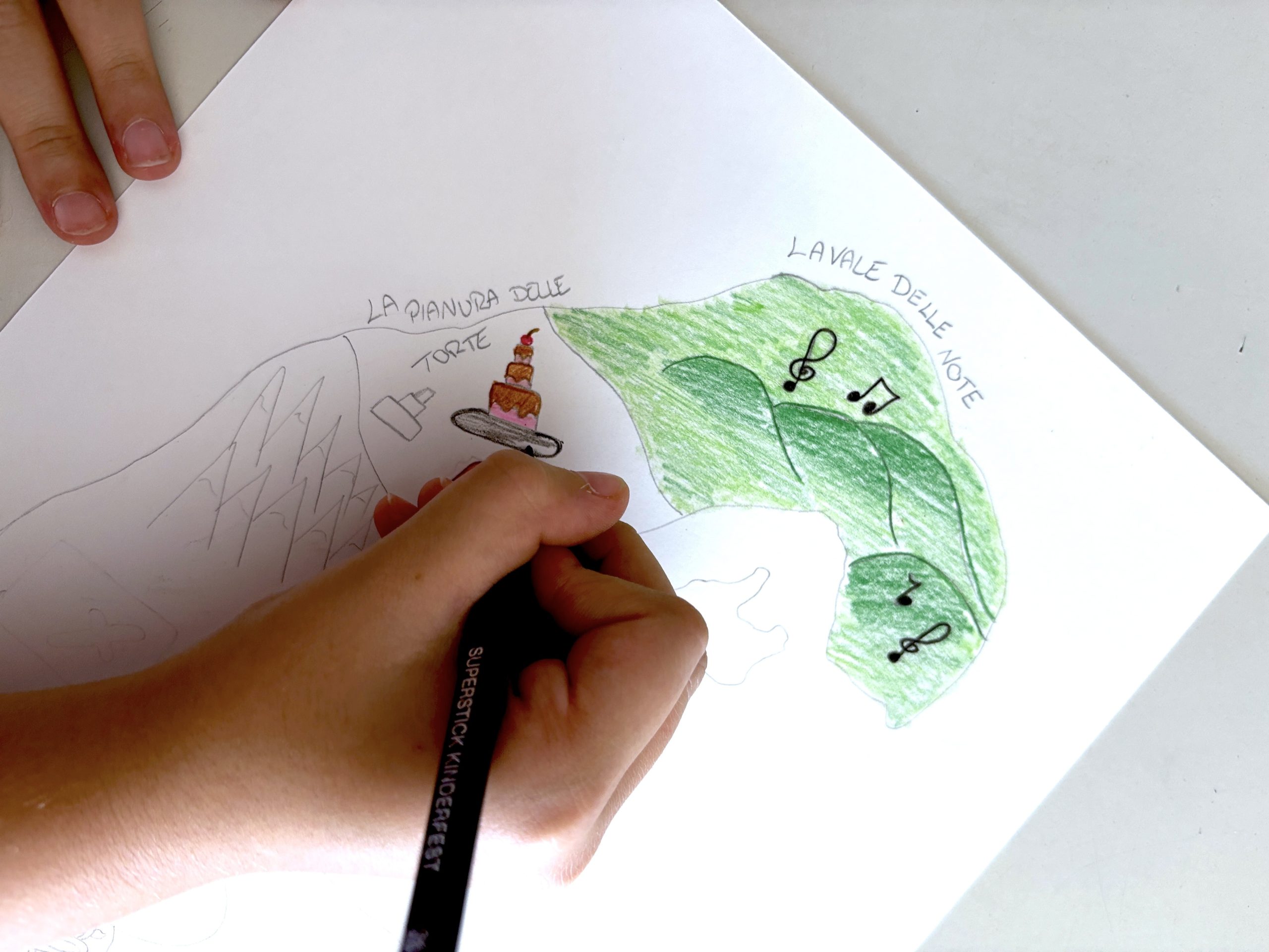
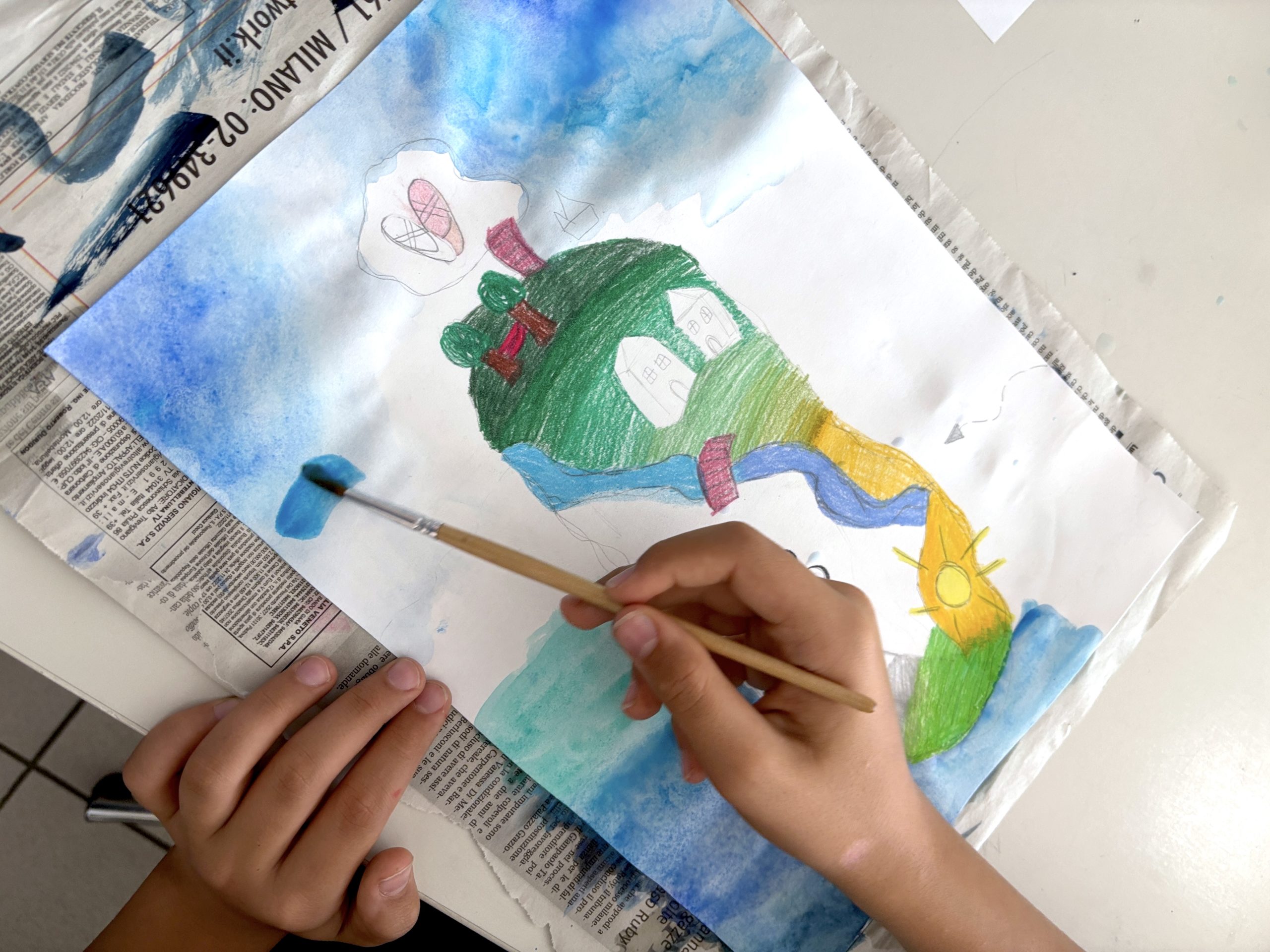
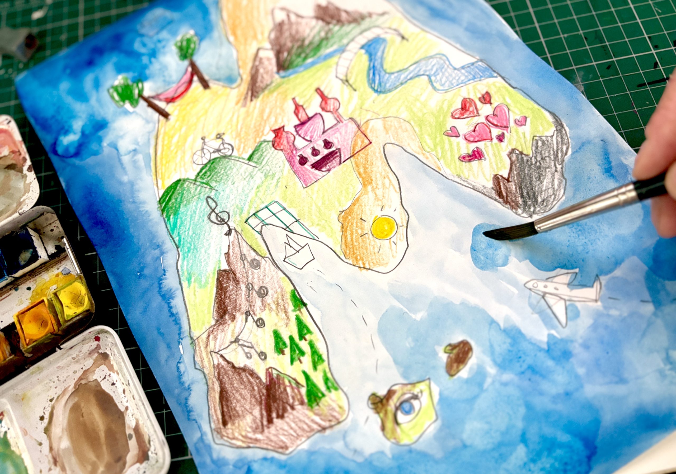
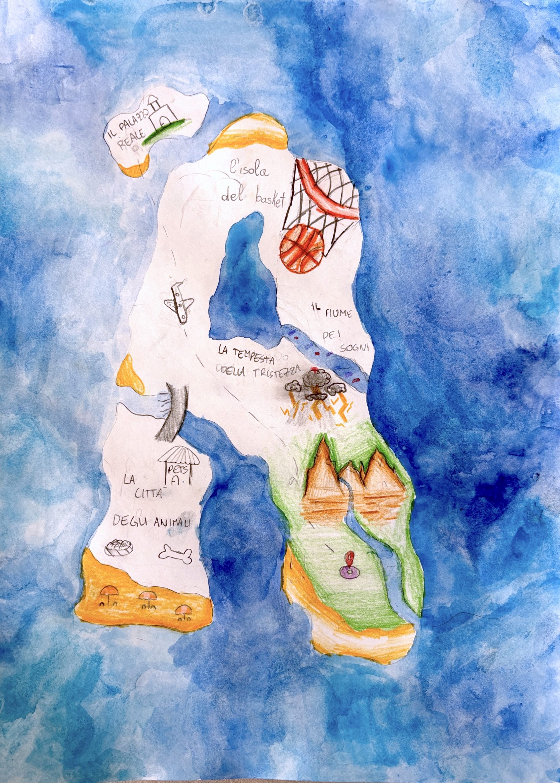
Once the drawing was completely dry, we moved on to the finishing touches. We traced all the outlines and details with a fine-tipped black marker to make the lines clearer. Finally, we added the names we’d invented for each location and area of our personal island.
Here’s a look at our Personal Islands, all coming together to form an archipelago of unique and diverse personalities!