Complementary colors are fascinating because of their contrast: the powerful fight between two contrasting colors is made of light, brightness and energy. We proved it painting a shape and its background in complementary colors.
I found this activity here in Artsonia Art Museum and I thought it was a good idea to review the theory about complementary colors with this activity.
We need:
- drawing paper or white cardboard size A4
- ruler, pencil, rubber
- watercolors and paintbrushes
- colored pencils
- scissor and glue
- a sheet of paper size A4
First we prepare a drawing on the rear of the drawing sheet: with the ruler we divide the sheet in 6 rectangles (10,5 cm x 9,9 cm) and in the middle of each rectangle we draw a heart. Pay attention to draw the 6 hearts more or less with the same position, shape and size.
After that we cut the sheet alongside the vertical line, in order to obtain two strips: one side of the strip is white and on the other side there is the drawing of the hearts.
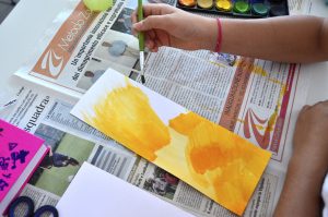
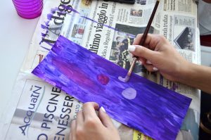
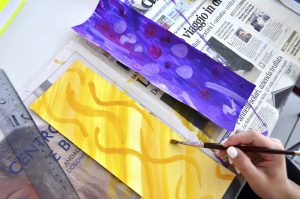
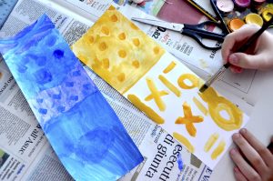
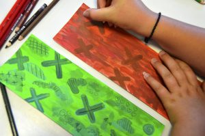
Now we paint the white part of the first strip with different tones of a single color ( e.g. blue), and then we paint the second strip with different tones of the complementary color (e.g. orange). We paint the surface completely and freely.
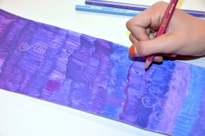
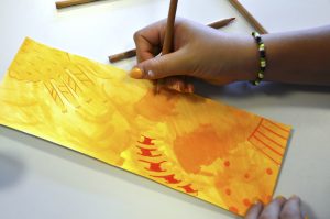
When the watercolors are dry, we draw on the colored surface some shapes, lines and patterns in the similar colors of the background, overlapping new drawings with colored crayons.
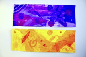
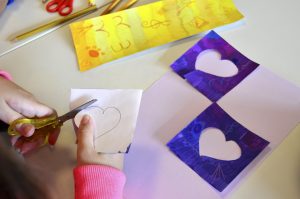
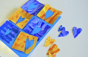
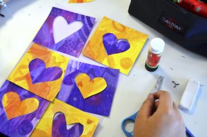
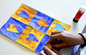
Then we turn over the colored stripes and cut out the rectangles and the hearts with a scissor. At the end we paste the rectangles and the hearts that had been cut out, on another sheet of paper, paying attention to glue the shapes with alternate complementary colors.

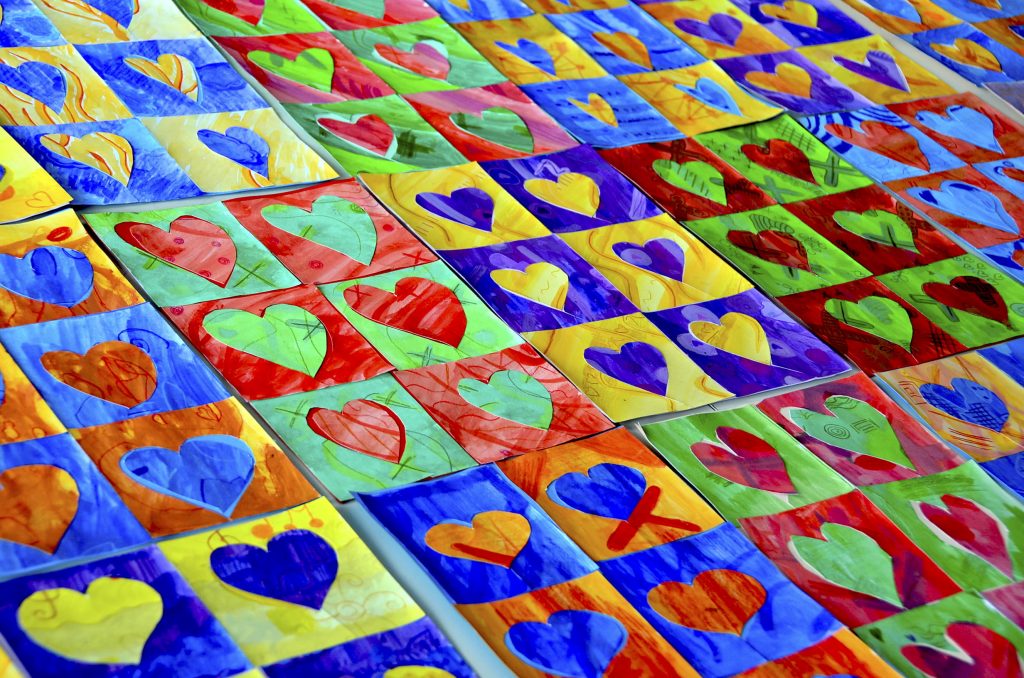




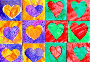
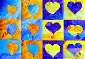


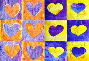

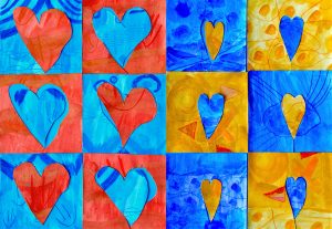
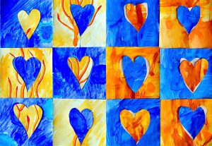

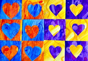
I absolutely love these!! I especially love the expressive way these were painted.
Hi Miss! The students enjoyed especially the paintings, because they were completely free to express themselves 😉