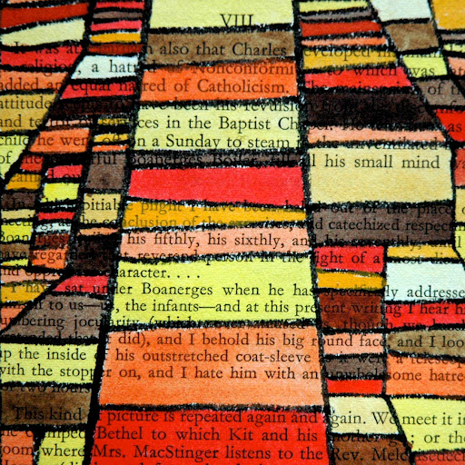
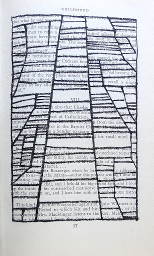
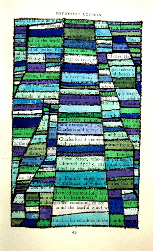
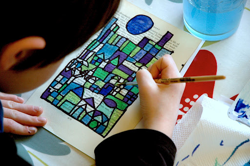
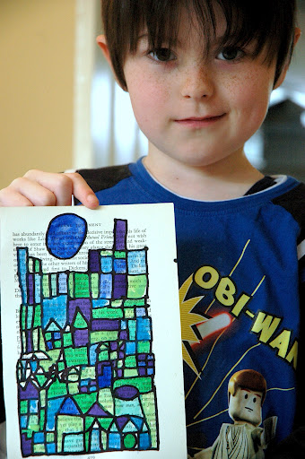
Un esercizio sui colori cadi e freddi, complementari , primari e secondari ispirati alle opere di Paul Klee. Qui abbiamo tracciato il disegno a china e poi l’abbiamo colorato con gli acuerelli. Per rendere più originale il disegno abbiamo dipinto sulle pagine di un vecchio libro, le righe stampate possono essere una specie di griglia per tracciare le linee perpendicolari.


 |
 |
 |
 |
 |
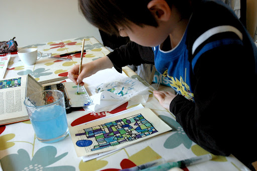
Questo esercizio è facile, anche per i più piccoli:
 |
 |
 |
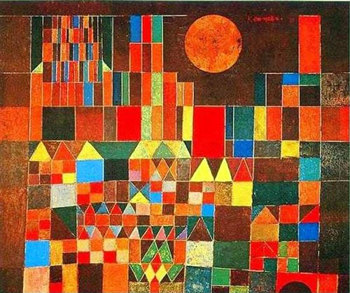
Ci siamo ispirati a queste opere di Klee:


LOVE. Will definitely be doing this.
These are awesome! Great project! Thanks for sharing! 🙂
These are awesome! I love this project! Saving in my archives, thanks for sharing! 🙂
Ma che bello questo esercizio sul colore!!! Grande idea e grande artista!!!Adorabile….
I love this project; very creative using the pages of a book.
Effetto straordinario…sarà la tecnica o l'artista?a presto,francesca
veramente d'effetto questa tecnica!!!
Fabulous! So stylish and contemporary. LOVE the use of book pages. I absolutely love Paul Klee and visited his museum in Switzerland- I highly recommend it. I also love how this project can appeal to students off differing abilities. Thanks for sharing!
I love this!! I think I will adapt it for my high schoolers!! Thank you!!!
I am in love with this! Thank You!
Thank you Tracey! I'm really happy to share!
Dear Miriam,while I searched for ideas for my next art-lessons in a school for special need children, I found your blog and your idea to use klee for warm-cold-complementary colours. But most lovely: the idea of book pages (even though I felt awful when I ripped of the pages of a book). The old paper is wonderful for watercolour, the given structure from the text lines gives it a special style and yeah – easy to say: me and my students loved it! I am so proud of their results, every one a unique one and how they broke the rules to find their own way and got a very personal painting!Thanks a lot for sharing!
Thank you Ann! Are you a teacher? I'm so happy to meet new teacher around the world, and even happier to share my ideas with them! So… do you have a blog with the works of your student? I'd like to have a look on their works! Nice to meet you Ann!
Love these too. Another great idea for my own students.Thanks again for sharing
Meraviglioso professoressa Miriam, penso di proporlo alla mia classe! Quello che mi chiedo è: con cosa fare i bordi neri, affinché sbavi poi l’acquerello? Inoltre, se uso un foglio di un quotidiano, rischio che si spacchi usando l’acquerello? Grazie…
Ciao Viola. Credo che le pagine dei quotidiani assorbono troppo l’acqua e se dipingi ad acquerello su quel tipo di carta è sicuramente troppo fragile. Io ho usato pagine di un libro vecchio, se ne trovano per pochi euro ai mercatini dell’usato. La linea nera è fatta con un pennarello indelebile, in modo che il segno non si sciolga con l’acqua. Se ti serve qualche altro consiglio fammi sapere. 🙂
sono belli
IN EFFETTI è VERO
Le tue idee fantastiche, ciao patrizia